walt wines
A memorable new identity for the HALL family’s Pinot house, built to pop on the shelf.
4 MIN READ · 08 SECTIONS · 35 IMAGES
(01) OVERVIEW01 / 08
a pinot house ready to stand on its own
WALT had great Pinot and glowing reviews. What it didn’t have was a brand identity people remembered.
WALT is the Pinot Noir and Chardonnay house of the HALL family, named for Kathryn Hall’s maiden name. The story behind it was powerful, but the old logo wasn’t telling it, and the label didn’t pop on the shelf. The brief was to refresh the logo, especially the icon, and keep the family tie to HALL. Over three rounds together, the team and I built a new mark, a family seal, a label system for fourteen wines and the shippers, gift boxes and web direction to match.
(02) CHALLENGE02 / 08
a label that didn’t pop on the shelf
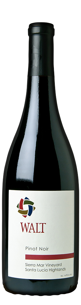
Fourteen wines wearing the same label, no quick way to tell them apart, and a round mark that looked a little too much like a recycling symbol.
(03) BRAND STRATEGY03 / 08
authentic, quality driven, approachable
Discovery gave us three words to design by. Every idea after that had to earn its place against them.
-
(01) TENET
Authentic
Grounded, with deep family roots and a cozy cottage on the Sonoma square.
-
(02) TENET
Quality driven
Fanatical about every step, from the farming to the bottle. No shortcuts.
-
(03) TENET
Approachable
For a lot of people, WALT is their first deep dive into nicer reds. An invitation to learn, never a test.
-
CORE AUDIENCE
The Pinot geek, who already gets the quality and wants the story behind every site.
-
GROWTH AUDIENCE
Younger, curious drinkers making their first deep dive into serious Pinot.
-
BIG IDEA
The modern craftsman. Handwork over mass production, heritage with a fresh coat of paint.
(04) LOGO04 / 08
a mark that looks back at you
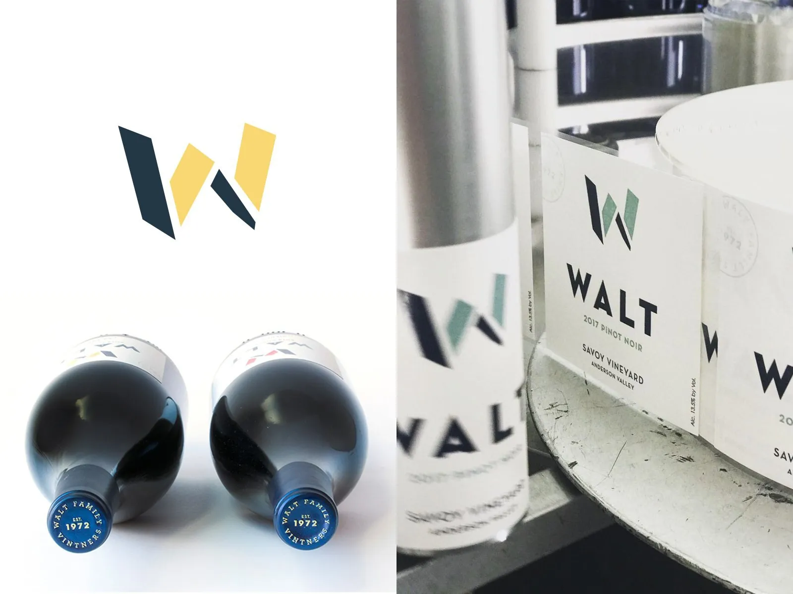
Initial concepts took a modern craftsman approach. In the end, the custom lettered W became the primary mark, the one Kathryn Hall said was looking at you from an angle and made you want to look at it.
Round one was brand explorations for a family winery and vintners in Sonoma, CA, focused on authenticity, approachability and quality, with a modern craftsman approach to colors, shapes and typography. Kathryn kept coming back to one page, a flat W that folds into a second dimension. She loved that it wasn’t static, and the yellow made her think of sun and brightness. Rounds two and three refined the fold and the two-tone color, along with variations for different applications.
(05) VISUAL IDENTITY05 / 08
a seal for every bottle
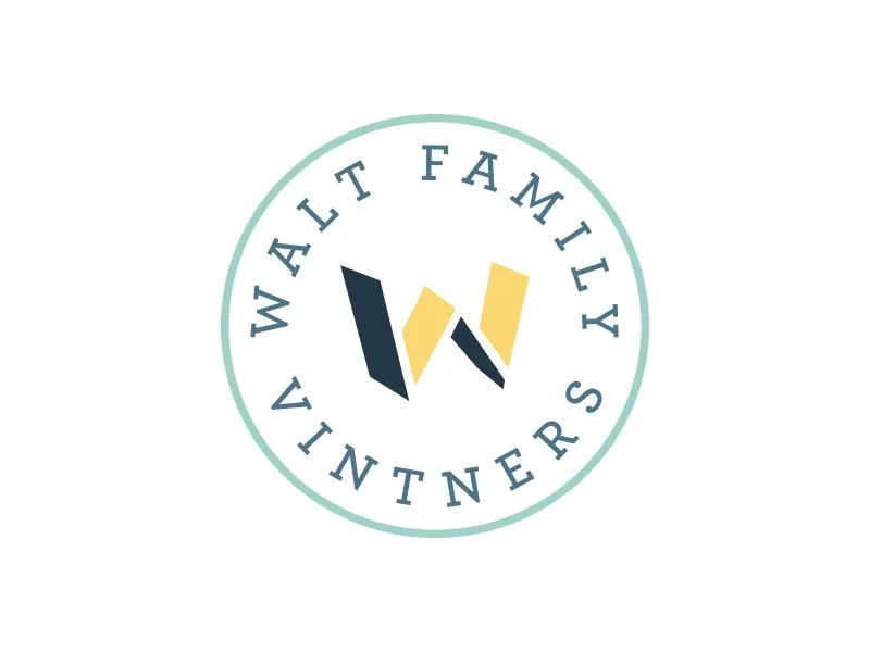
The custom lettered W is the primary mark. A vintage stamp speaks to the heritage of the Walt family vintners in the Napa and Sonoma region.
- NAVY#243746
- YELLOW#FAD771
- SEA GLASS#9FD0CC
- BRICK#D83F20
(06) PACKAGING06 / 08
fourteen wines, one family
An important part of branding is the flexibility within the identity system to expand beyond its original scope and embrace new lines of products, yet still maintain a connection to the master brand.
- 01 VINTAGE
- 02 WALT
- 03 REGION
- 04 VARIETAL
- 05 VINEYARD
(07) INTERACTIVE07 / 08
carrying it online
The site should feel like opening the bottle.
(08) IN THE WORLD08 / 08
poured, gifted and worn
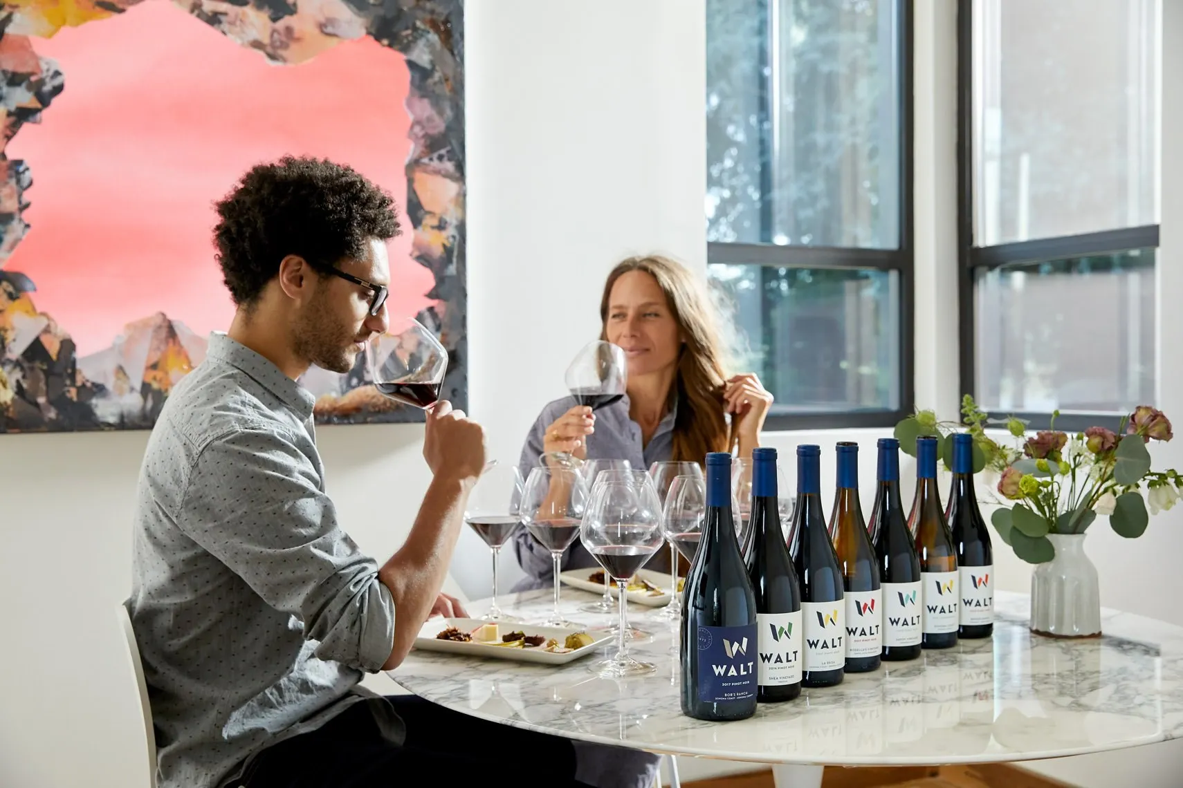
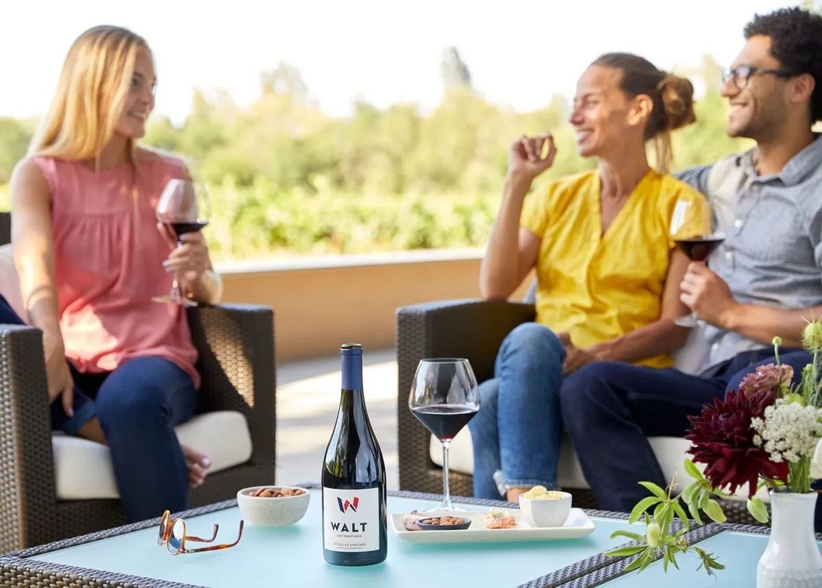
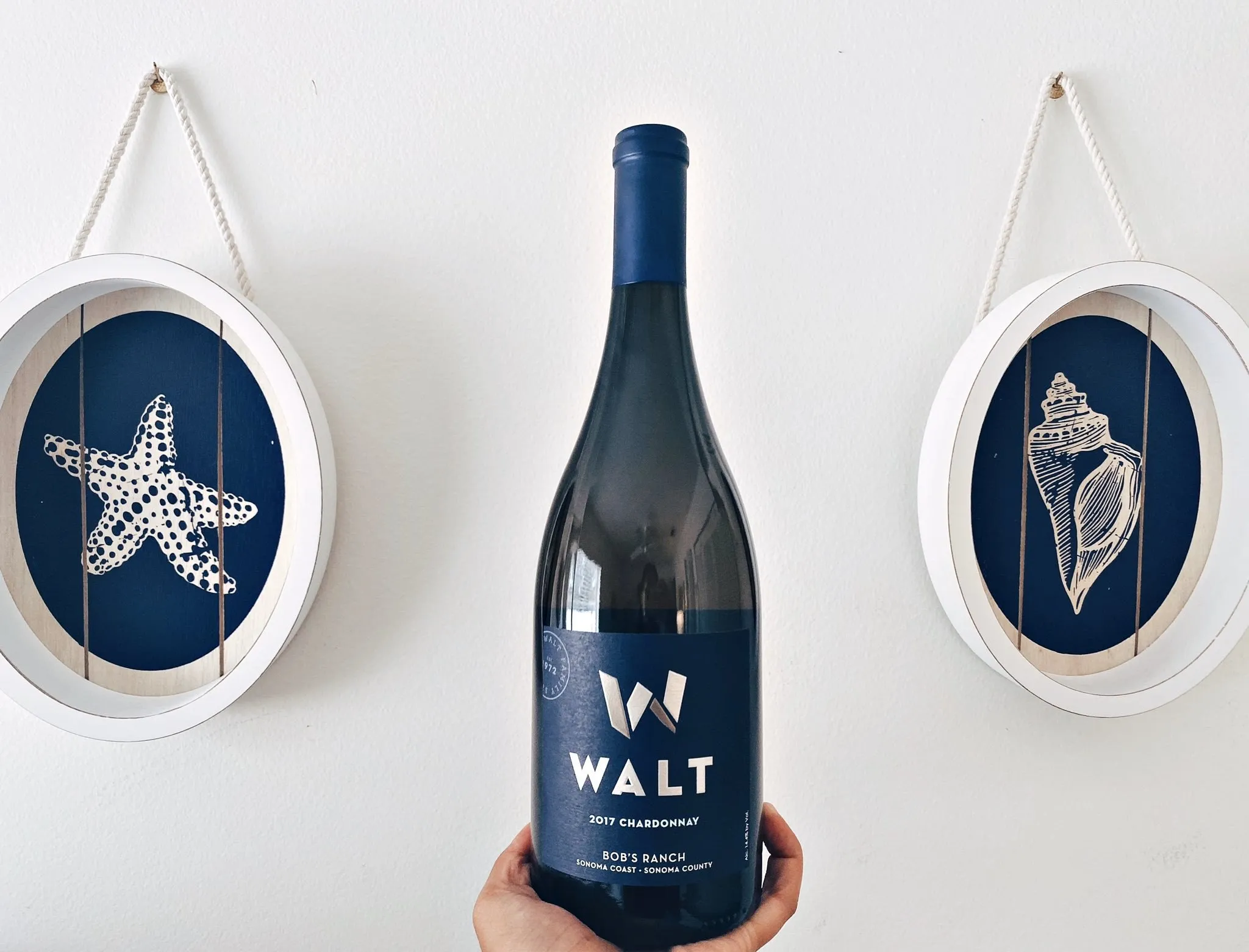
Always fun to see something you’ve created out in the wild! I had the pleasure of visiting the tasting room in Sonoma, CA, and their Pinots are quite amazing.
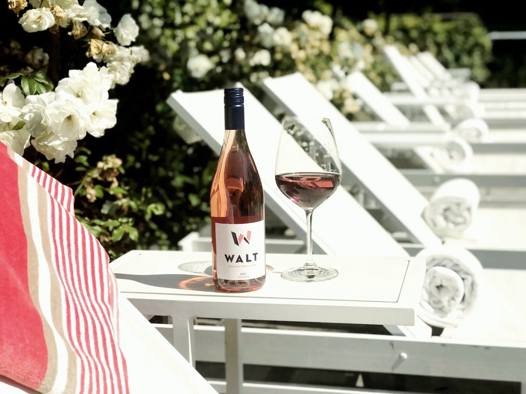

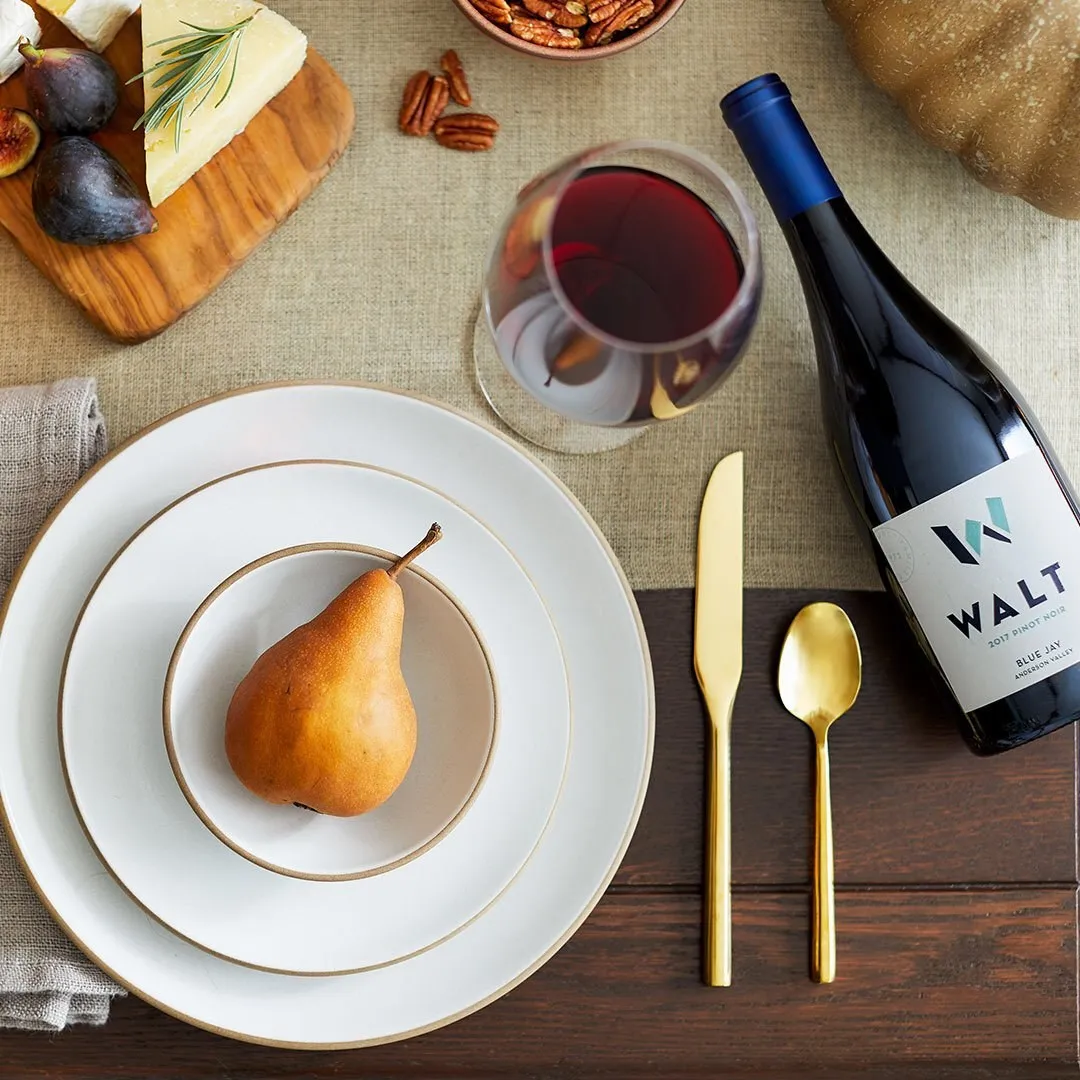
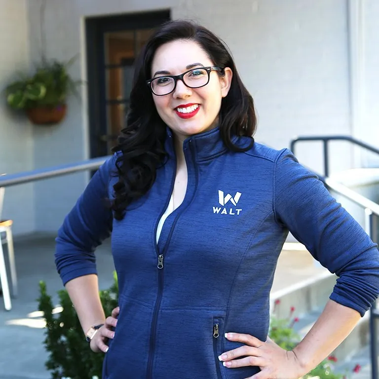
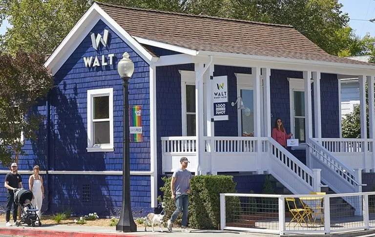
PHOTOGRAPHY · WALT WINES
(01) OVERVIEW
a pinot house ready to stand on its own
WALT is the Pinot Noir and Chardonnay house of the HALL family, named for Kathryn Hall’s maiden name. WALT is a winemaker, not a grower, so its grapes come from small vineyard sites up and down the Pacific Coast, from the Sta. Rita Hills to the Willamette Valley.
The wine was winning scores, but the look wasn’t keeping up. The brief asked me to refresh the logo, especially the icon, and keep the type close enough to HALL that the family connection stayed. The story was powerful. The label just didn’t pop on the shelf. Over three rounds together, the team and I built a new mark, a family seal, a label system for fourteen wines and the shippers, gift boxes and web direction to match.
(02) CHALLENGE
a label that didn’t pop on the shelf
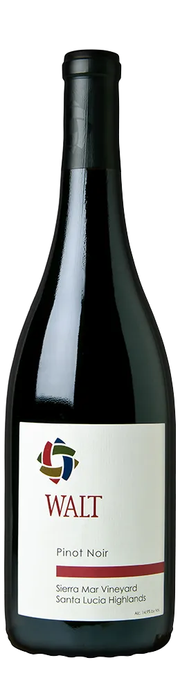
Discovery told a story I heard again and again. The old circle stood for the four places the wine came from, a nice idea nobody could read from across a room. One person compared it to a convenience store sign. Another said it was starting to look like the recycling symbol. On a crowded shelf, the label simply disappeared.
The real problem was practical. There were fourteen wines under one name, and you had to read every label to find the one you wanted. In our first review, one of the leaders told me the old label wasn’t broken, but if they were going to change it, they should really change it. I took that as permission to go big.
(03) BRAND STRATEGY
authentic, quality driven, approachable
Discovery gave us three words to design by, and every idea after that had to earn its place against them.
- AUTHENTIC
- Grounded, with deep family roots and a cozy cottage on the Sonoma square.
- QUALITY DRIVEN
- Fanatical about every step, from the farming to the bottle. No shortcuts.
- APPROACHABLE
- For a lot of people, WALT is their first deep dive into nicer reds. An invitation to learn, never a test.
The Pinot geek was the core audience, the person who cares about clones and vineyard sites. The growth audience was younger and curious, looking for a way into serious Pinot without the pretense. The idea that tied them together was the modern craftsman: handwork over mass production, heritage with a fresh coat of paint.

(04) LOGO
a mark that looks back at you
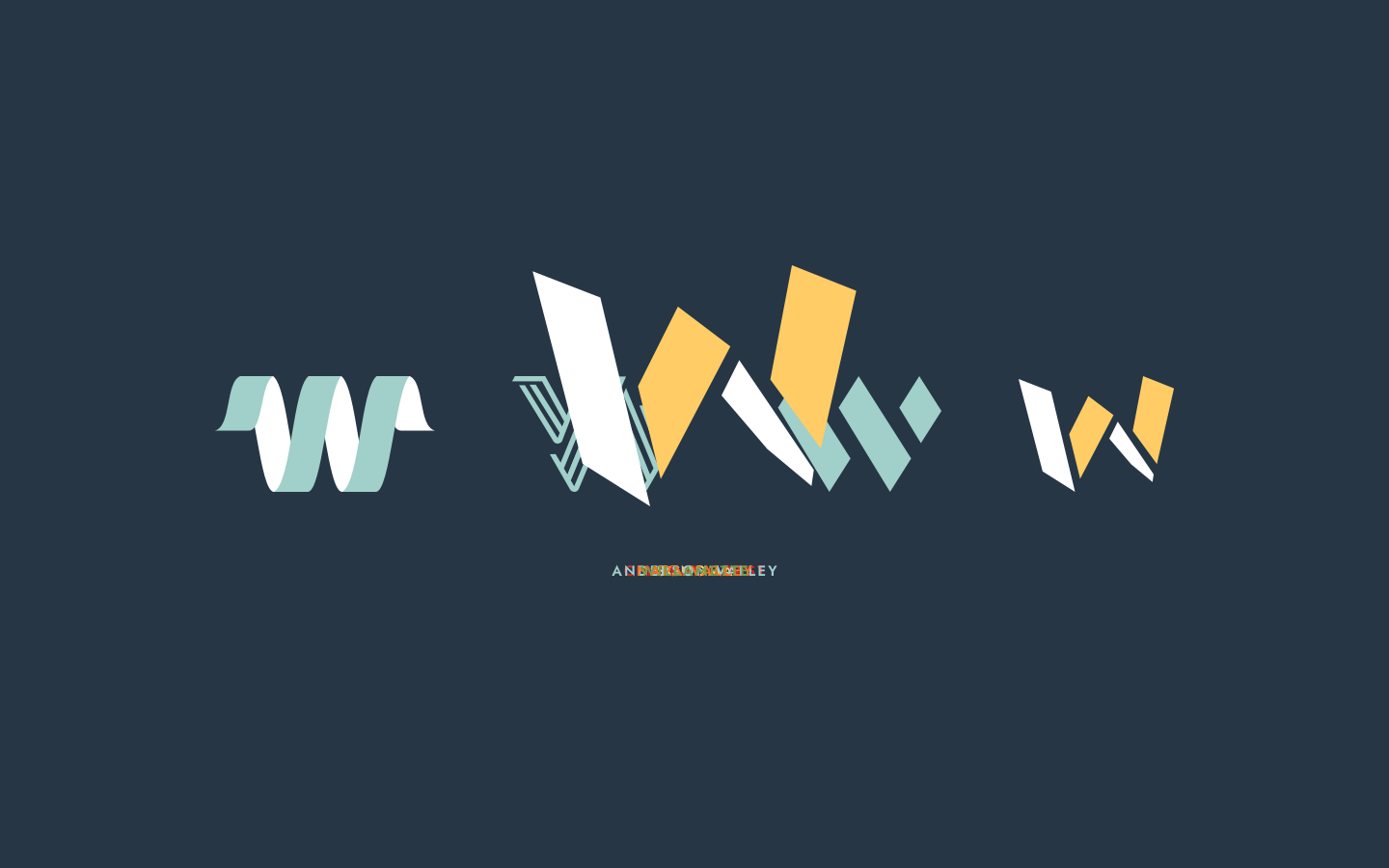
Initial concepts took a modern craftsman approach. In the end, the custom lettered W became the primary mark, the one Kathryn Hall said was looking at you from an angle and made you want to look at it.
Round one was brand explorations for a family winery and vintners in Sonoma, CA, focused on authenticity, approachability and quality, with a modern craftsman approach to colors, shapes and typography. Kathryn kept coming back to one page, a flat W that folds into a second dimension. She loved that it wasn’t static, and the yellow made her think of sun and brightness. Rounds two and three refined the fold and the two-tone color, along with variations for different applications.
(05) VISUAL IDENTITY
a seal for every bottle
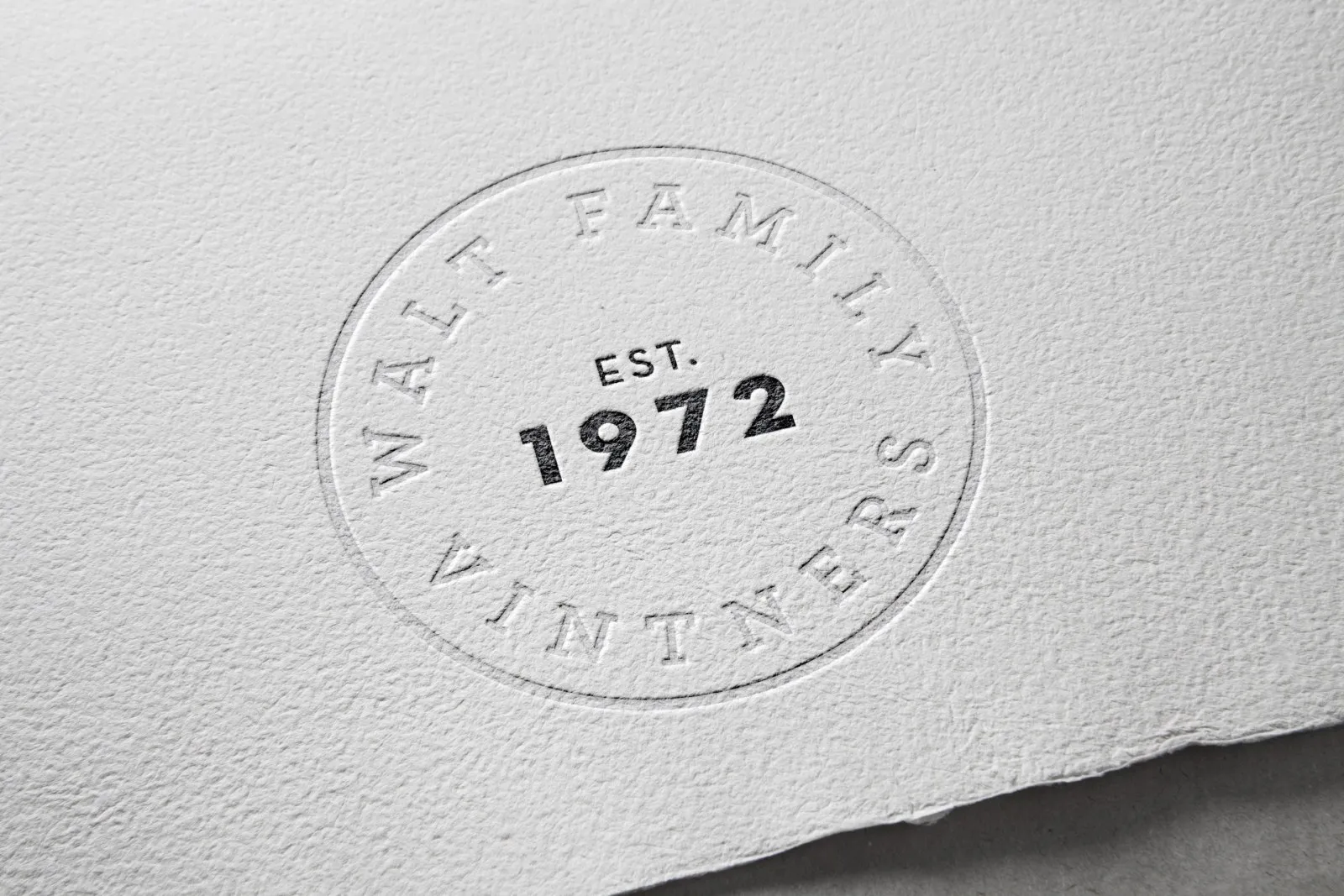
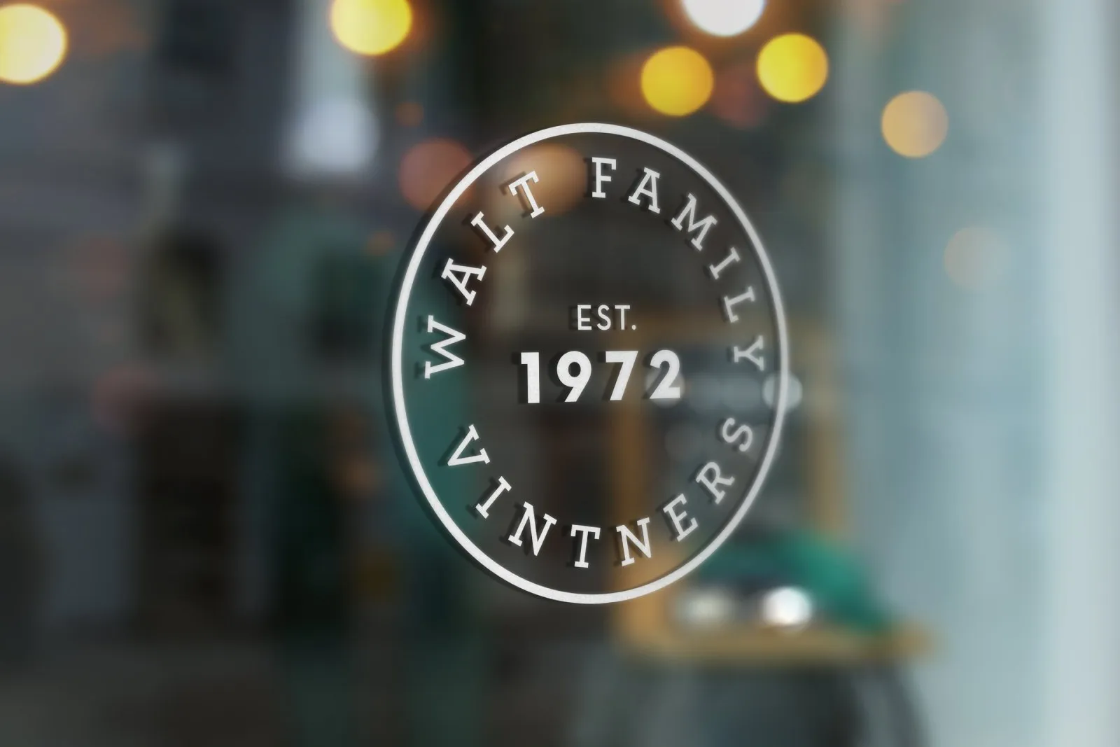
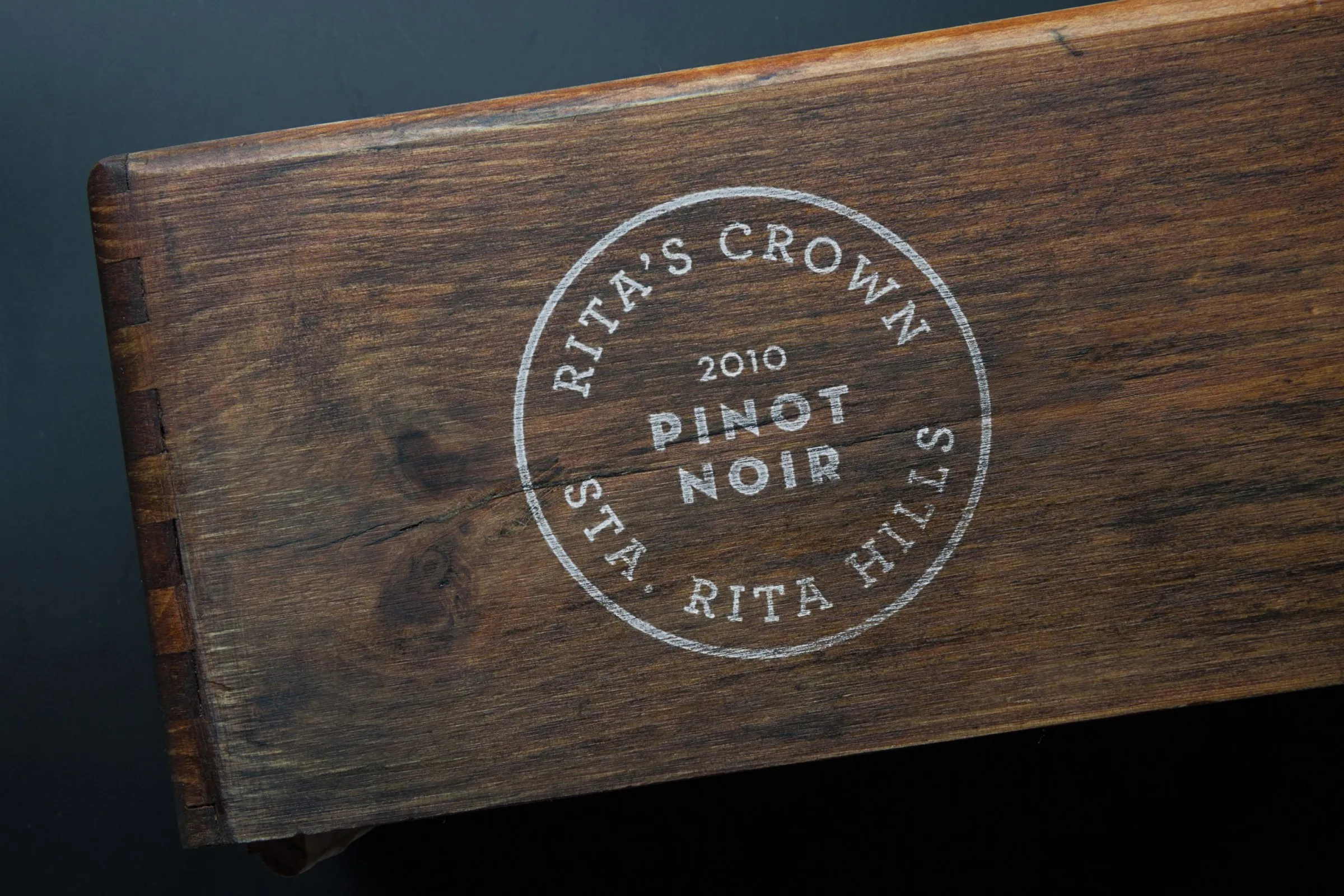
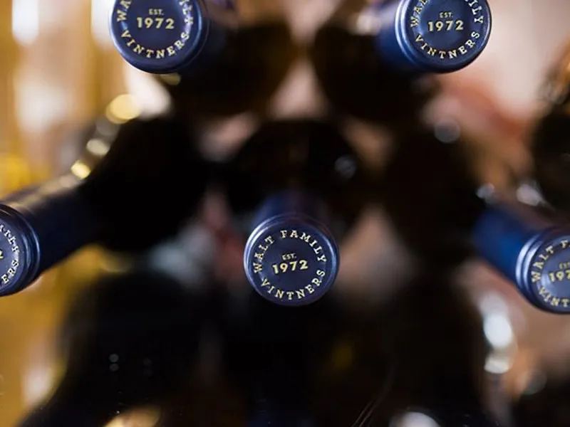
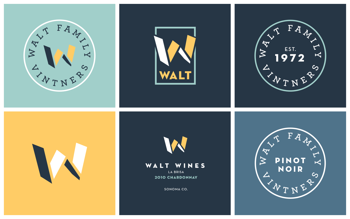
Every family label needs something that says where it came from, so I also created a vintage stamp that speaks to the quality and heritage of the Walt family vintners in the Napa and Sonoma region. The Walt Family Vintners seal carries EST. 1972, comes in versions for Pinot Noir and Chardonnay, and holds up embossed, foil stamped, etched on glass or branded into wood.
Deep navy anchors the palette. Warm yellow, sea glass and brick red give the W room to change color from wine to wine.
- NAVY
- YELLOW
- SEA GLASS
- BRICK
(06) PACKAGING
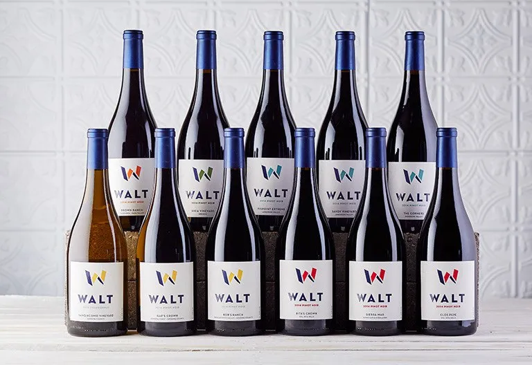
fourteen wines, one family
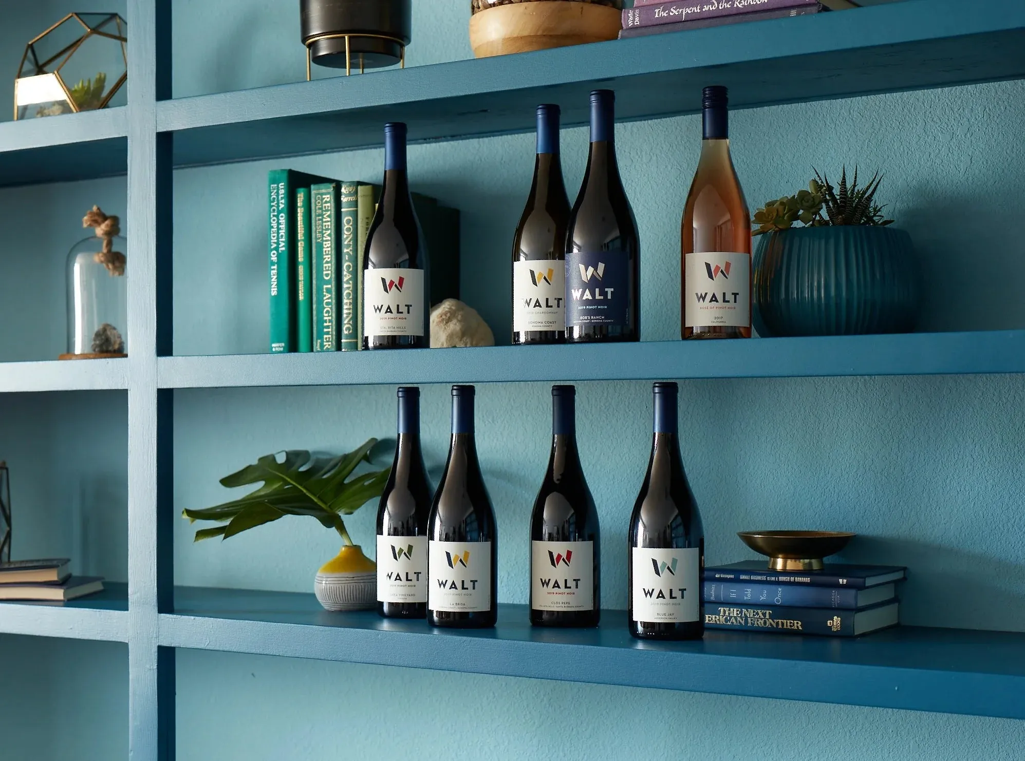
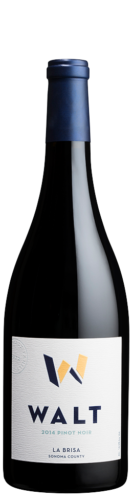
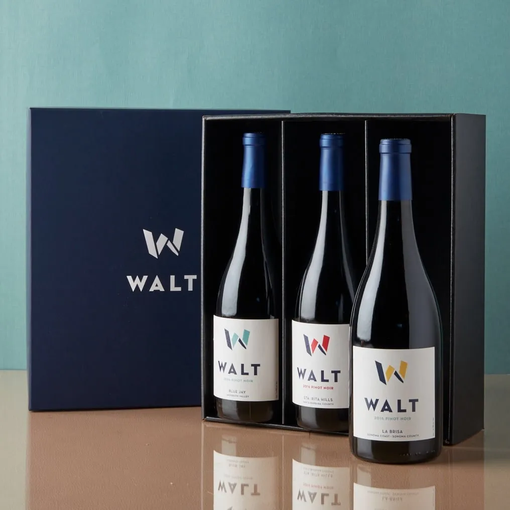
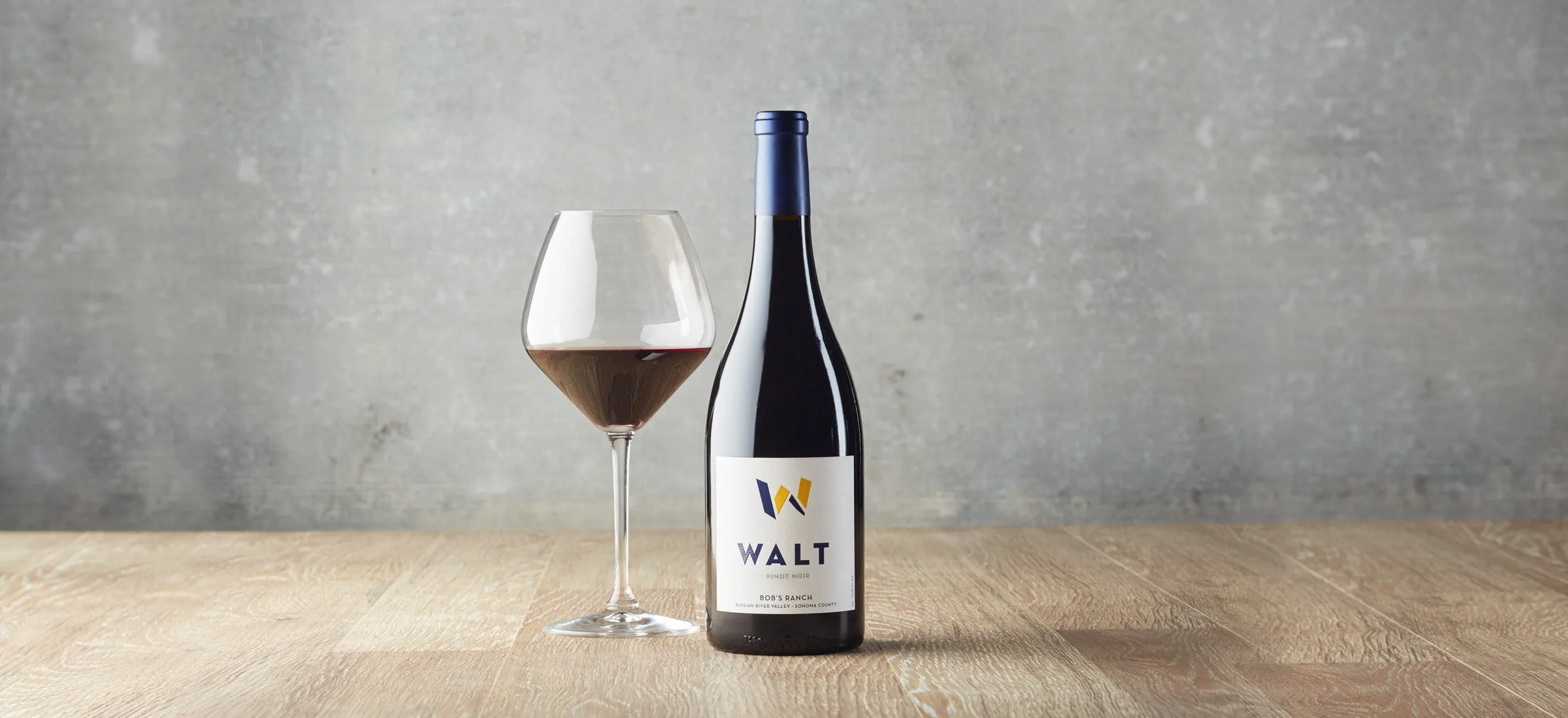
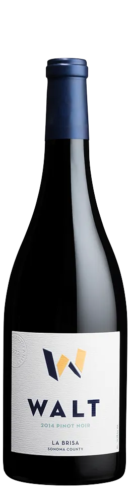
The labels stay white and quiet so the W can do the work. Every one follows the same order: vintage, WALT, region, varietal and vineyard.
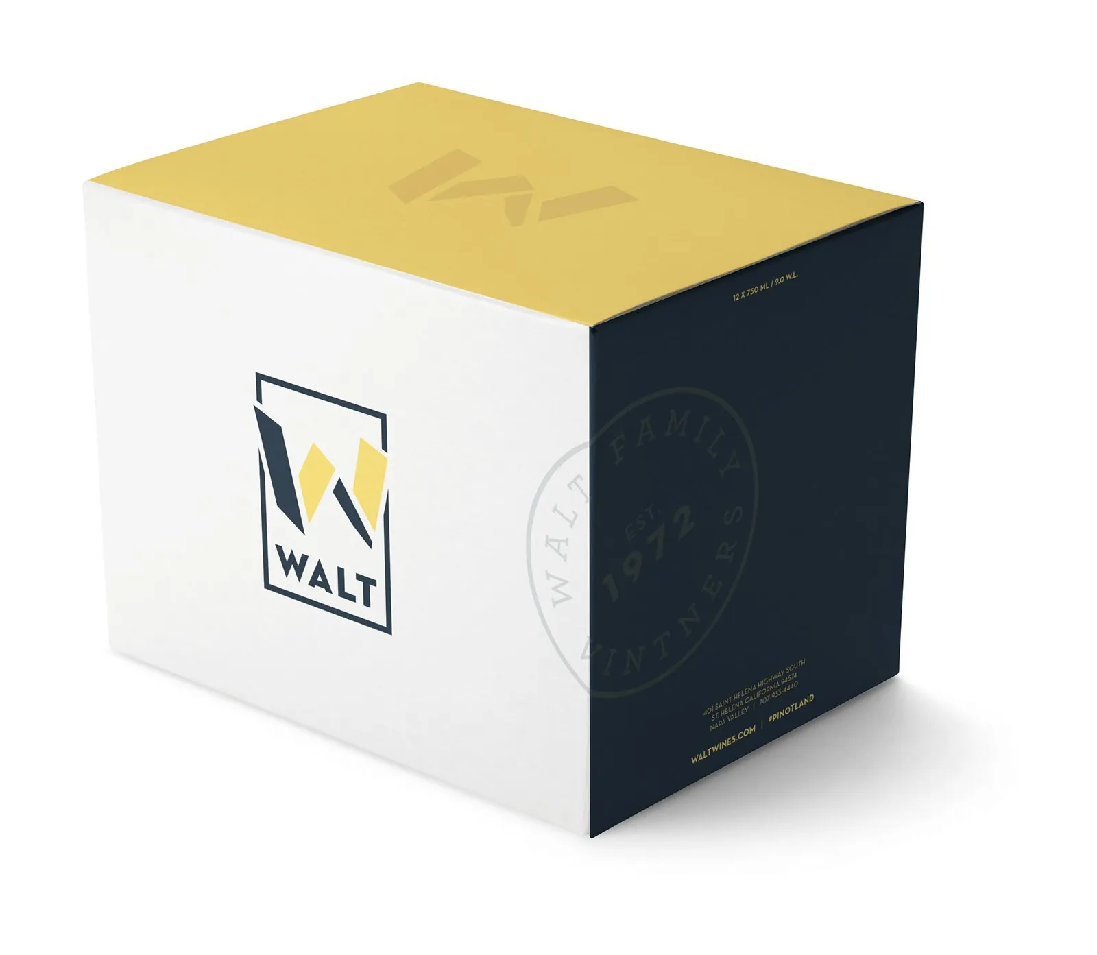
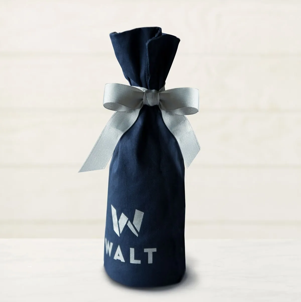
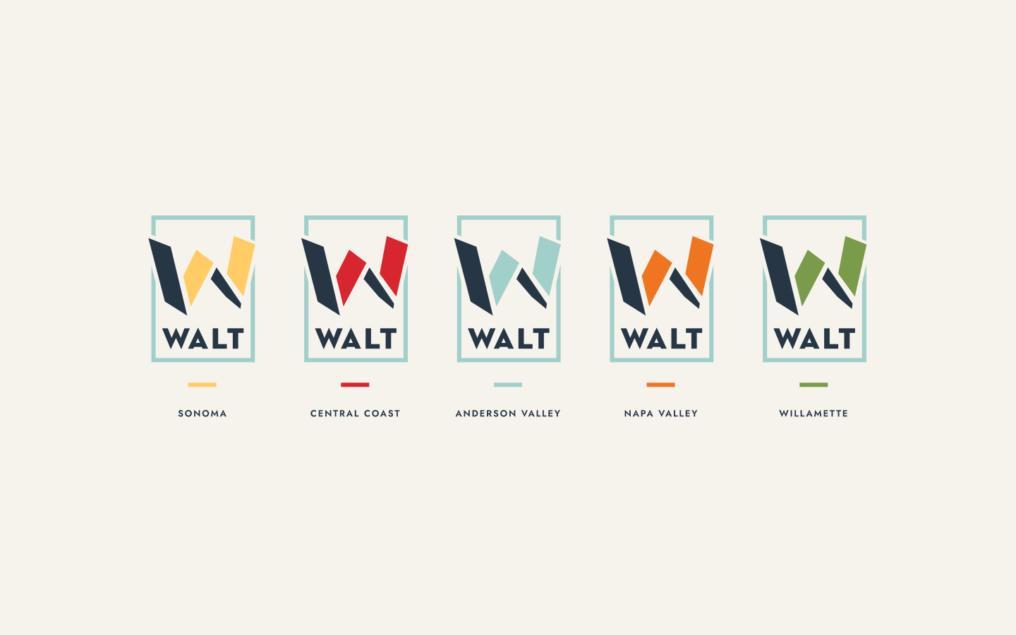
Color lives in the W, so you can scan a wall of bottles and spot the region you’re after without reading a word. The family seal sits on top of every capsule, and the system carries onto the six- and twelve-bottle shippers, gift boxes and bottle bags. An important part of branding is the flexibility within the identity system to expand beyond its original scope and embrace new lines of products, yet still maintain a connection to the master brand.
(07) INTERACTIVE
carrying it online
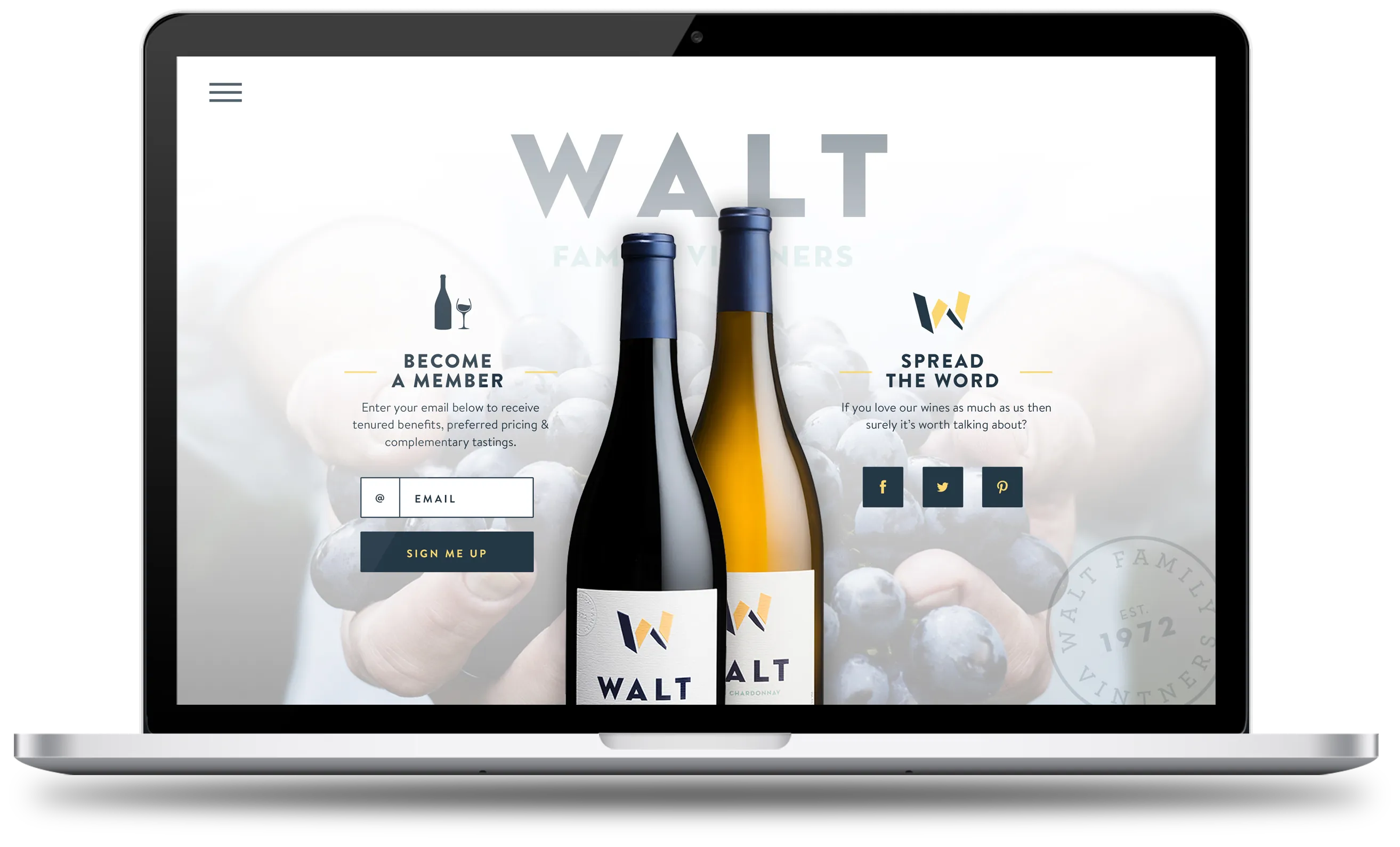
WALT’s in-house team ran the online store, so my job was to give them a clear direction and stay close while they built it. I designed a landing page concept and the brand boards they worked from, and checked in along the way so the site felt like the bottle.
PHOTOGRAPHY · WALT WINES
(08) IN THE WORLD
poured, gifted and worn
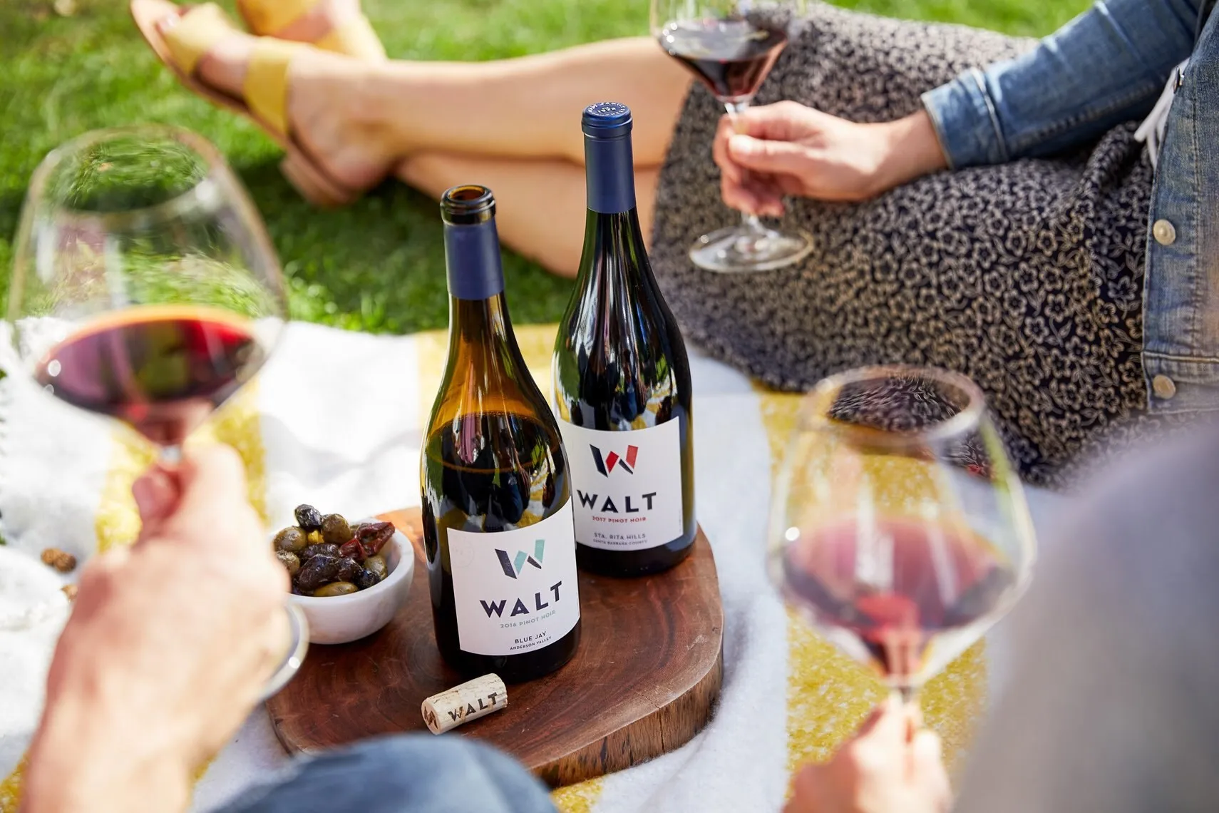
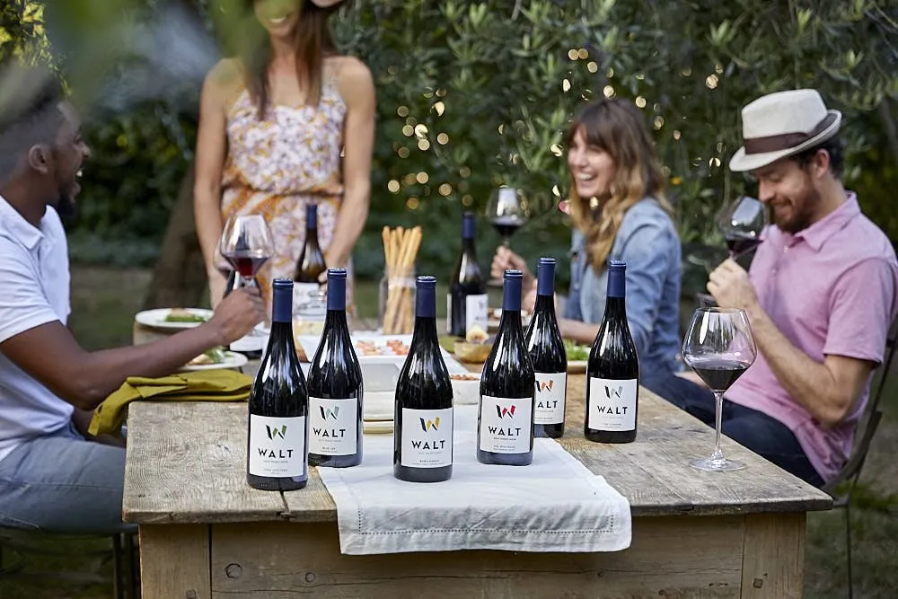
The best test of a system is what happens after you hand it over, and it’s always fun to see something you’ve created out in the wild. I had the pleasure of visiting the tasting room in Sonoma, CA, and their Pinots are quite amazing. These are WALT’s own photos: the W in the tasting room, at the table, in gift packaging and on the team.
Jeremy has an eye for creating imagery and designs that are compelling, fresh and above all, original. He was timely, efficient, easy to work with and produced some great assets that have helped to propel our visual identity.
DELIVERABLES
- Logo and lockups
- Family seal and varietal stamps
- Color palette
- Label system
- Six- and twelve-bottle shippers
- Gift box and bottle bags
- Brand boards
- Web landing concept
DISCIPLINES
- Discovery & Strategy
- Brand Identity
- Packaging
- Interactive Direction
CREDITS
- Creative direction: Jeremy Mansfield
- Photography: WALT Wines