baca zinfandel
Life is an adventure, here’s to those who drink it up! A spirited new identity for the HALL family’s Zinfandel house, and the rosé that followed.
4 MIN READ · 08 SECTIONS · 35 IMAGES
(01) OVERVIEW01 / 08
a zinfandel for the kid at heart
BACA Zinfandel wanted to stand out with wines that reflect the vibrant, versatile regions the grapes come from, and a real penchant for the uncharted.
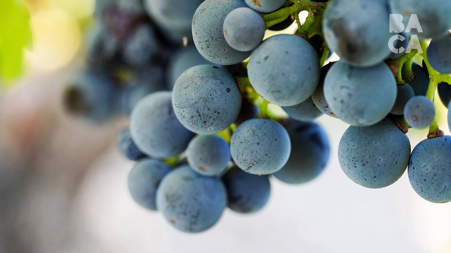
BACA is the third wine brand from the HALL family, starting with single vineyard Zinfandels from Rockpile in Sonoma, Howell Mountain in Napa and Dusi Ranch in Paso Robles. Drawing from raw nature and the meaning of BACA, Latin for berry, I created a brand identity to complement such a curious, spirited and adventuresome company. Working alongside the BACA team and their brand strategist, we built it from the ground up: logo, palette, labels, packaging and signage, plus a rosé that carried the brand into new colors.
(02) CHALLENGE02 / 08
zinfandel had a reputation
Zinfandel had a reputation for being heavy, jammy and a bit macho. BACA wanted to be high quality without the pretense, carefully crafted but also playful.
(03) BRAND STRATEGY03 / 08
bold, progressive, crafted
BACA celebrates creativity, drives exploration and inspires discovery. The strategy gave that a name, bold progressive craftsmanship, and every design choice had to live up to it.
-
(01) TENET
Bold
Selective about the talent, the vineyards and the grapes, and always pushing forward.
-
(02) TENET
Progressive
Thinking outside the box, and refusing to stand still.
-
(03) TENET
Crafted
Time spent up front leaves room to take risks, without cutting corners.
-
CORE AUDIENCE
Millennials, plus the older drinkers who share their outlook and don’t see a great bottle as an extravagance.
-
MINDSET
Discerning, free-spirited adventurers who favor the journey over the destination.
-
BIG IDEA
Bohemian luxury. High quality without the pretense, carefully crafted but also playful.
(04) LOGO04 / 08
four letters and a period
Three directions became one stacked, distressed wordmark, and Kathryn Hall loved the period after Zinfandel from the very first round.
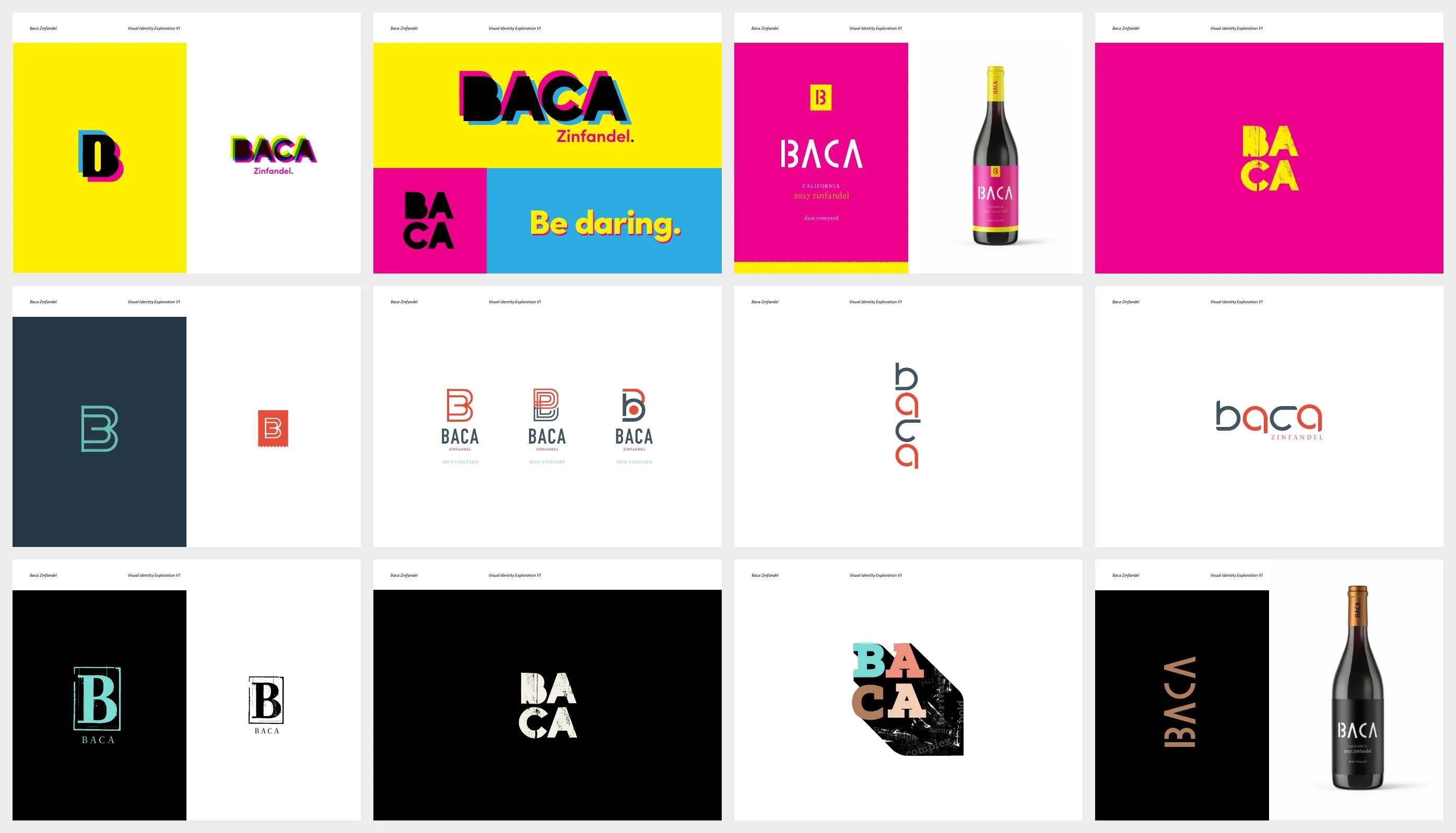
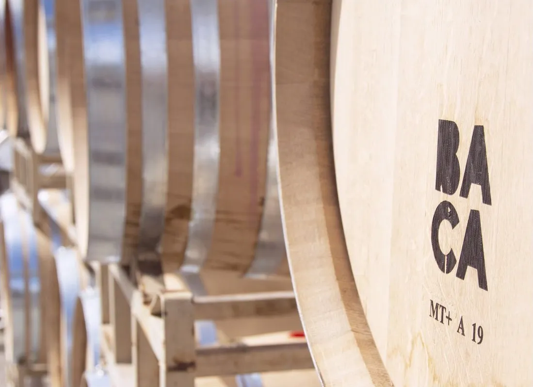
Round one explored three directions: Engaging Excitement, Modern Craftsman and Bohemian Luxury. Bohemian Luxury was the big favorite, and its stacked, distressed letters won out, bold enough for Zinfandel and worn in enough to feel made by hand. Along the way we tried a berry tucked into the period and topo maps of the vineyards, then landed on block letters, one signature color and a rounded B that reads at any size.
(05) VISUAL IDENTITY05 / 08
craft luxury, fired up
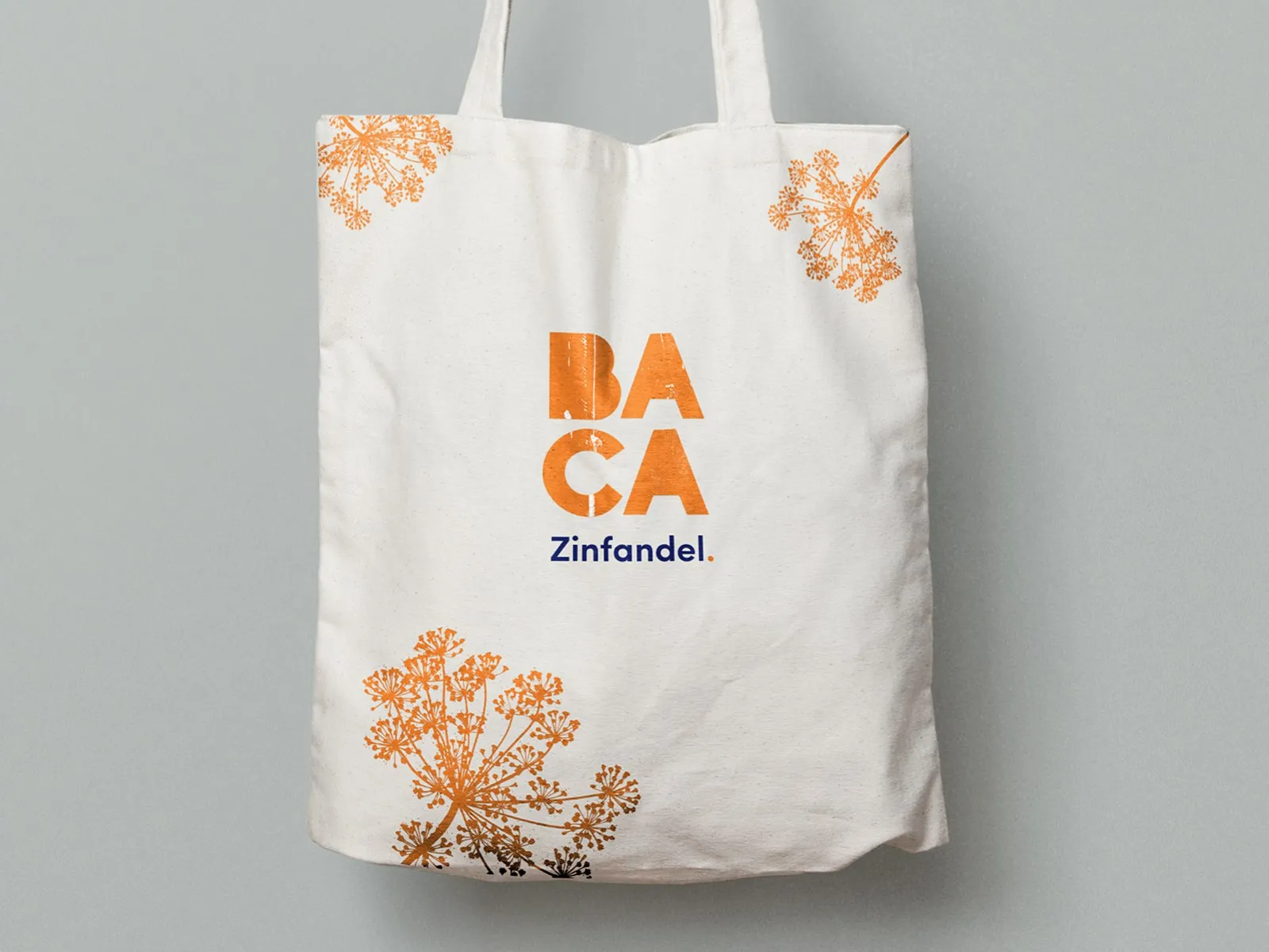
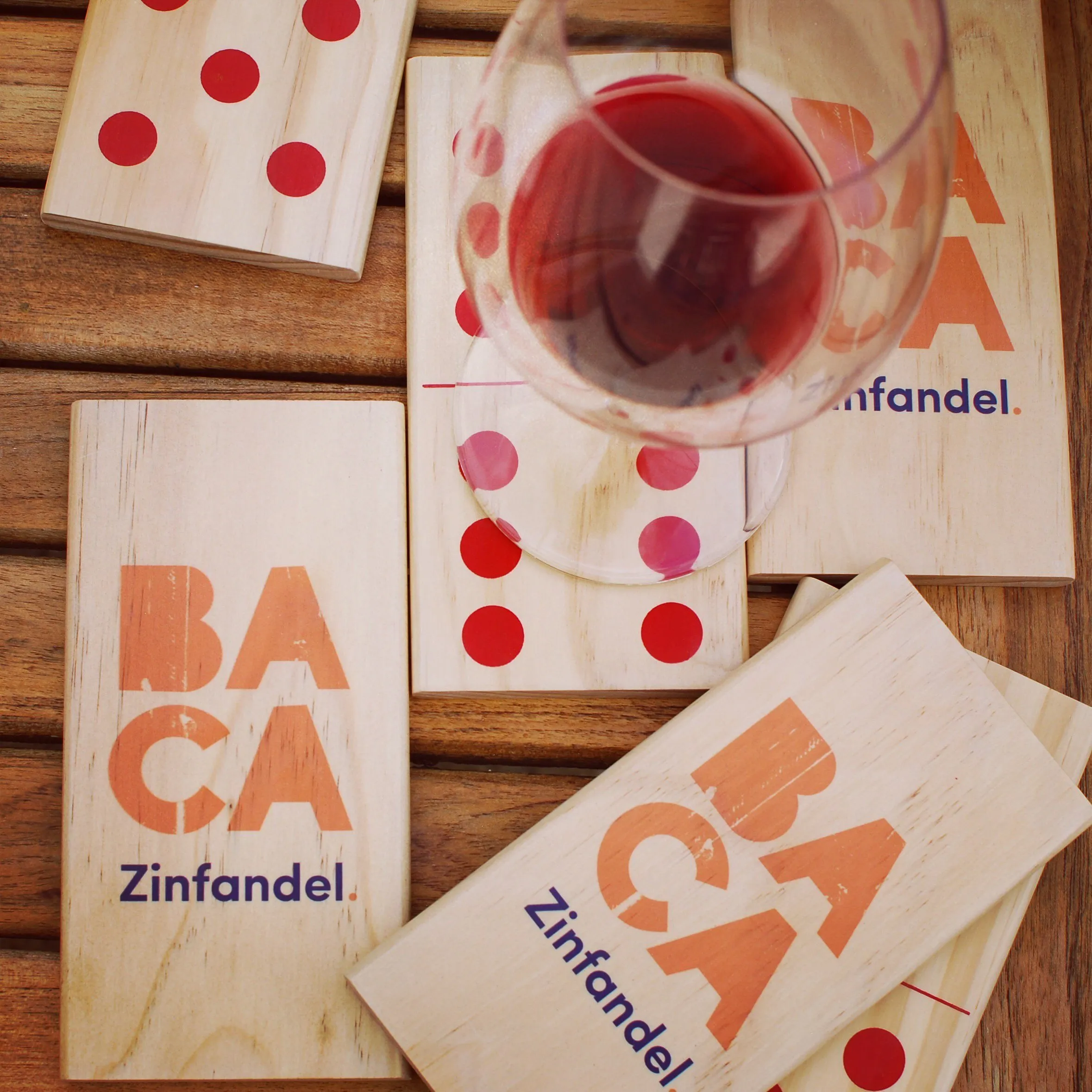
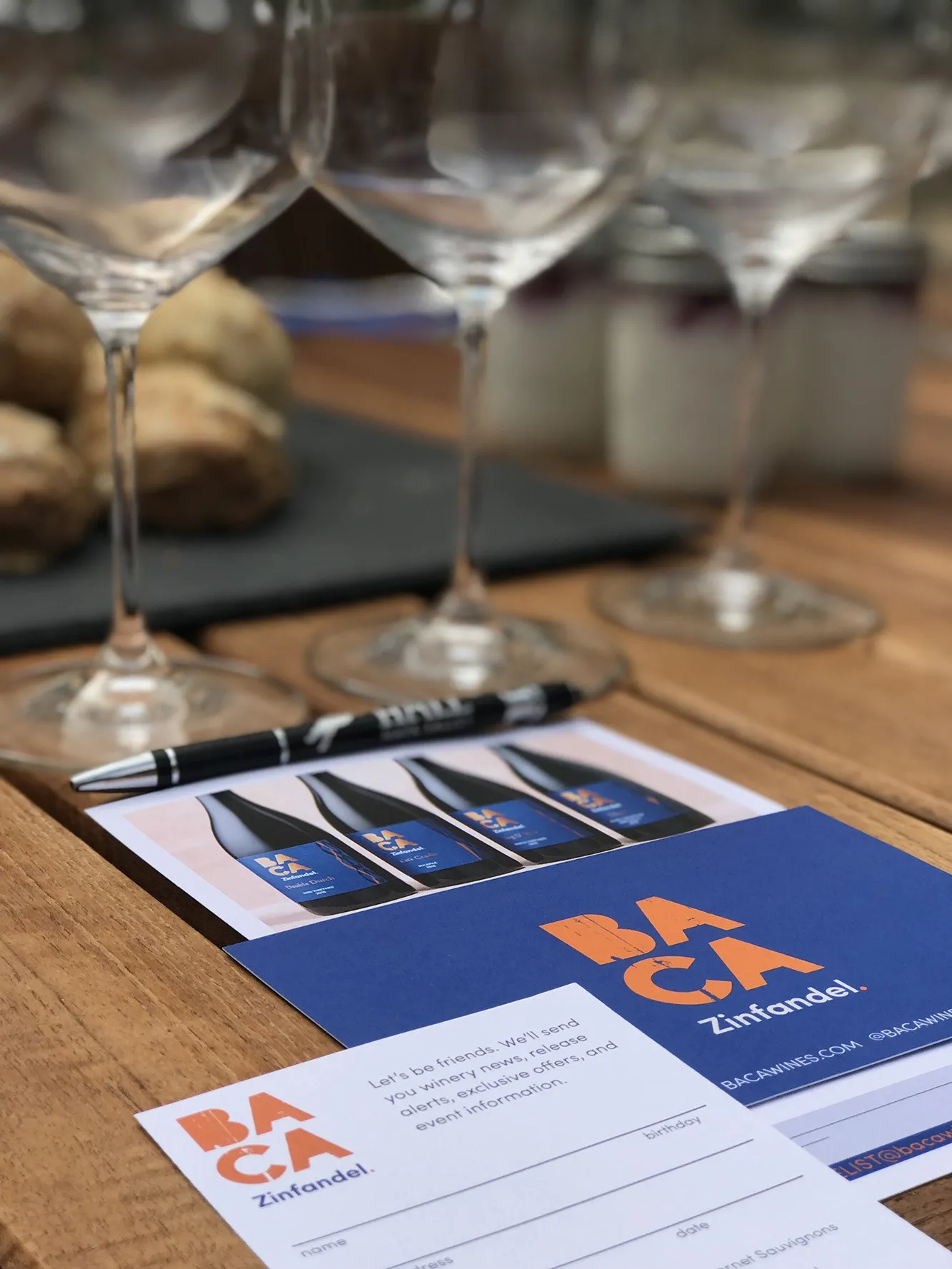
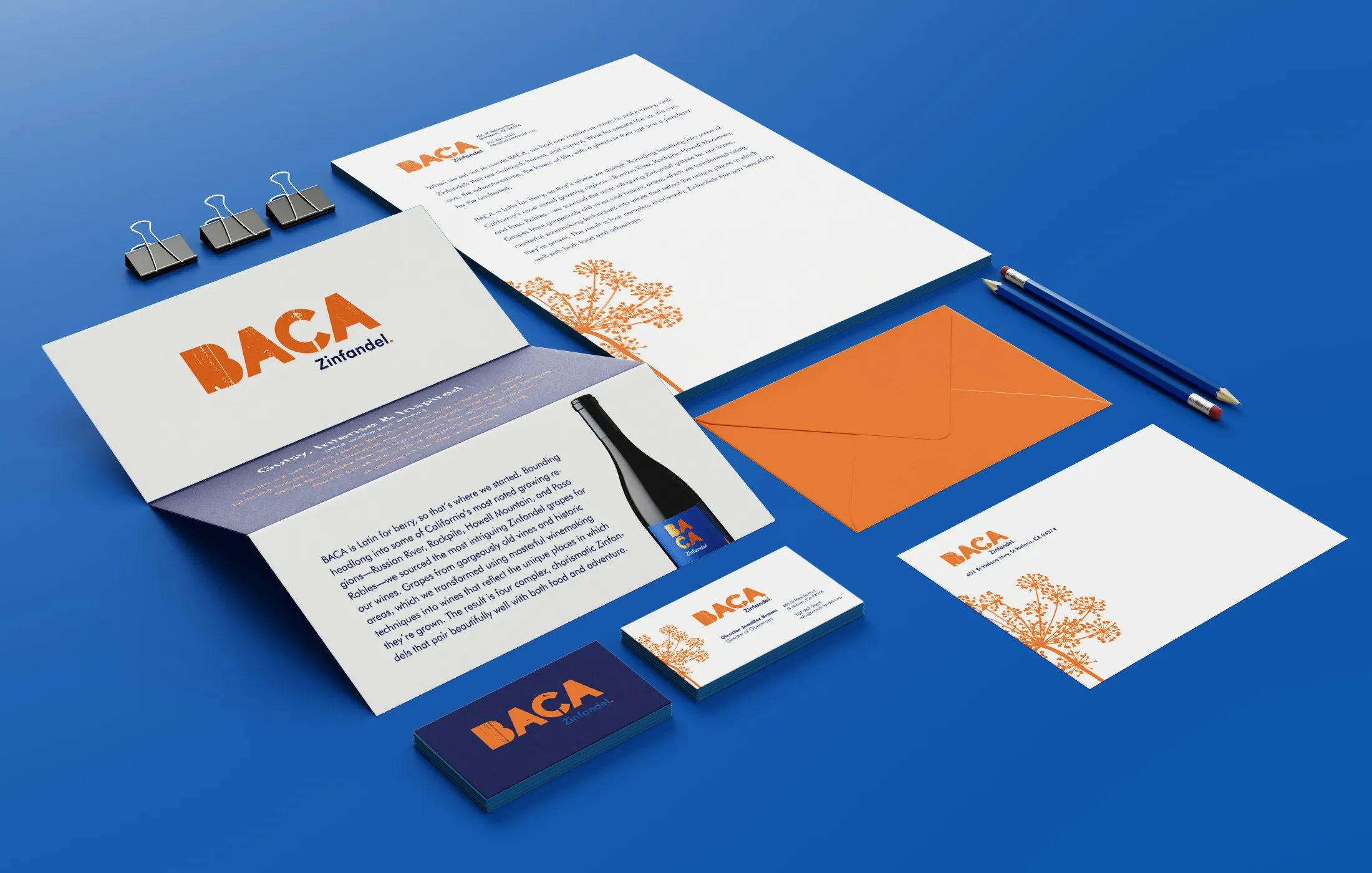
Deep blue meets a fired up orange, with cool grays and cream to keep things grounded. The navy and orange pairing is the one the team kept coming back to.
- DEEP BLUE#00303C
- FIRED UP ORANGE#FF671D
- SLATE BLUE#415364
- CREAM#EFECE3
(06) PACKAGING06 / 08
every wine, a playground game
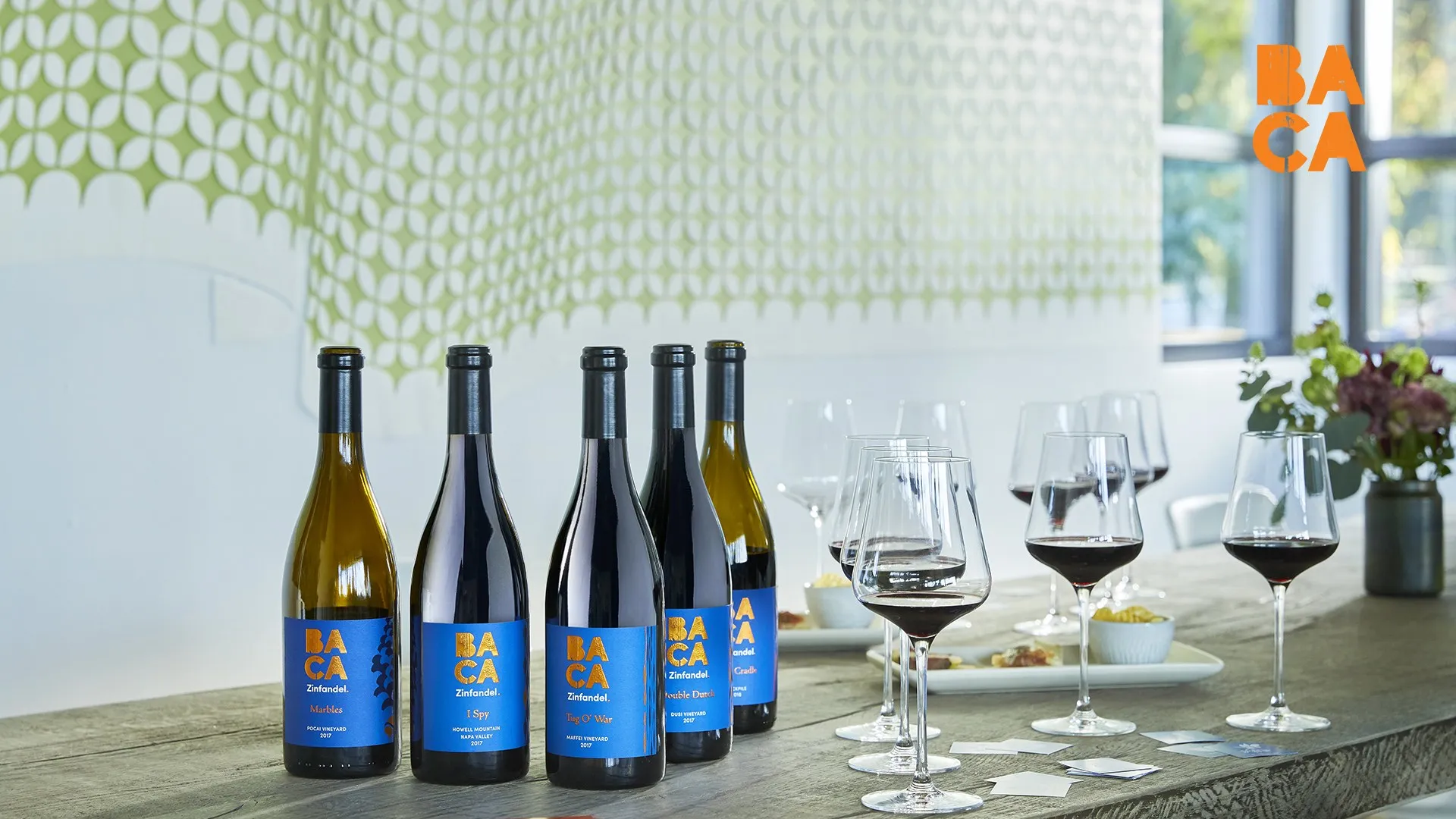
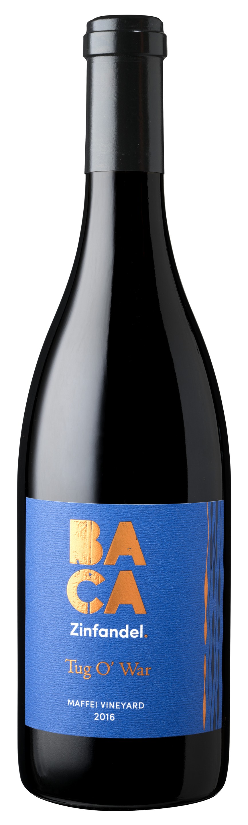
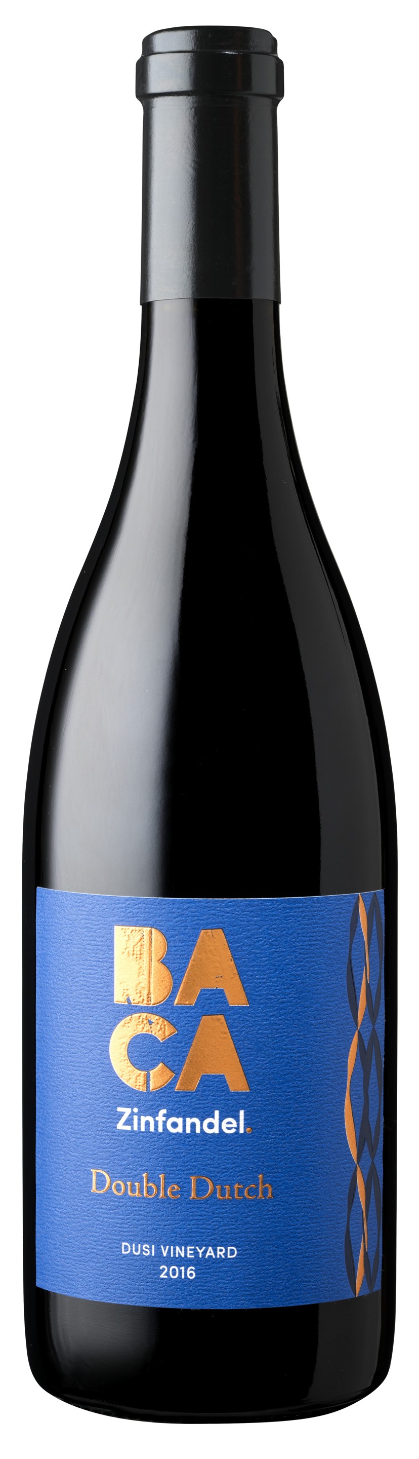
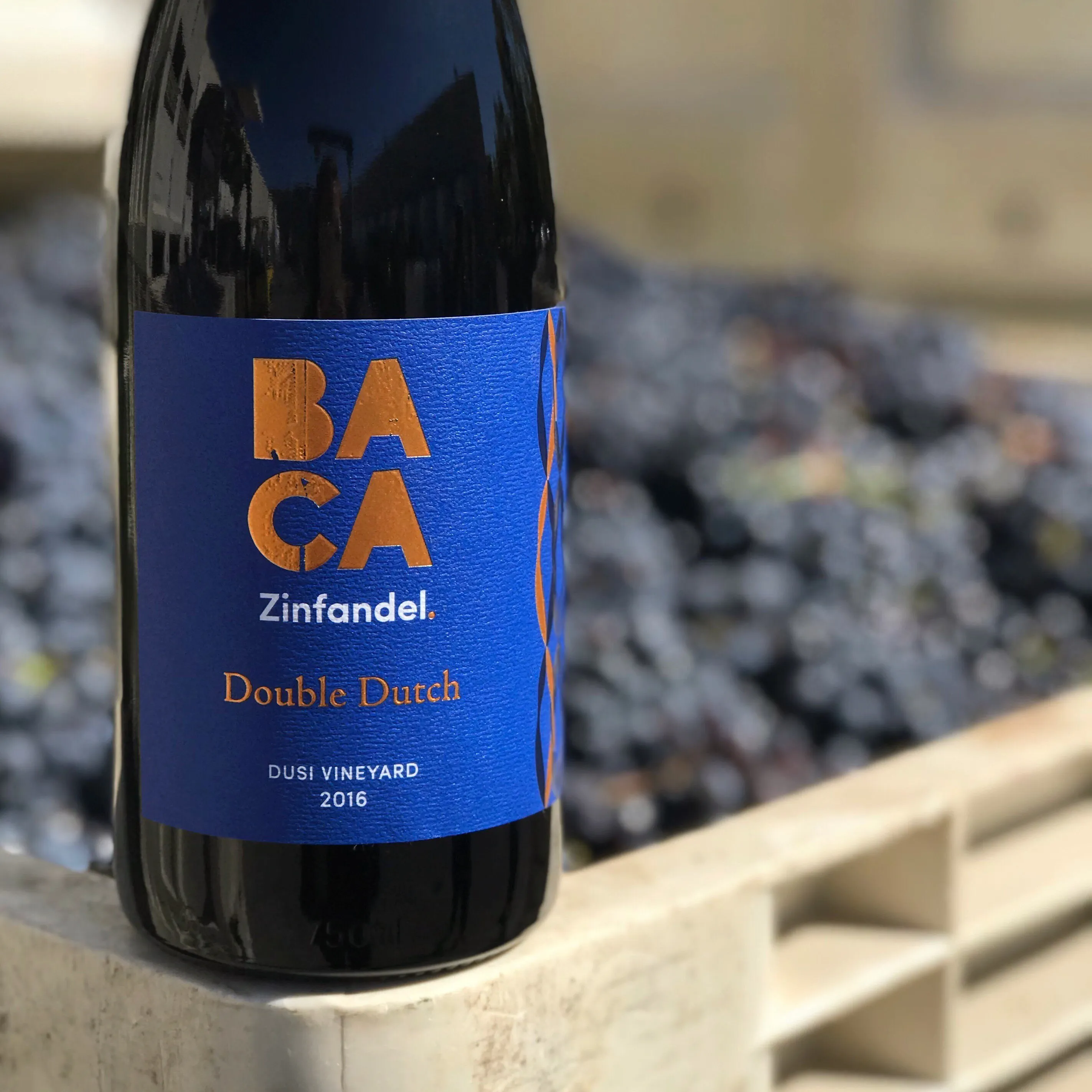
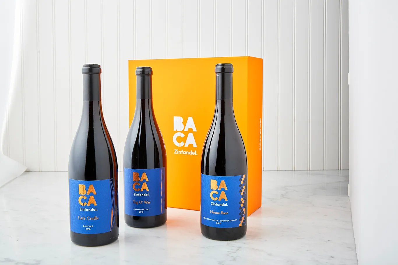
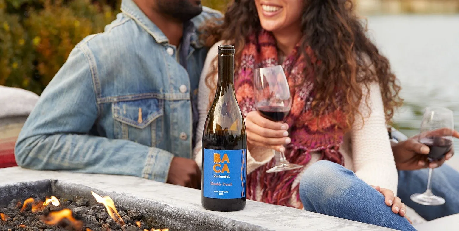
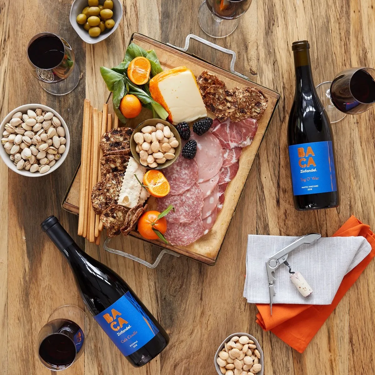
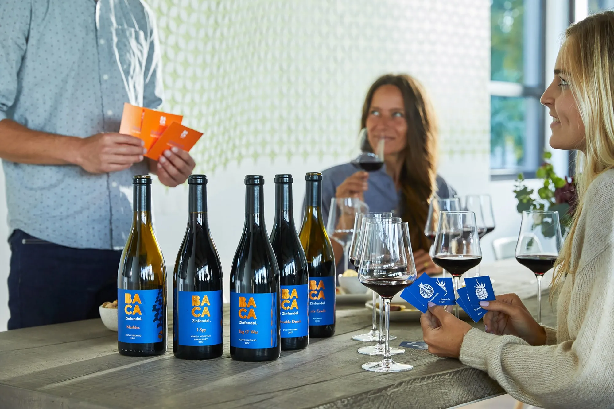
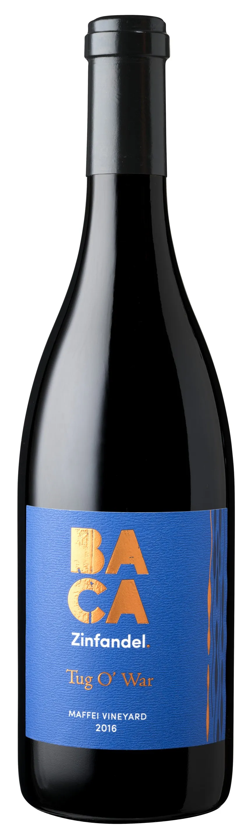
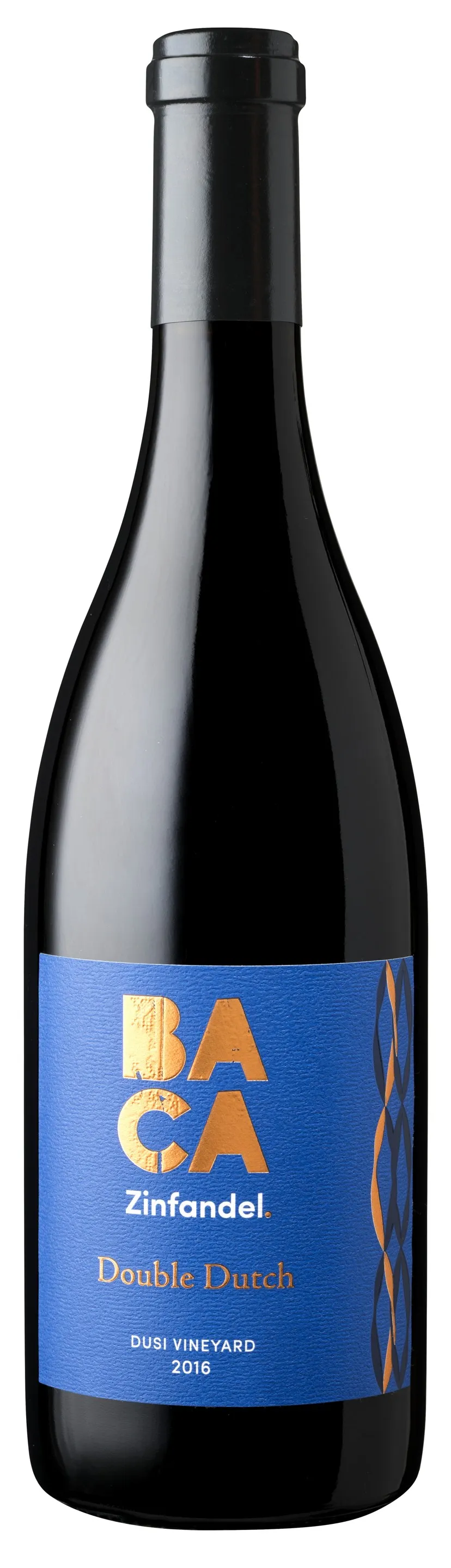
Every wine gets its name from a playground game: Tug O’ War, Double Dutch, I Spy and Cat’s Cradle. It’s the kid at heart, dressed up for dinner.
- 01 BACA
- 02 ZINFANDEL.
- 03 WINE NAME
- 04 VINEYARD
- 05 VINTAGE
(07) ROSÉ07 / 08
the brand, spun into rosé
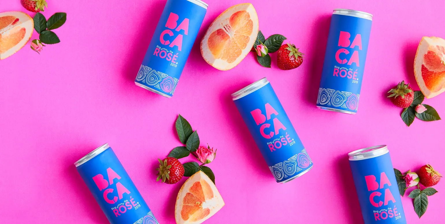
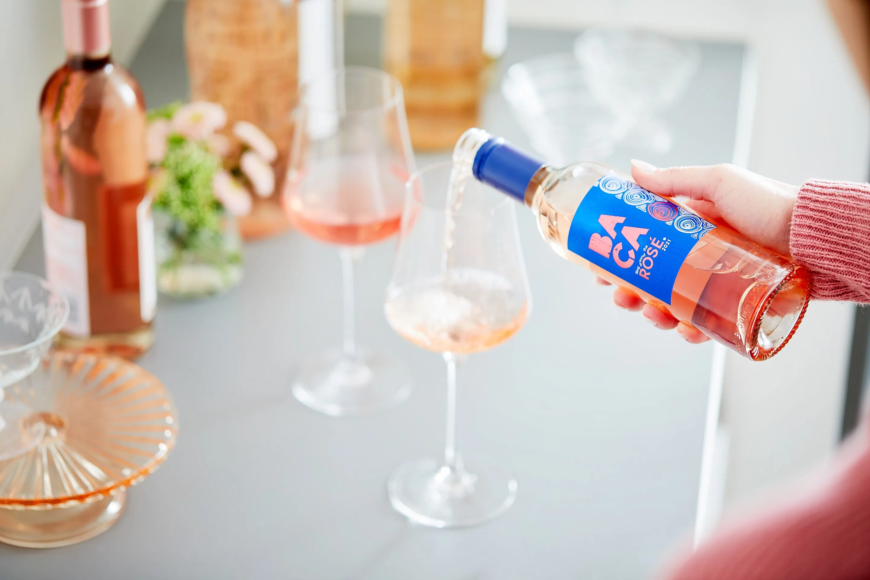
BACA Rosé is where bold expression meets elevated craft: a vibrant, crisp wine for those who value authenticity, curiosity and a sense of adventure in every glass.
(08) IN THE WORLD08 / 08
made for game night
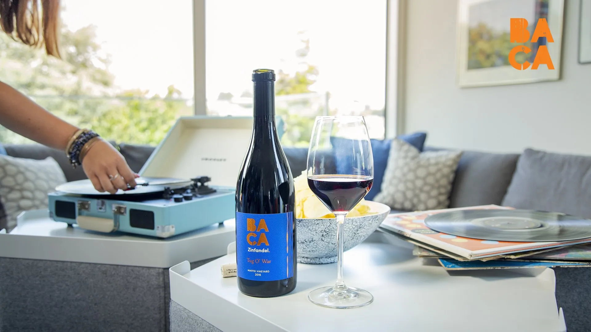
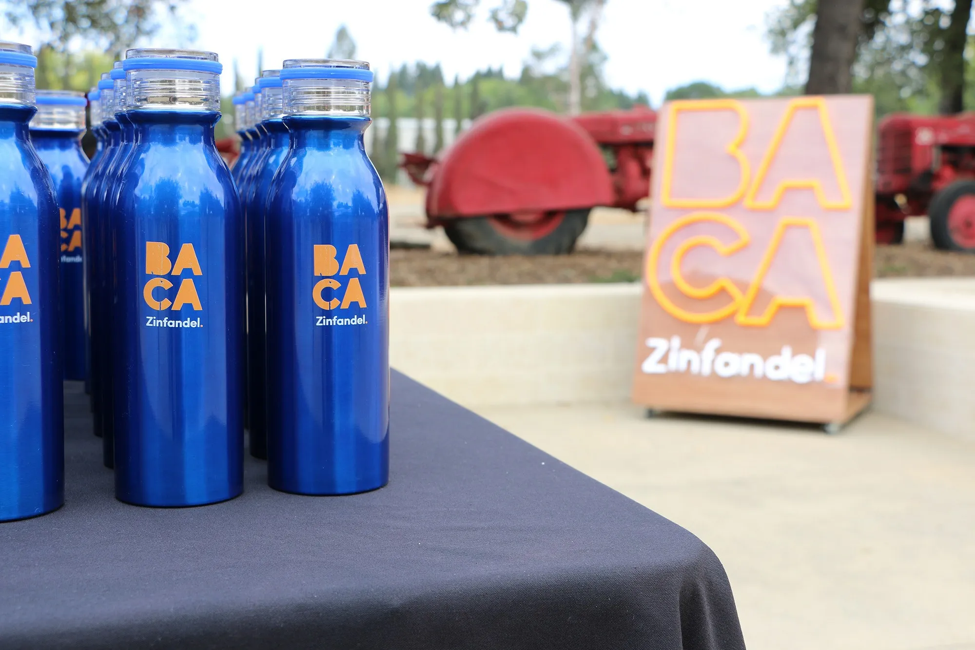
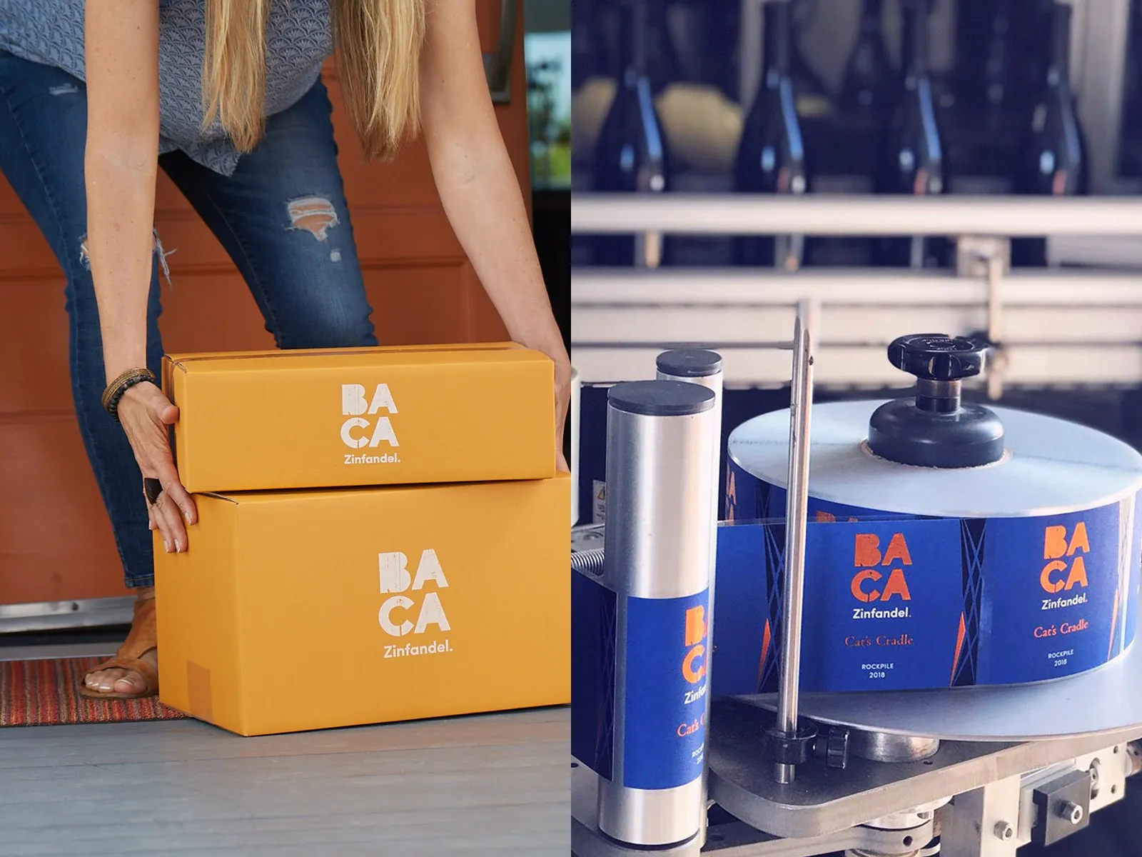
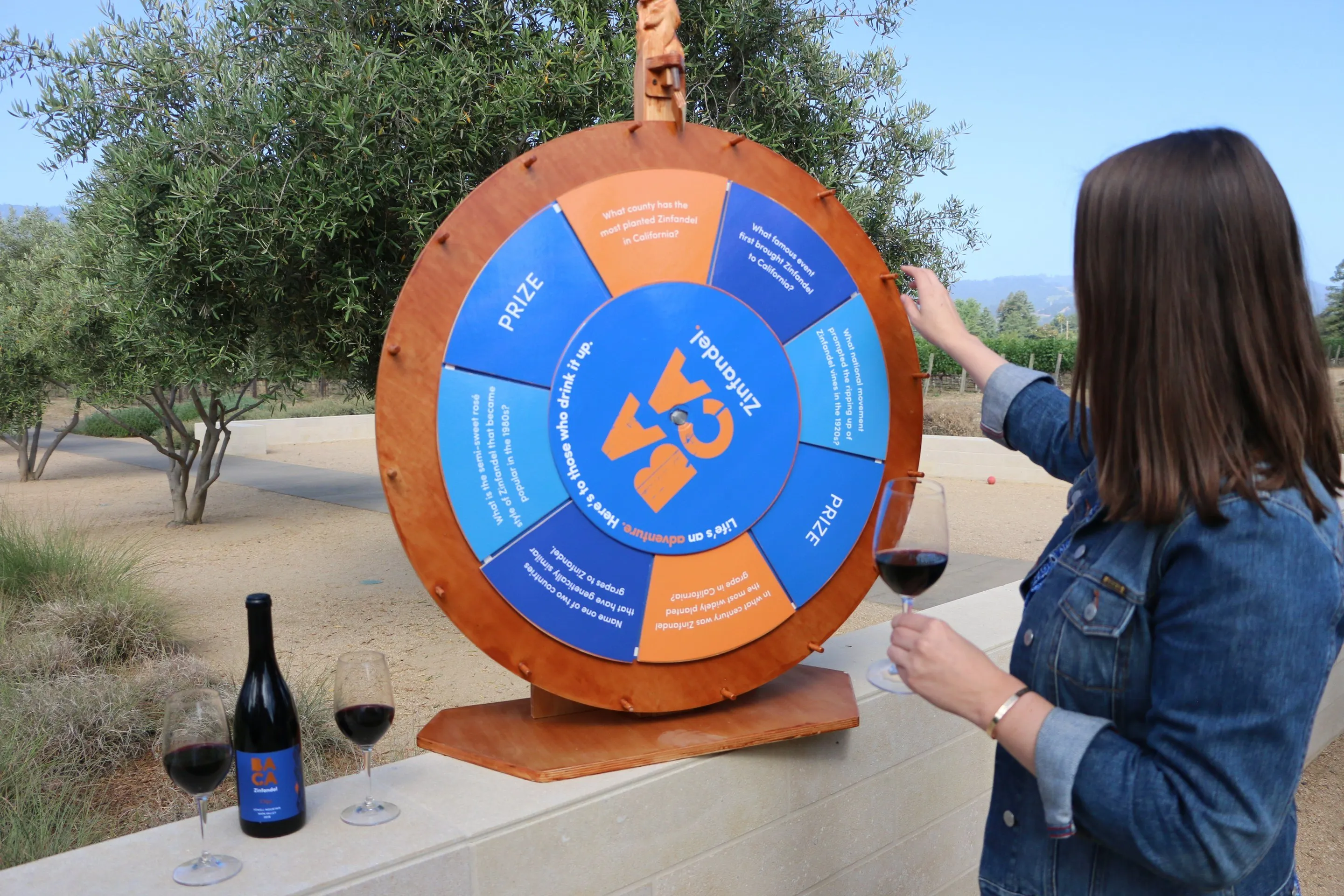
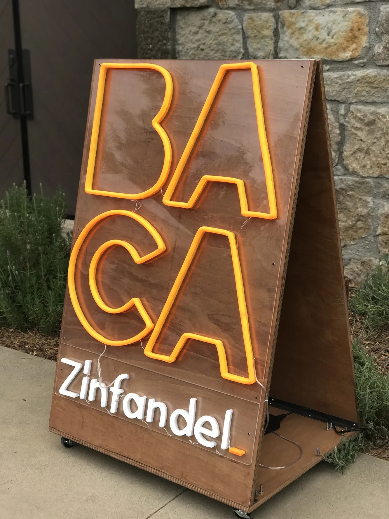
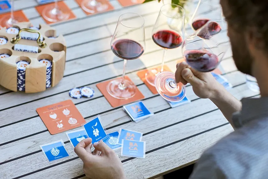
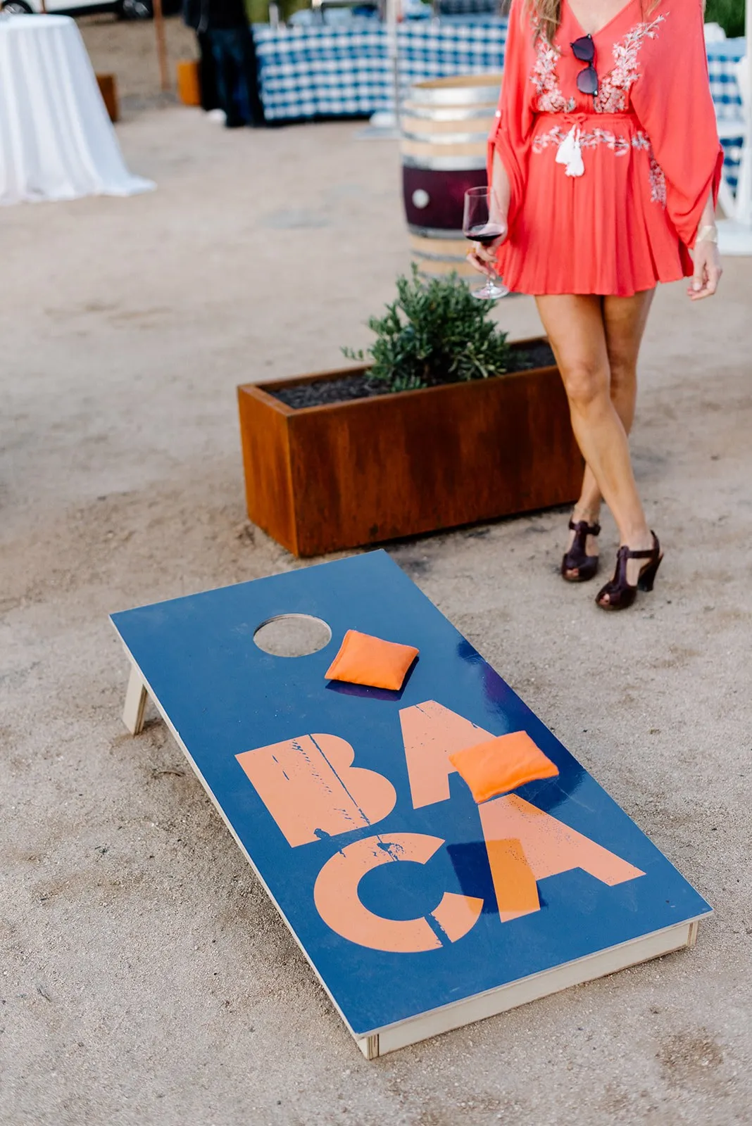
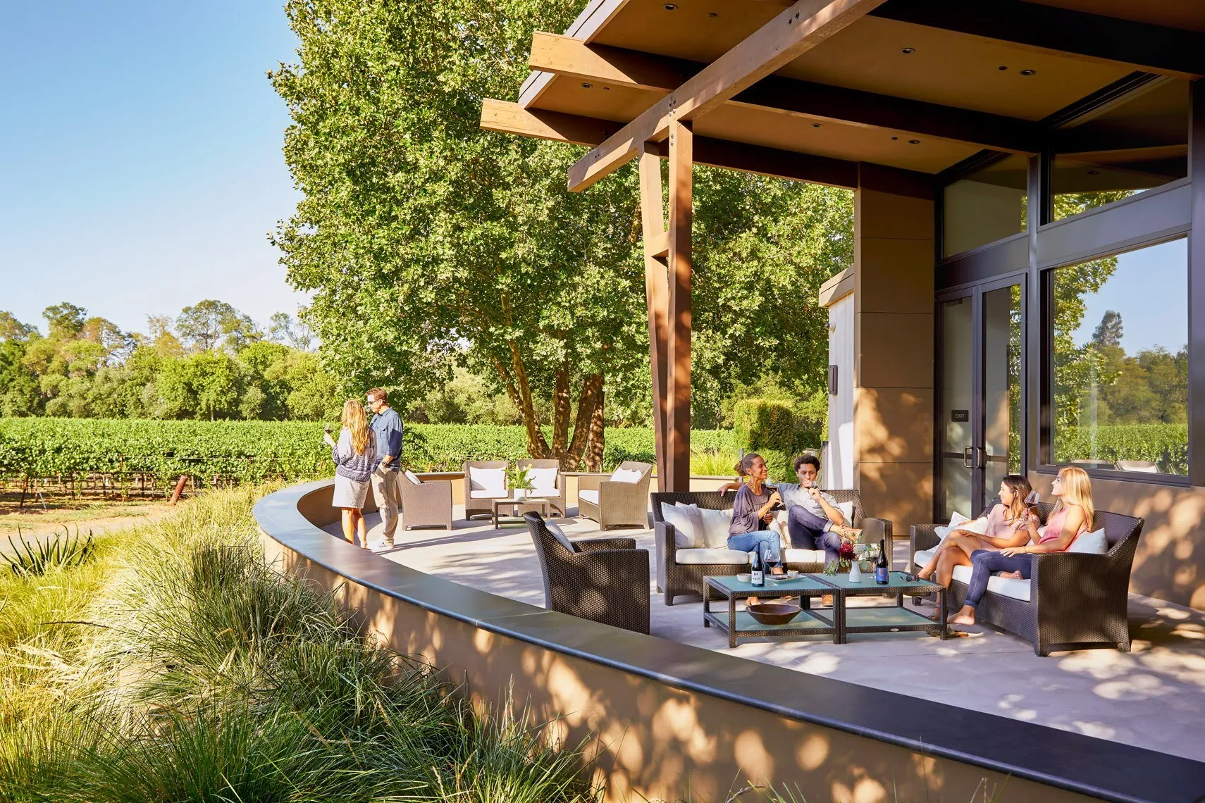
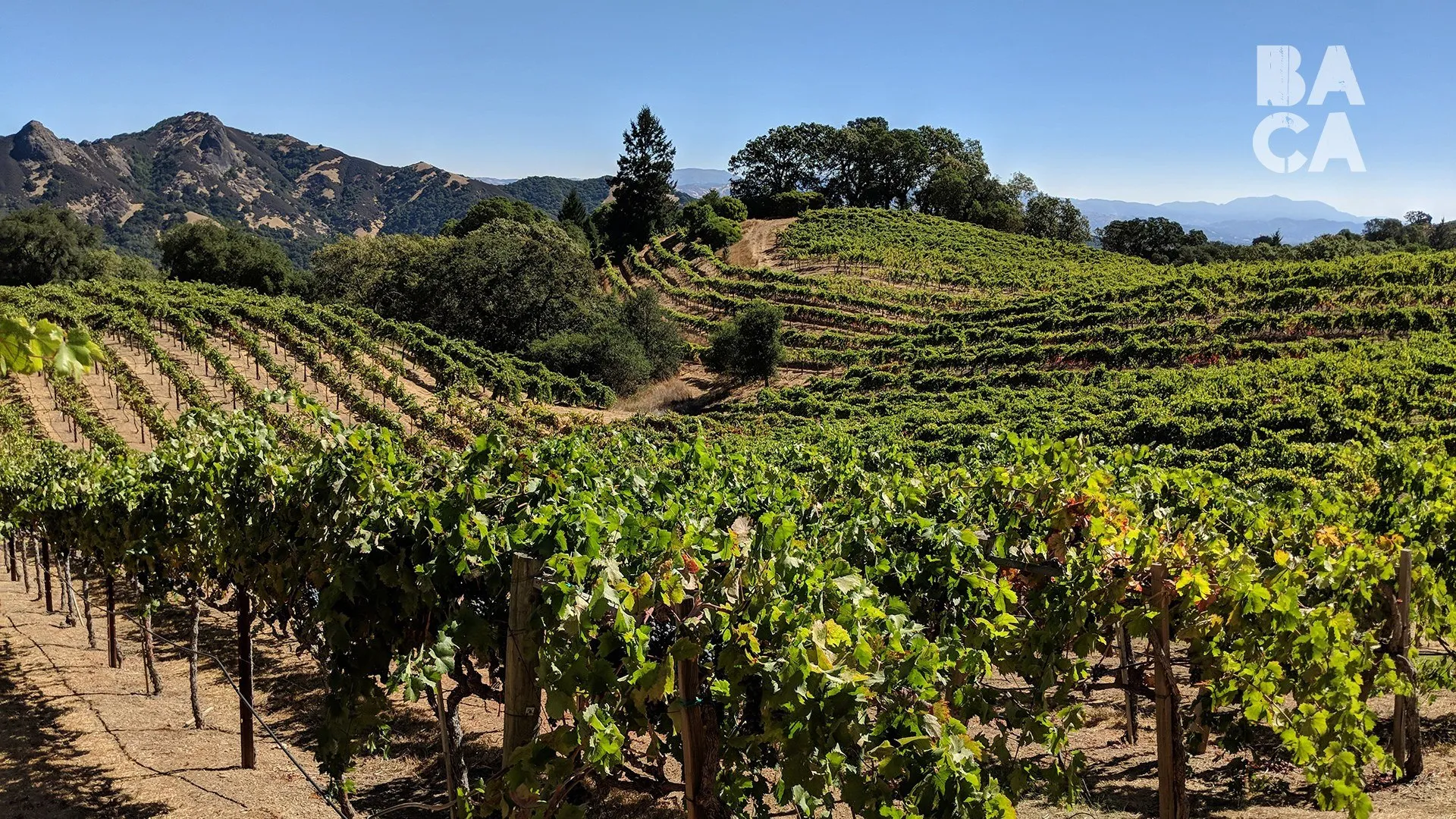
Seeing it out in the world never gets old: signage, custom games, club shipments and a patio full of friends, all from BACA’s own photography.
PHOTOGRAPHY · BACA ZINFANDEL
(01) OVERVIEW
a zinfandel for the kid at heart
BACA Zinfandel wanted to stand out through its dedication to making Zinfandels that reflect the vibrant and versatile regions the grapes come from, and a penchant for the uncharted. It’s the third wine brand from the HALL family, starting with single vineyard wines from Rockpile in Sonoma, Howell Mountain in Napa and Dusi Ranch in Paso Robles.
Drawing from raw nature and the meaning of BACA, Latin for berry, I created a brand identity to complement such a curious, spirited and adventuresome company. It had to feel different from HALL and WALT while sharing their resources, so working alongside the BACA team and their brand strategist, we built it from the ground up: logo, palette, labels, packaging and signage, plus a rosé that carried the brand into new colors.
(02) CHALLENGE
zinfandel had a reputation
Zinfandel had a reputation. Most of what was on the shelf was sweet, thick and syrupy, marketed as either macho or cute. BACA was aiming for the top of the category, and it wanted to be high quality without the pretense, carefully crafted but also playful.
It also had to be its own thing. HALL and WALT were already so different that the team struggled to bring them together, and BACA needed a personality bolder and more playful than either while still belonging to the family.
(03) BRAND STRATEGY
bold, progressive, crafted
BACA celebrates creativity, drives exploration and inspires discovery. The strategy gave that a name, bold progressive craftsmanship, and three values became the filter for every design decision.
- BOLD
- Selective about the talent, the vineyards and the grapes, and always pushing forward.
- PROGRESSIVE
- Thinking outside the box, and refusing to stand still.
- CRAFTED
- Time spent up front leaves room to take risks, without cutting corners.
The core audience was millennials and the older drinkers who share their outlook. The idea that tied it together was bohemian luxury: high quality without the pretense, carefully crafted but also playful.
(04) LOGO
four letters and a period
Round one put three directions in front of the team: Engaging Excitement, Modern Craftsman and Bohemian Luxury. Modern Craftsman felt too calm and too close to WALT. Bohemian Luxury was the big favorite, with its stacked, distressed letters and a palette drawn from raw nature. Kathryn Hall loved the period after Zinfandel, a declarative mark, and it never left.
Four more rounds refined it. We tried a berry tucked into the period and topo maps of the vineyards, then settled on block letters over stencil, one signature color instead of two, Zinfandel and its period locked up below, and a rounded B with more texture showing through so the mark holds up small.
(05) VISUAL IDENTITY
craft luxury, fired up
The palette pairs deep blue with a fired up orange, the combination the team kept coming back to, with cool gray blues and cream around them for a sense of bohemian luxury. Sofia Pro gives the brand its modern voice, and Australis Pro adds an elegant serif for supporting copy.
The stacked mark carries across totes, tasting sheets, water bottles, signage and a custom set of games, usually in orange on blue or cream.
- DEEP BLUE
- FIRED UP ORANGE
- SLATE BLUE
- CREAM
(06) PACKAGING
every wine, a playground game
The label is a near-square die cut in cobalt blue with the stacked mark in orange. Every label follows the same order: BACA, Zinfandel., the wine name, the vineyard and the vintage.
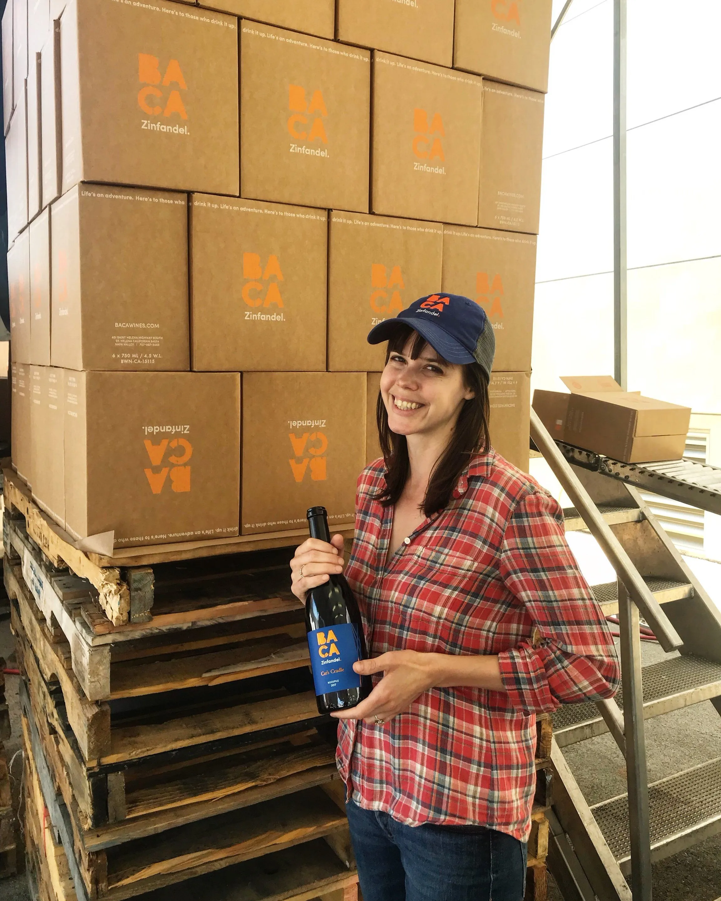
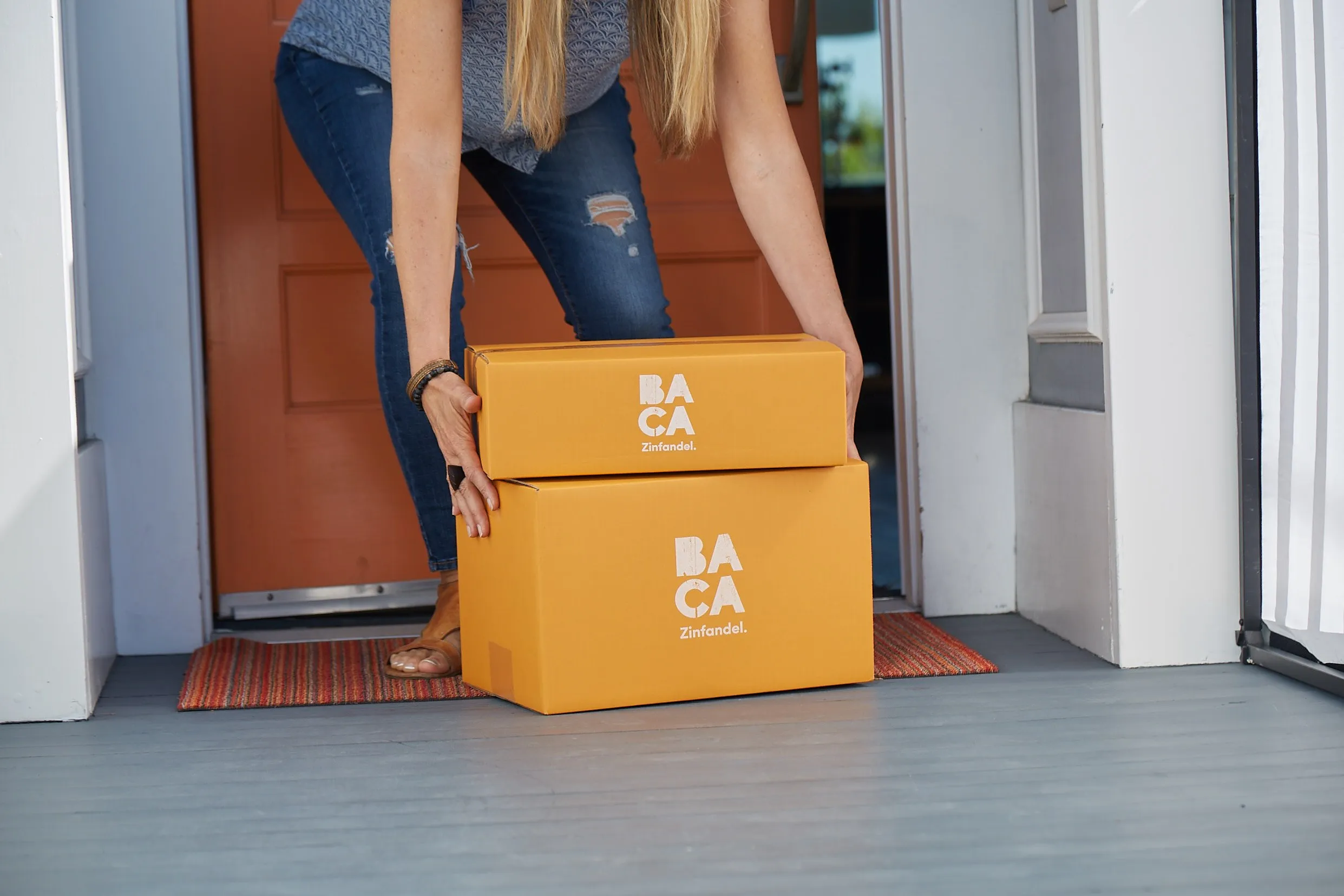
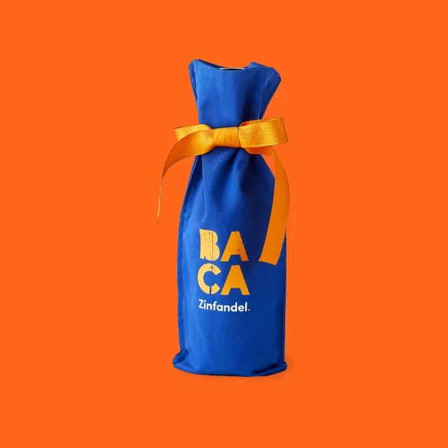
Each wine takes its name from a playground game, Tug O’ War, Double Dutch, I Spy and Cat’s Cradle among them, a nod to the brand’s kid-at-heart spirit. The mark carries onto shippers, gift boxes, bottle bags and neoprene totes.
(07) ROSÉ
the brand, spun into rosé
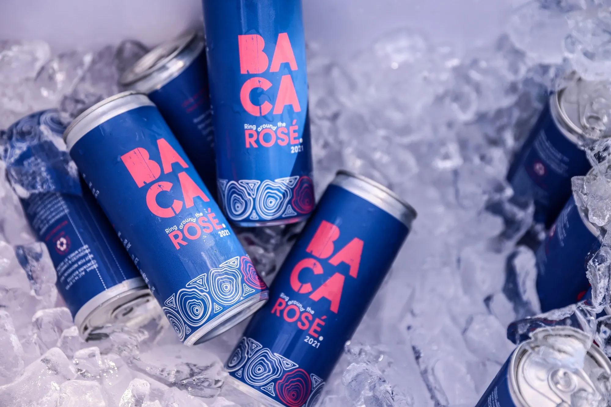
BACA Rosé stands at the intersection of bold expression and elevated craft. It’s designed for wine drinkers who value authenticity, curiosity and a sense of adventure in every glass. Confident, playful and modern, with an undercurrent of sophistication, it speaks to those who are unapologetically themselves and seek moments of joy and connection. Bursting with notes of wild strawberry and citrus zest, it feels effortlessly stylish and refreshingly unpretentious. On the can, the stacked mark turns pink and a patterned band wraps the base.
PHOTOGRAPHY · BACA ZINFANDEL
(08) IN THE WORLD
made for game night
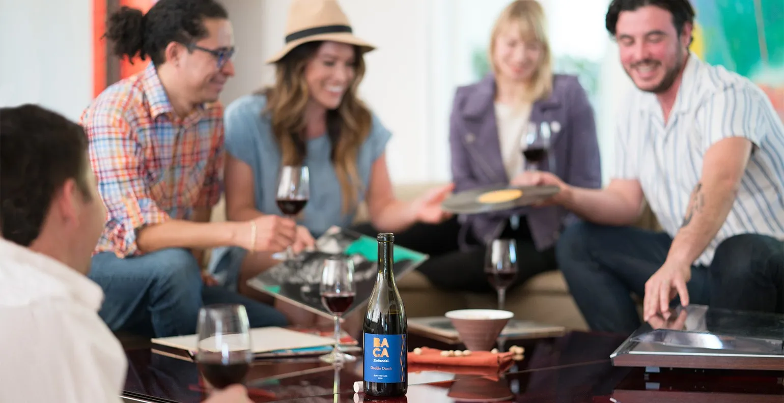
Seeing it out in the world never gets old. BACA’s own photography shows it at work on the tasting room wall, on game boards and poker chips, in club shipments and on the patio.
Jeremy has an eye for creating imagery and designs that are compelling, fresh and above all, original. He was timely, efficient, easy to work with and produced some great assets that have helped to propel our visual identity.
DELIVERABLES
- Logo and lockups
- Typography
- Color palette
- Label system
- Shippers and gift boxes
- Bottle bags and neoprene totes
- Stationery and signage
- Rosé can and half bottle
DISCIPLINES
- Discovery & Strategy
- Brand Identity
- Packaging
- Brand Extension
CREDITS
- Creative direction: Jeremy Mansfield
- Photography: BACA Zinfandel