beyond the uniform
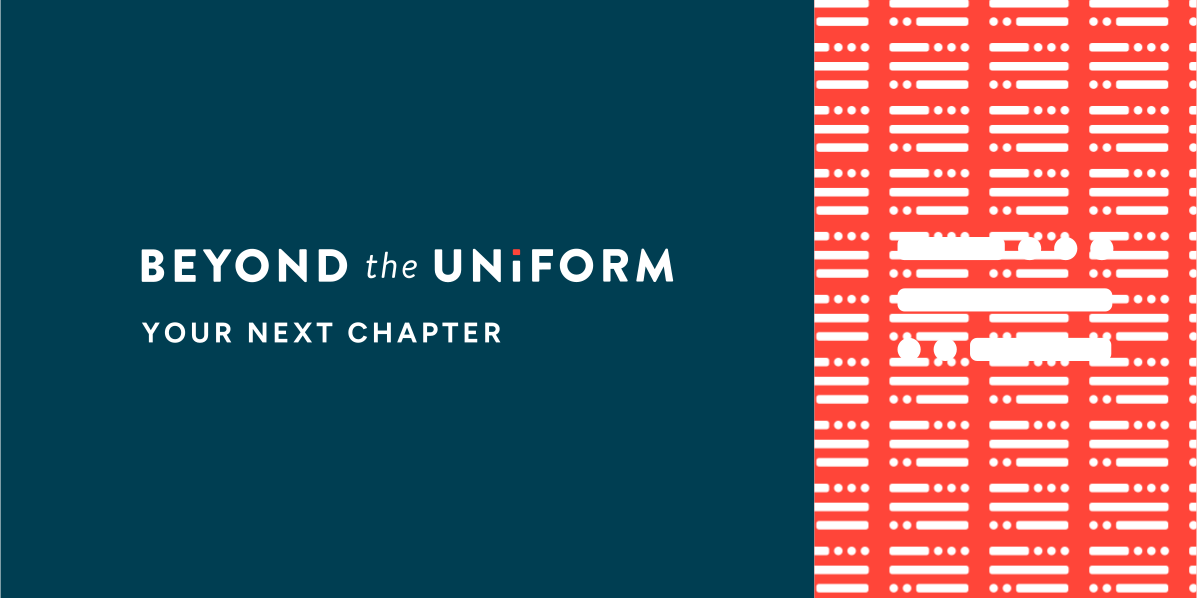
A new identity for a veteran career consultancy, built on a flag that spells B, T and U in Morse code.
4 MIN READ · 08 SECTIONS · 31 IMAGES

(01) OVERVIEW01 / 08
a signal for what comes next
When Justin Nassiri left the Navy, he went looking for help figuring out what came next and found very little. So he built it for the veterans coming after him.
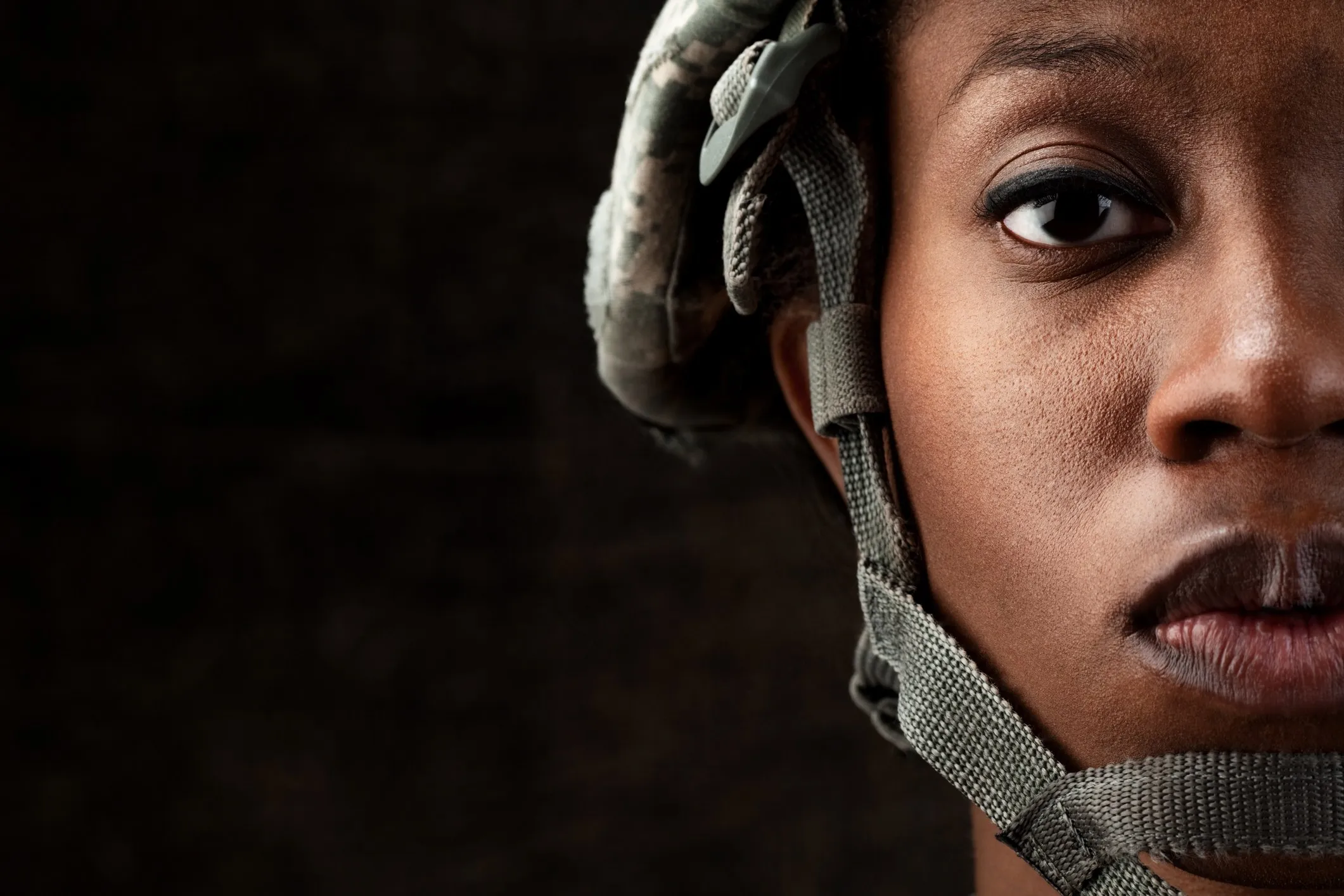
A Naval Academy graduate and former naval officer, he found little to guide the move into civilian work, and he wasn’t alone. Most service members leave active duty with little insight into the careers open to them. Some leave in a hurry, some stay out of fear of the unknown, and some settle into work that doesn’t fit. Beyond The Uniform began as Justin’s side project to fill that gap. It shares the stories of veterans who have made the move, analyzes data to spot career trends and points to the resources that help. Working alongside him, I created the identity from the ground up: logo, palette, typography, business cards and stationery, a podcast cover and a site banner, plus concepts for events, social and merchandise.
(02) CHALLENGE02 / 08
proud, but not rigid
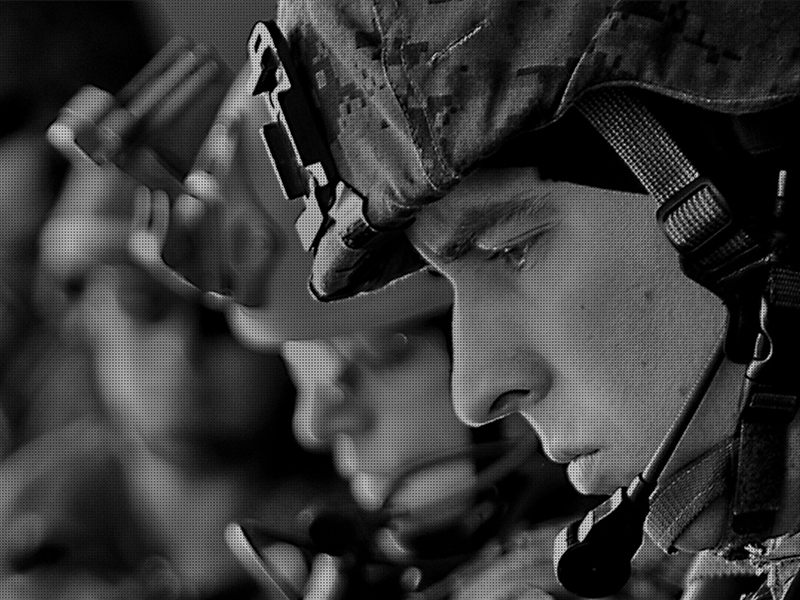
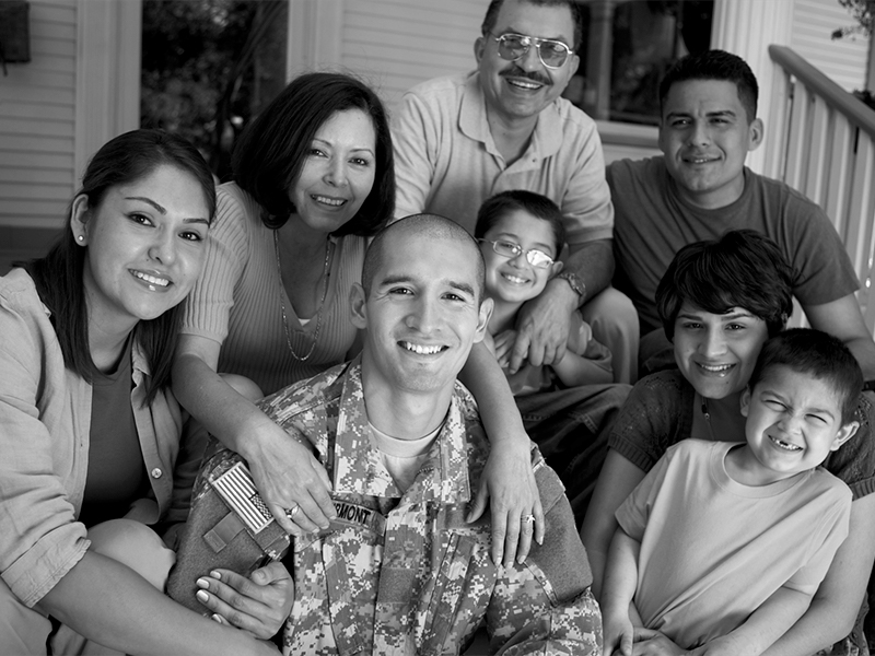
The people BTU serves have spent years inside one of the most recognizable identities there is. The brand had to honor that service, point clearly toward civilian life and never feel dated, sales-y or zealous.
(03) BRAND STRATEGY03 / 08
modern, trusted, humbly patriotic
Justin’s brief named four traits, each with an opposite to avoid, and every sketch had to live up to all of them at once.
-
(01) TENET
Forward thinking
Modern and forward thinking. Looking ahead to the next career, never back at the past.
-
(02) TENET
Trustworthy
Efficient, succinct and trustworthy. Real stories and real data, said plainly and never sales-y.
-
(03) TENET
Humbly patriotic
Proud of the service without being zealous about it. The flag is there, but it doesn’t shout.
-
CORE AUDIENCE
Service members getting ready to leave active duty, often with little idea of the civilian careers open to them.
-
GROWTH AUDIENCE
Veterans already out who settled into a career that doesn’t fit and want to find a better one.
-
BIG IDEA
Educate and advance. Veteran stories, career data and resources for life beyond the uniform.

(04) LOGO04 / 08
three letters, one signal
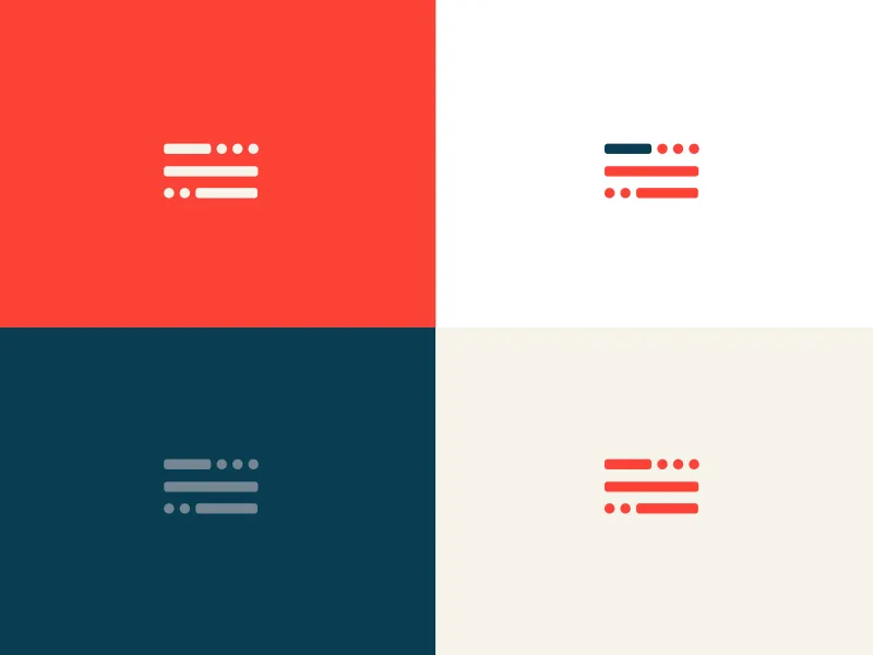
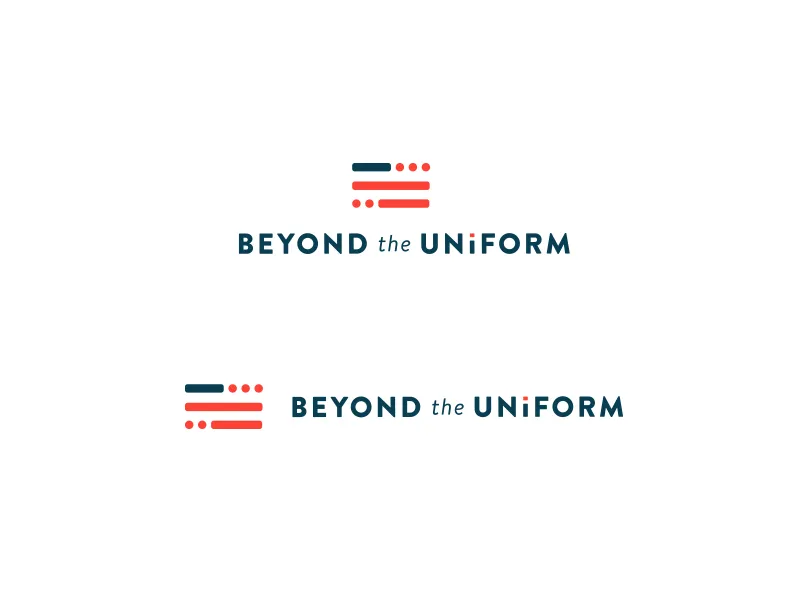
I brought Justin the idea of Morse code, a flag that spells B, T and U. By round two, it was the mark.
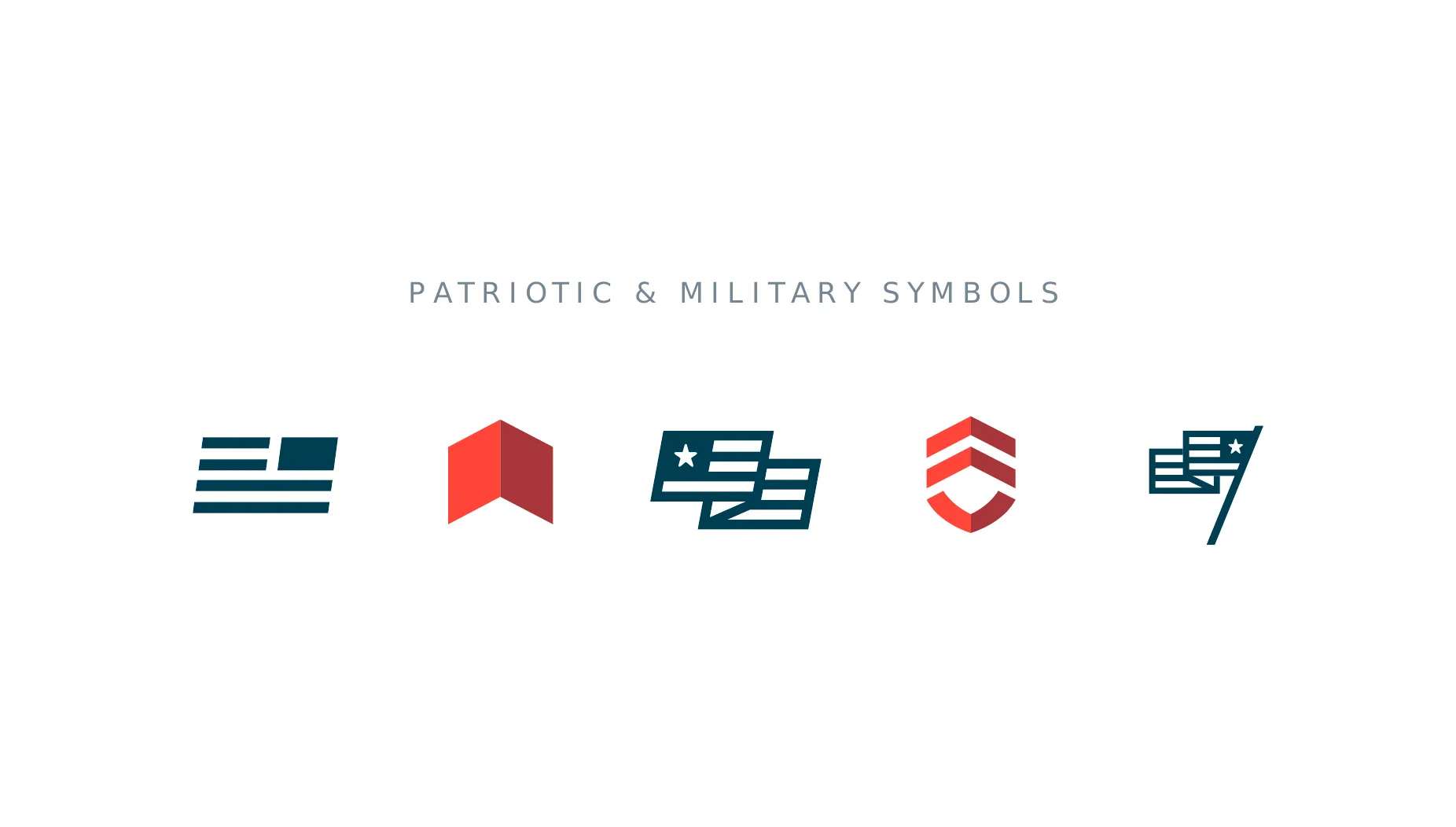
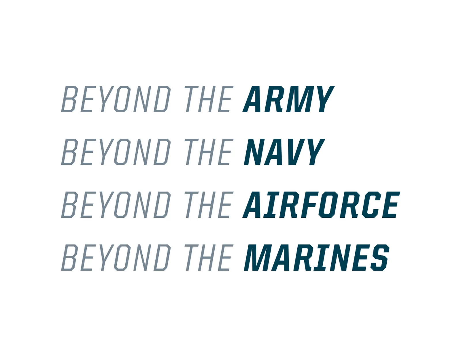
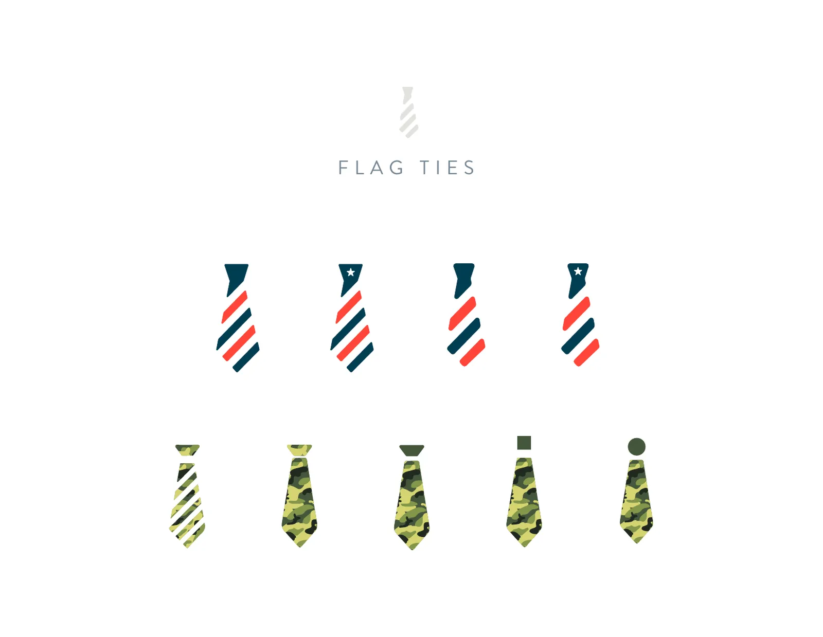
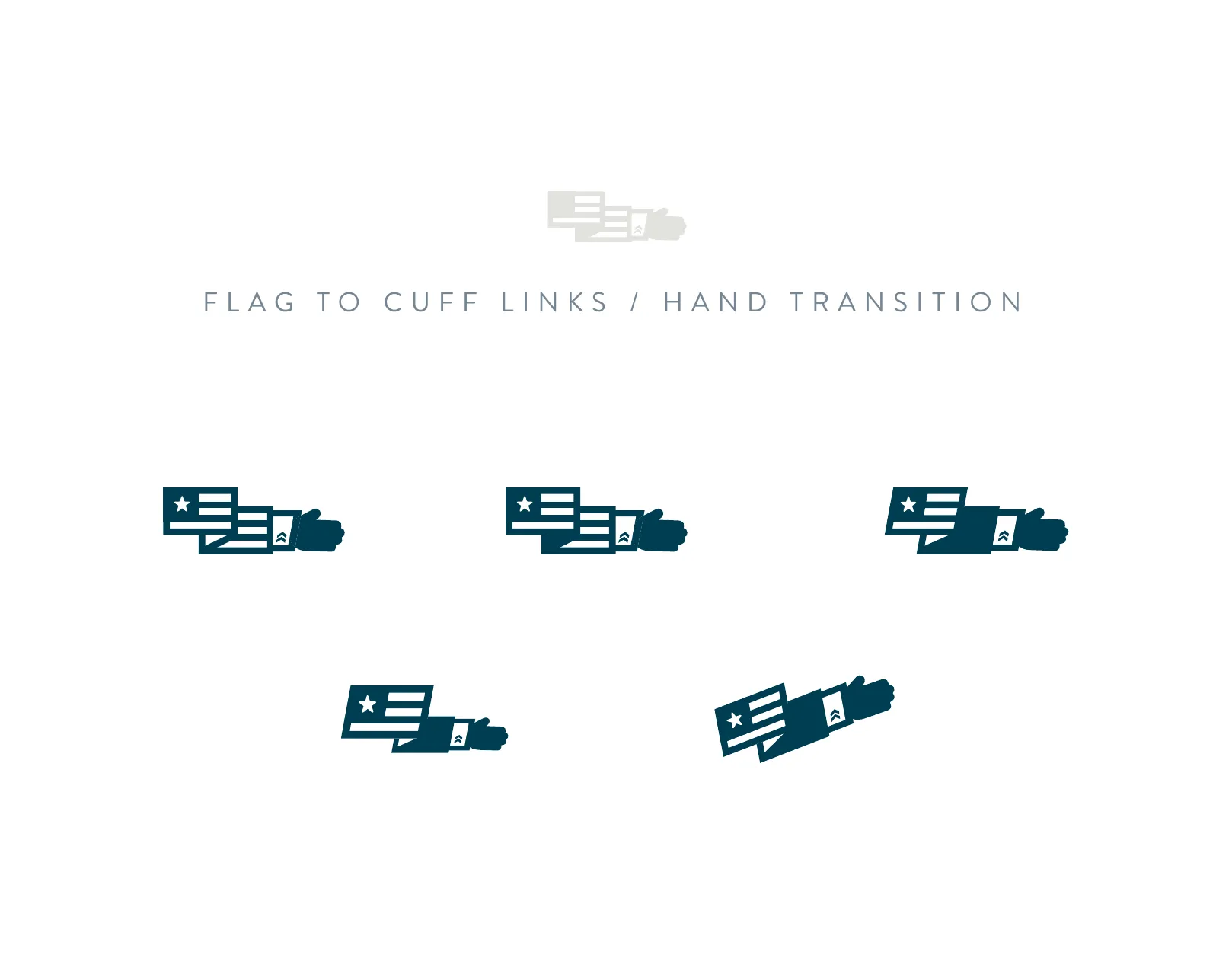
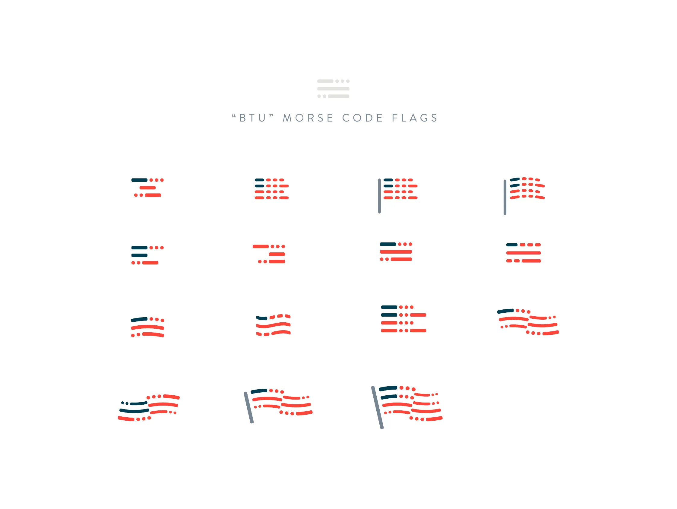
Round one explored flags, shields and a ribbon. Justin loved the type and one flag icon and type treatment, but a backwards flag brought discomfort, and every symbol leaned too far to the military side. What he wanted was transformation, something military becoming something civilian, so in round two I turned the flag into Morse code, the idea I’d pitched in our review, and also tried flag ties, camo briefcases and a flag that turns into cuff links. Justin chose the Morse flag with the dot on the i as the final mark. It stood apart from the usual flags and shields, it turned a patriotic symbol into a message, and it spoke the language of military signals while spelling B, T and U. A symbol of service, sending a signal about what comes next.
(05) VISUAL IDENTITY05 / 08
navy, warm red and cream
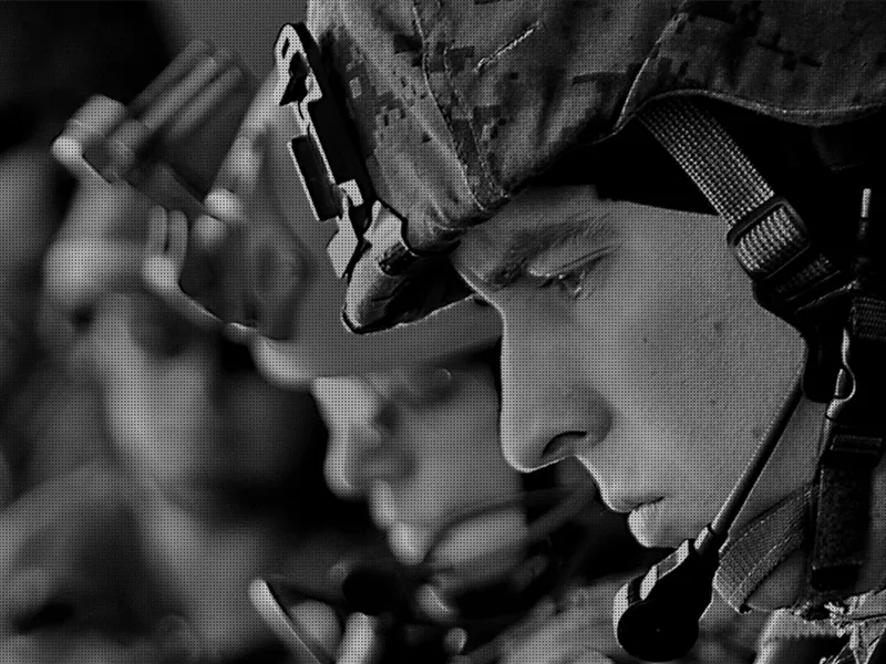
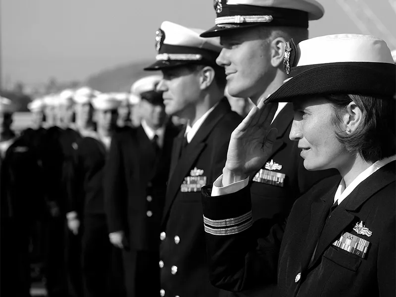
Everything grows out of the flag: navy and warm red, with slate, steel and cream, Brandon Text for the words, and black-and-white photos of real people.
- NAVY#003E52
- WARM RED#FF4539
- SLATE#415464
- CREAM#F5F2E7
(06) PRINT06 / 08
one flag, on paper
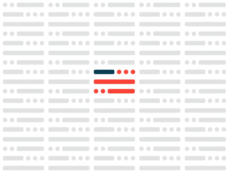
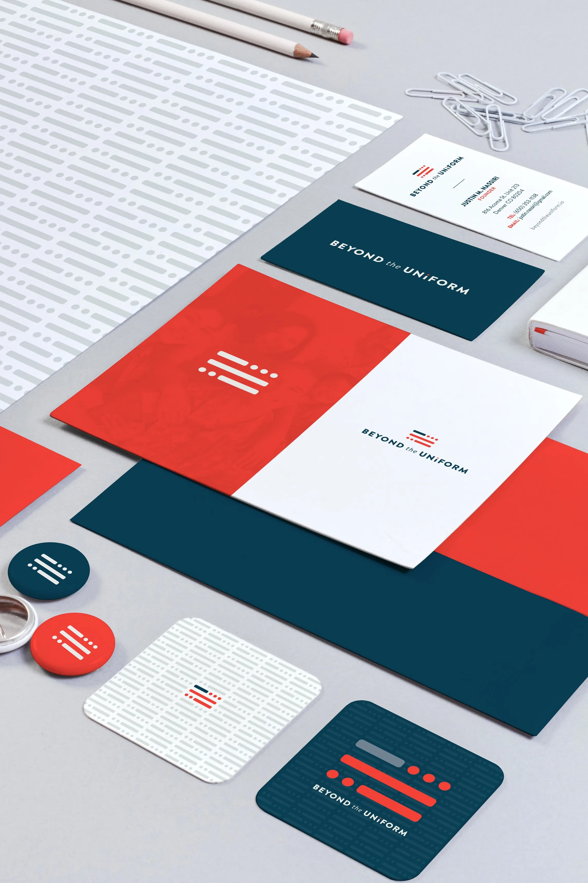
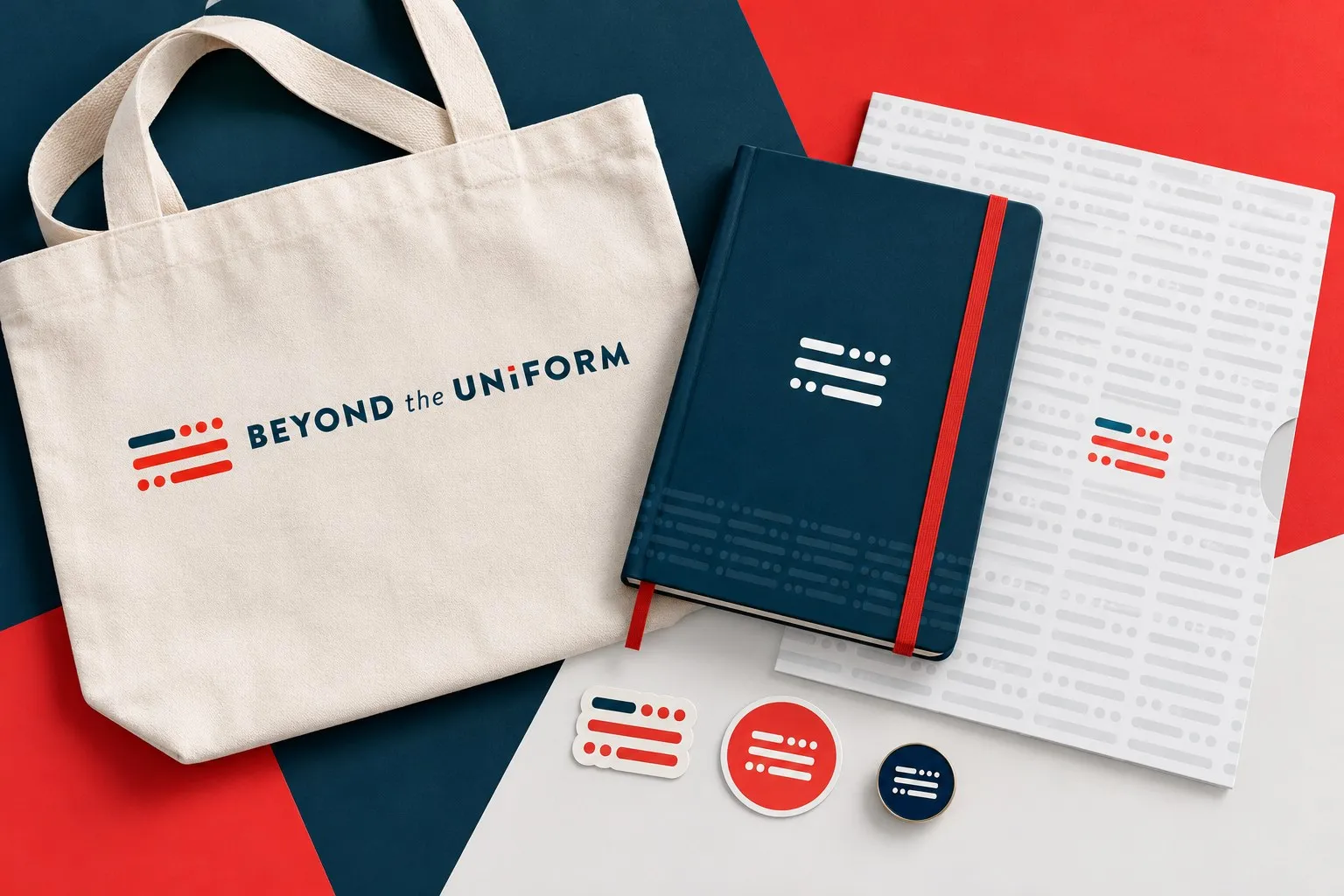
On paper, the full logo sits on white and the flag gets to play on the back, in warm red and navy over the Morse pattern.
- 01 LETTERHEAD
- 02 ENVELOPE
- 03 BUSINESS CARD
- 04 BUTTONS
- 05 COASTER
(07) DIGITAL07 / 08
the same signal, on screen
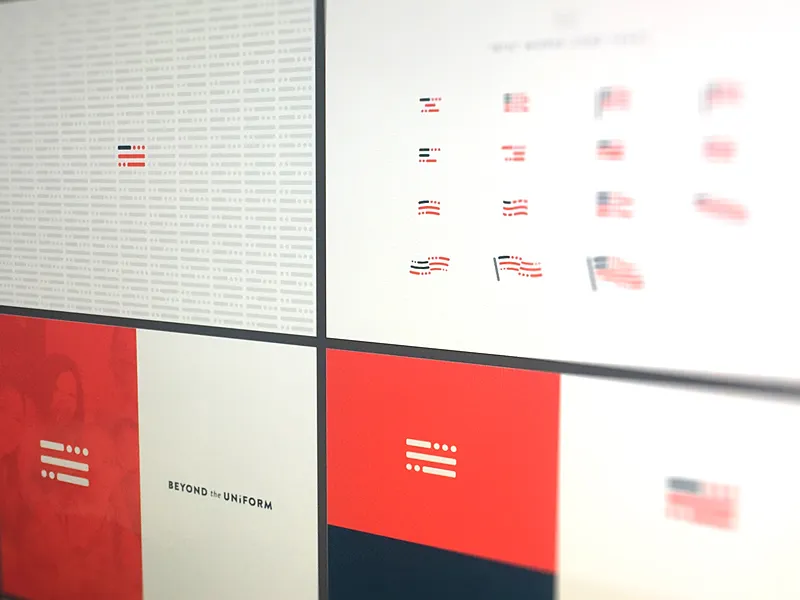
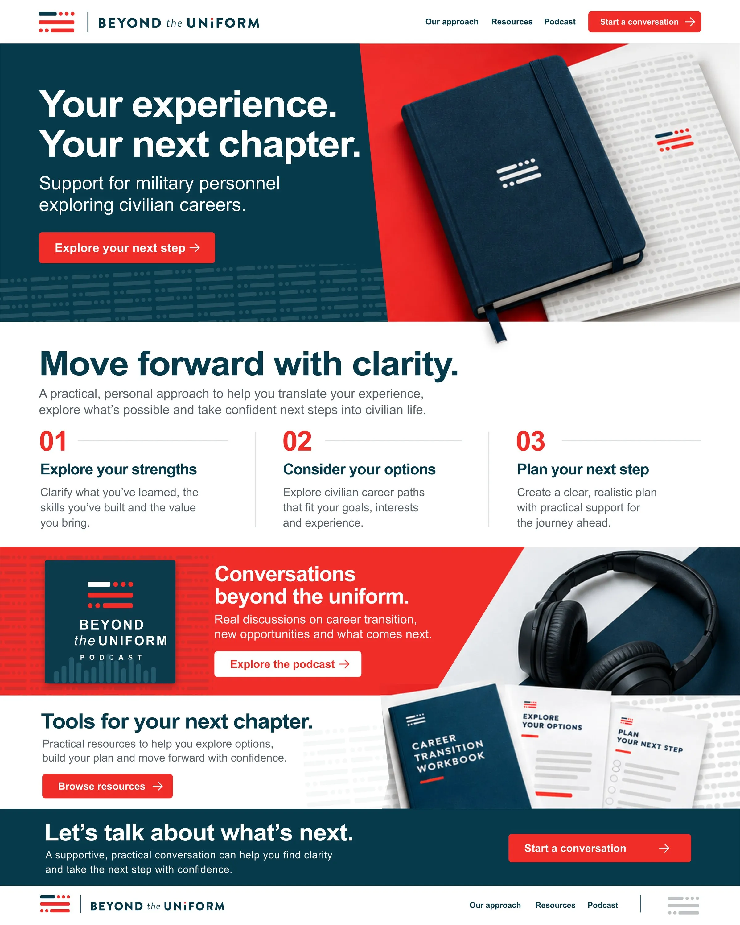
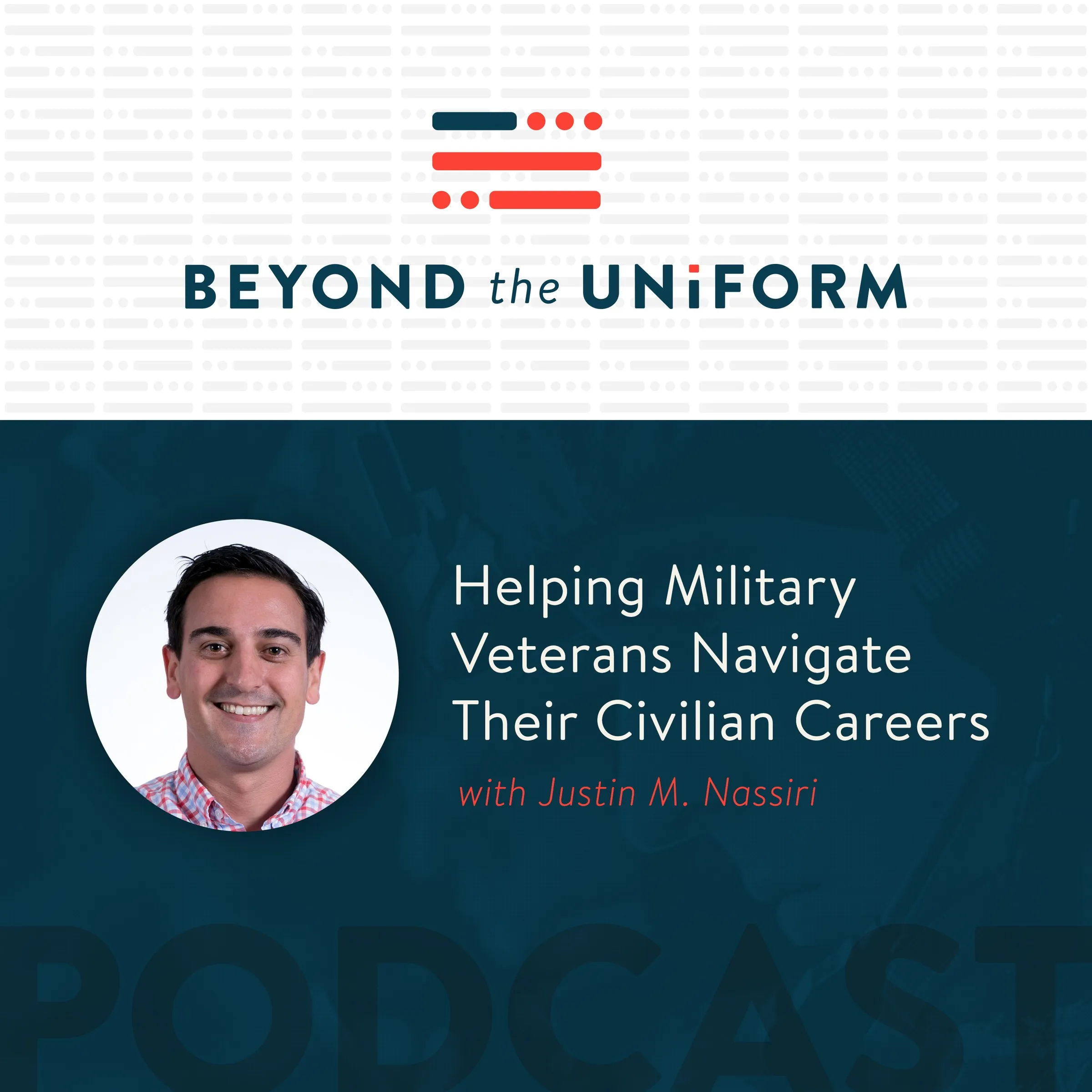
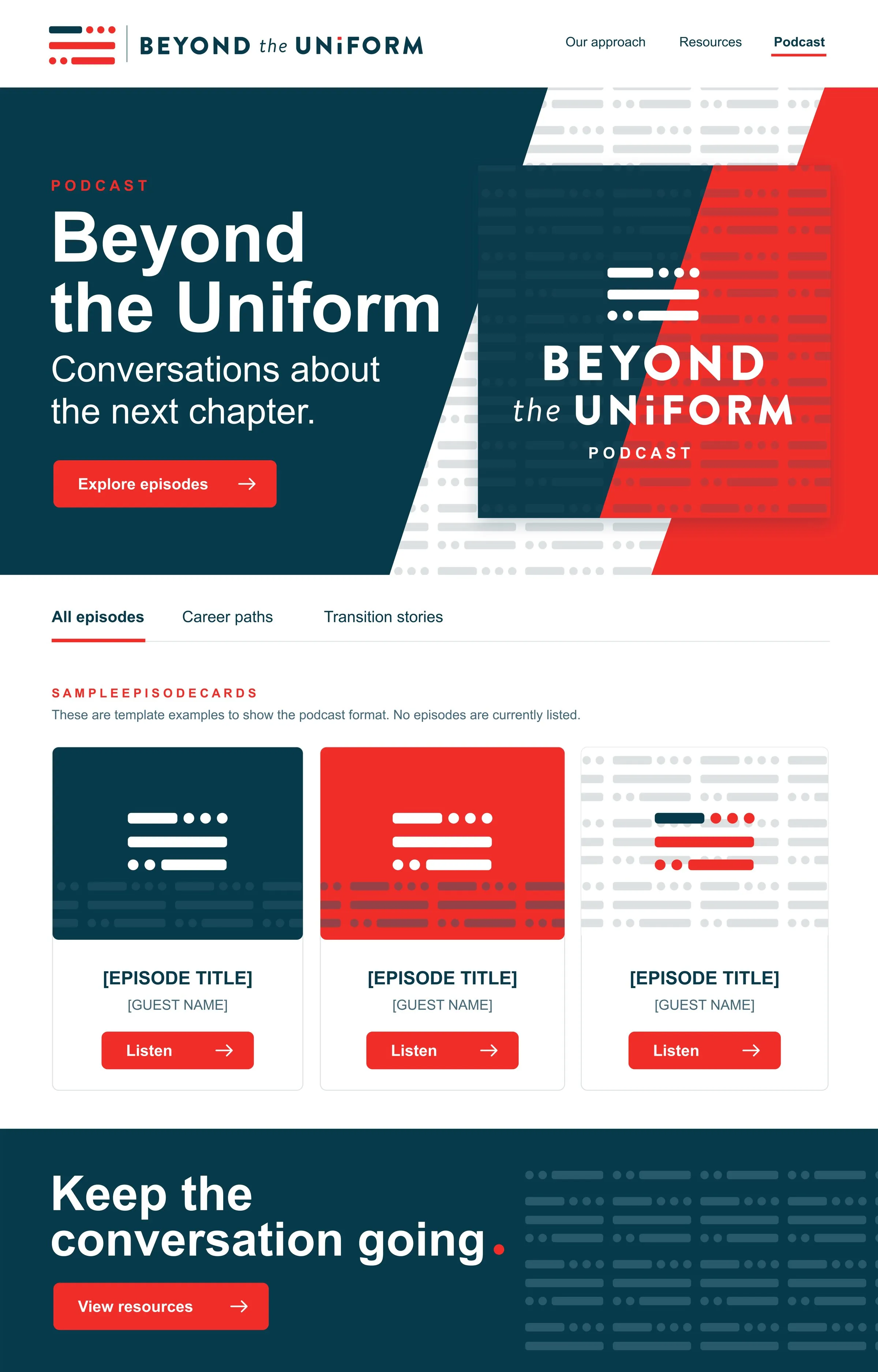
The podcast cover and the site banner put the system on screen first. The web concepts show where it could go next.
(08) IN THE WORLD08 / 08
educate and advance
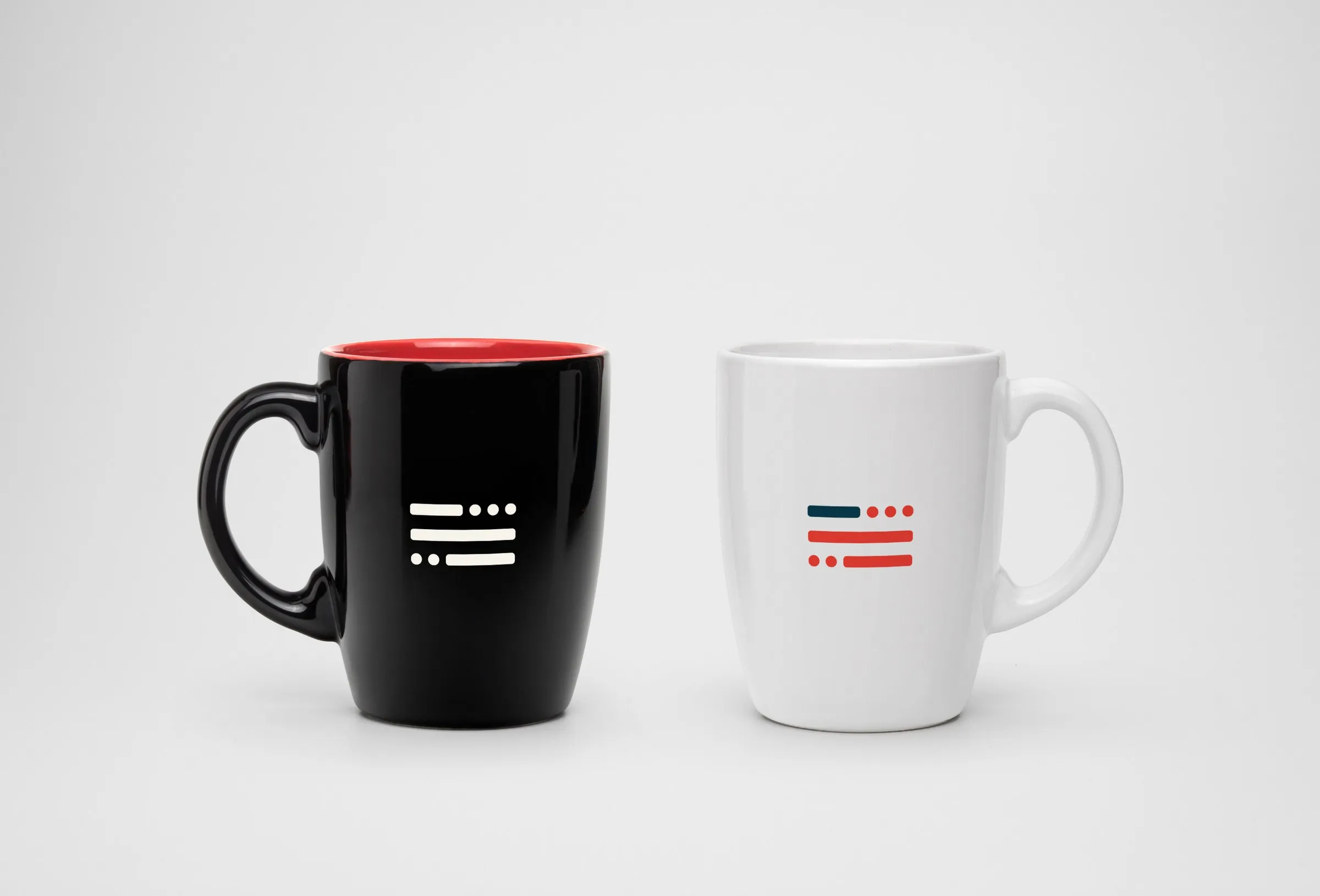
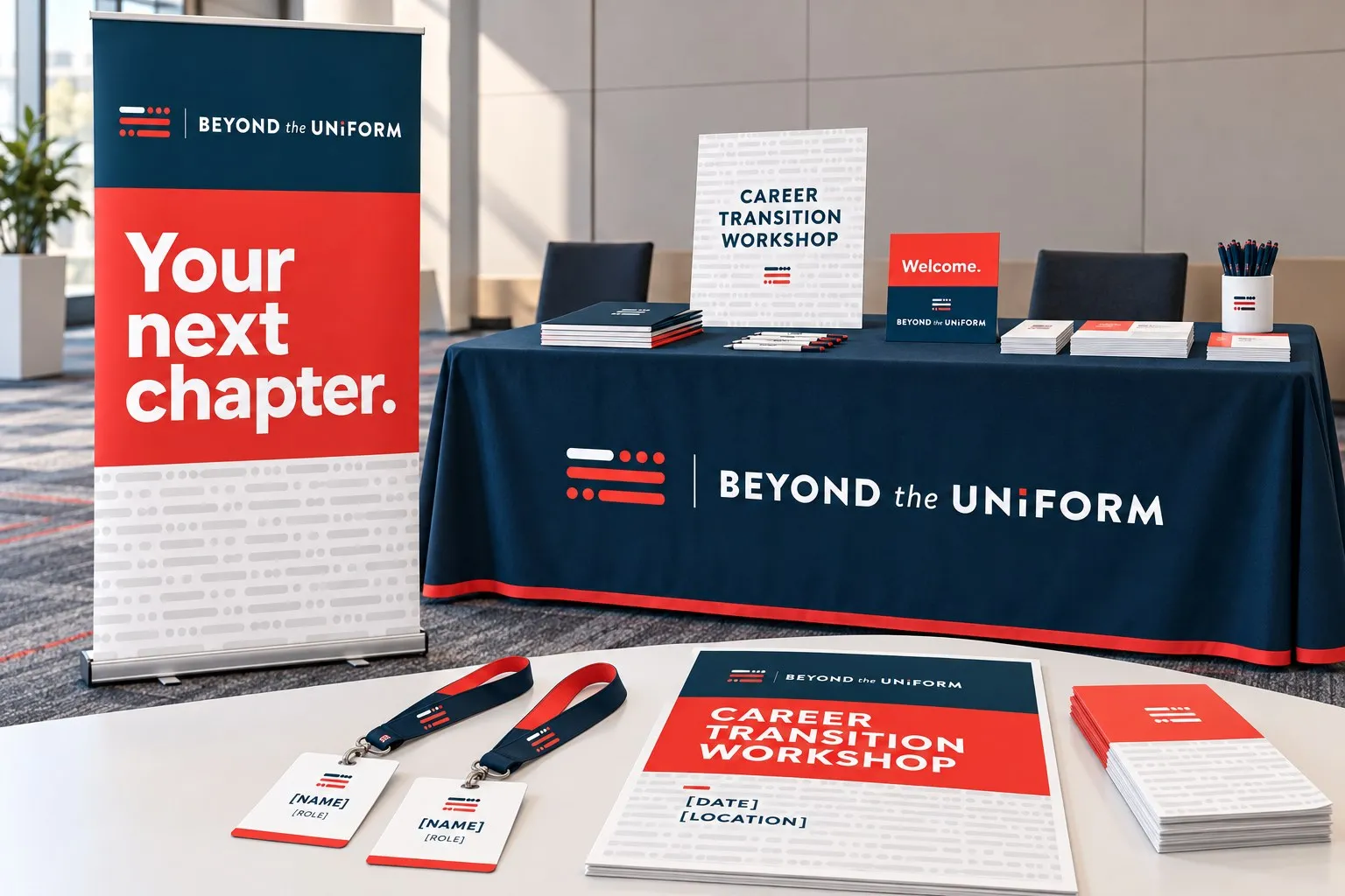
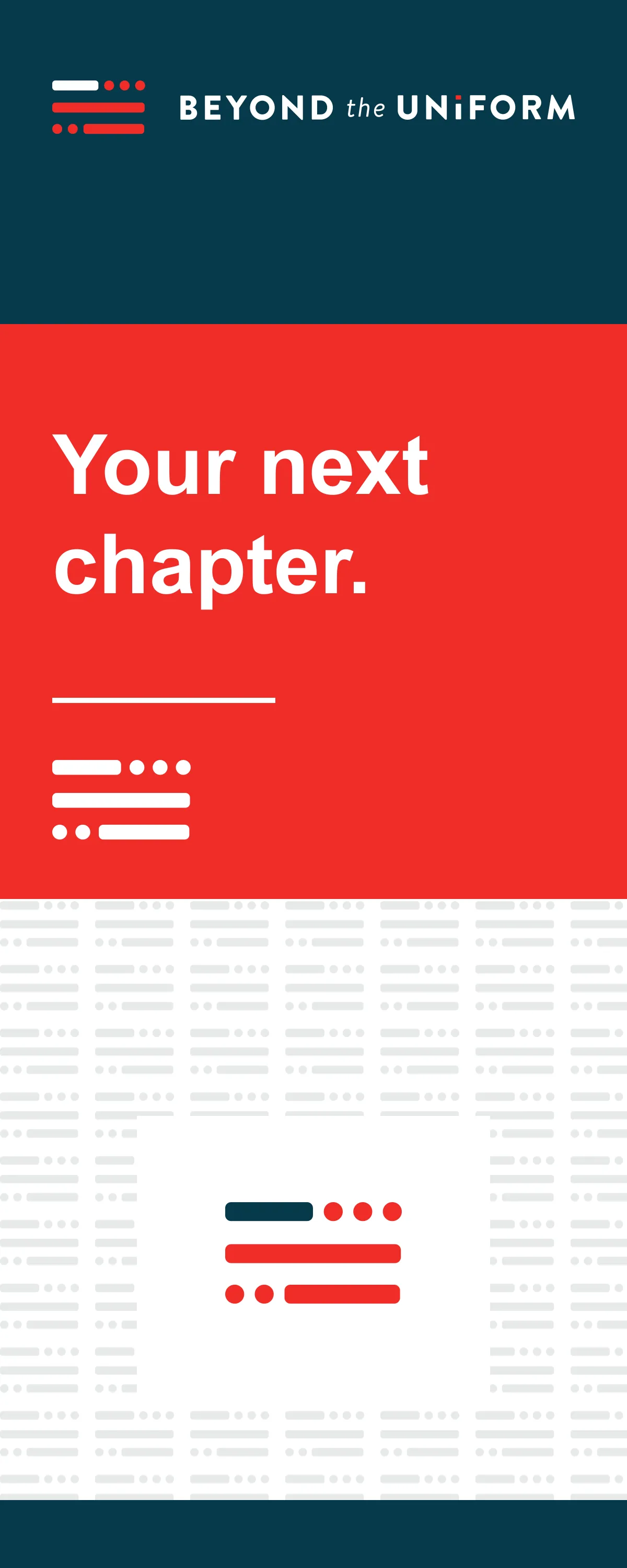
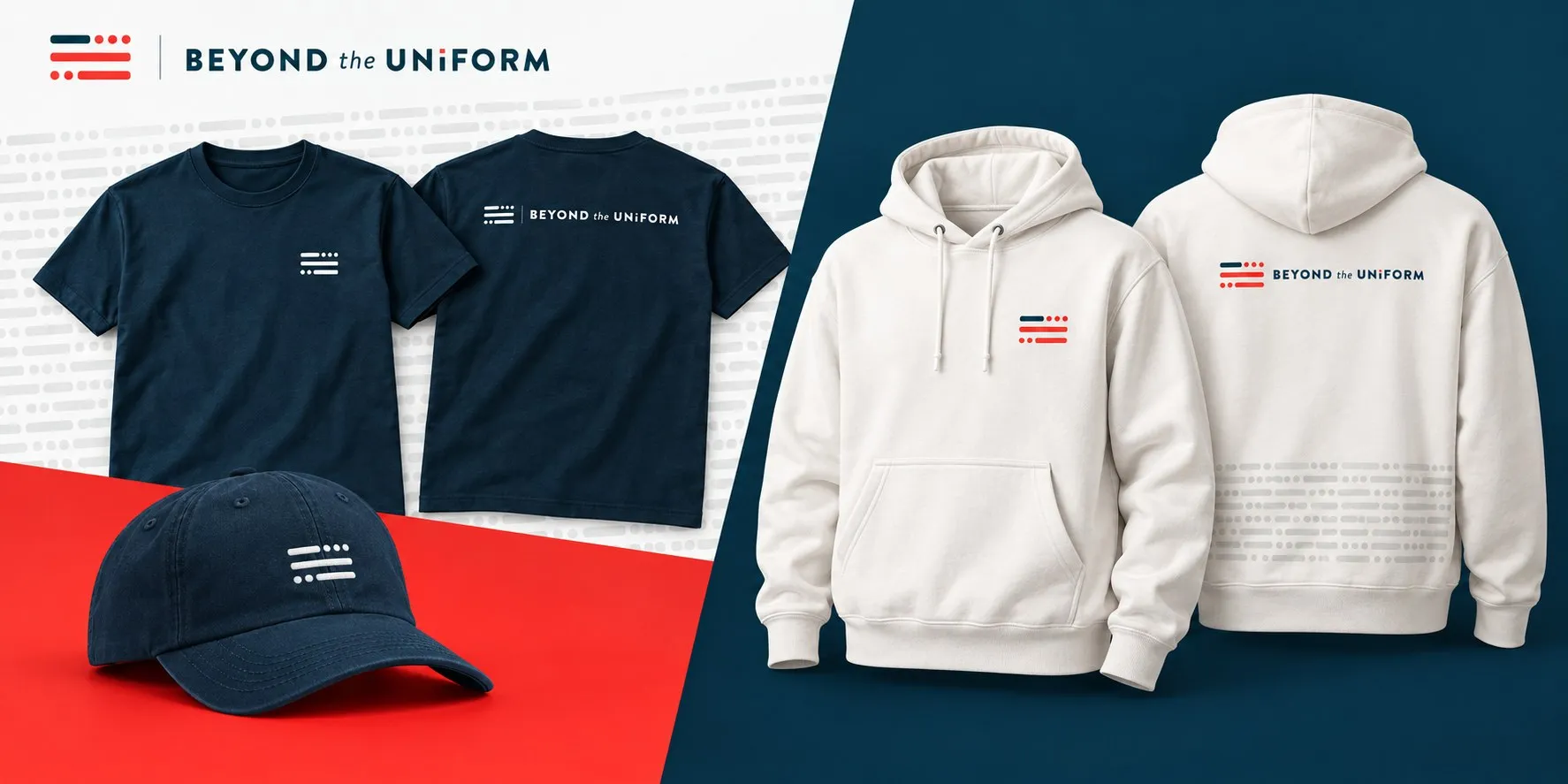
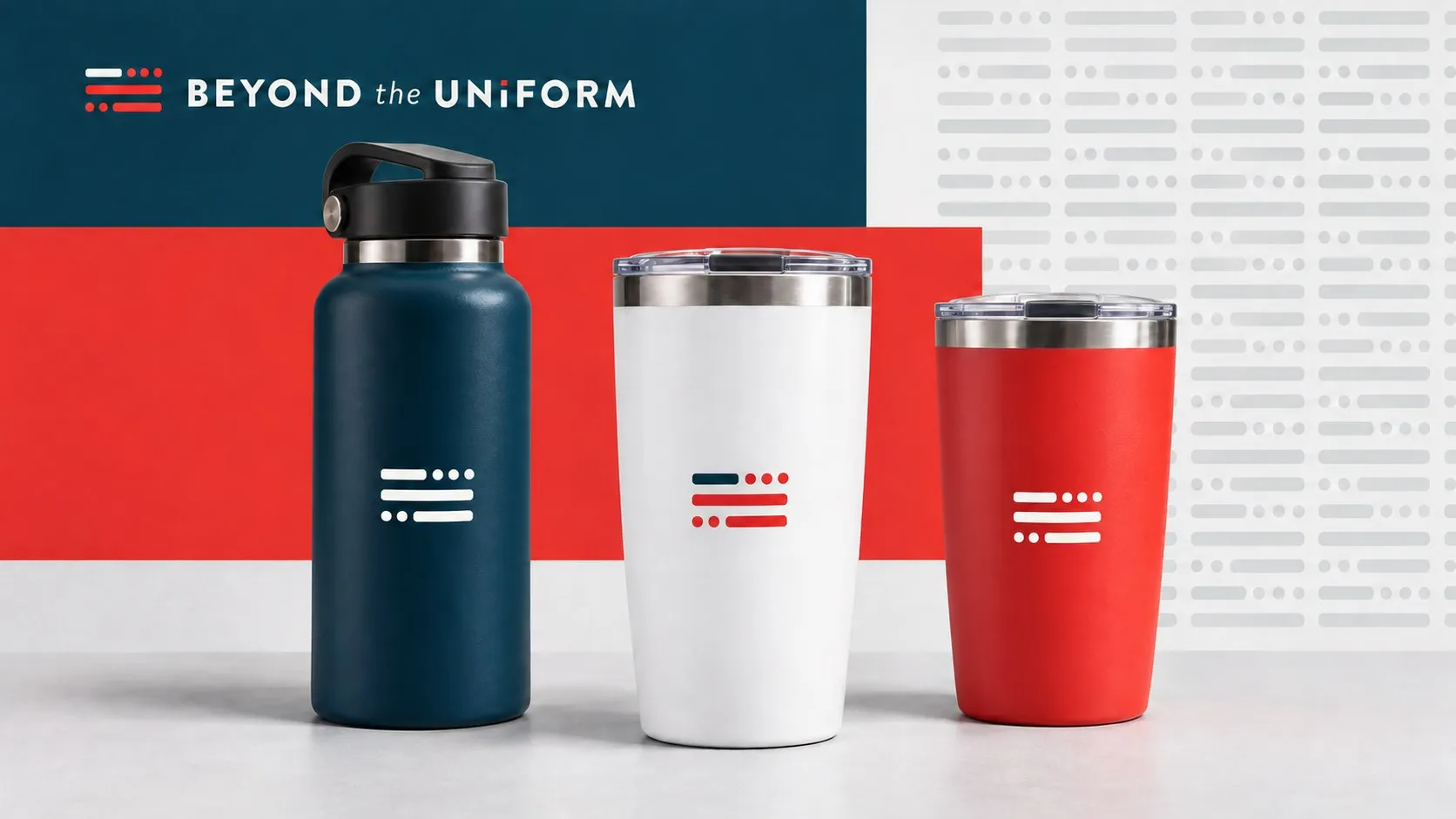
It’s always fun to see how far a small flag can travel. These concepts take it to workshop tables, apparel, drinkware and every new episode post.
CONCEPTS · EVENTS, MERCHANDISE AND SOCIAL
(01) OVERVIEW
a signal for what comes next
When Justin Nassiri, a Naval Academy graduate and former naval officer, left the Navy, he went looking for help figuring out what came next and found very little. He wasn’t alone. Most service members leave active duty with little insight into the careers open to them. Some leave in a hurry, some stay out of fear of the unknown, and some settle into work that doesn’t fit.
So he started Beyond The Uniform as a side project to fill that gap. It shares the stories of veterans who have made the move, analyzes data to spot career trends and points to the resources that help. Working alongside Justin, I created the identity from the ground up: logo, palette, typography, business cards and stationery, a podcast cover and a site banner, plus concepts for events, social and merchandise.
(02) CHALLENGE
proud, but not rigid
Justin knew the audience firsthand. The people BTU serves have spent years inside one of the most recognizable identities there is. The brand had to honor that service and still point clearly toward civilian life.
Justin’s brief was clear about what BTU should be: modern and forward thinking, efficient and succinct, trustworthy and humbly patriotic. It was just as clear about what it shouldn’t be: historic and dated, drawn out and hierarchical, sales-y, or zealous. Among the logos he admired, he pointed to USAA.
(03) BRAND STRATEGY
modern, trusted, humbly patriotic
We boiled those traits down to three, forward thinking, trustworthy and humbly patriotic, and every sketch had to live up to all of them at once, from the mark to the business card.
- FORWARD THINKING
- Modern and forward thinking. Looking ahead to the next career, never back at the past.
- TRUSTWORTHY
- Efficient, succinct and trustworthy. Real stories and real data, said plainly and never sales-y.
- HUMBLY PATRIOTIC
- Proud of the service without being zealous about it. The flag is there, but it doesn’t shout.
The core audience is service members getting ready to leave active duty. The growth audience is veterans already out who settled into a career that doesn’t fit. What ties them together is the next step: one place to learn what’s possible, from people who have already made the move.
(04) LOGO
three letters, one signal
Round one explored patriotic and military symbols: flags, shields and a ribbon, with a wordmark that could flex into Beyond The Army, Navy, Air Force and Marines. Justin loved the type, liked the ribbon and loved one flag icon and type treatment. A flag facing backwards brought discomfort, though, and every symbol leaned too far to the military side.
What he really wanted was transformation, a military symbol that becomes a civilian one. His ideas included a half uniform, half suit, a compass, a map, a parachute and a periscope, and I pitched Morse code. In round two, I turned the flag’s stripes into Morse code, and we also tried flag ties, camo briefcases and a flag that turns into cuff links. Justin chose the Morse flag with the dot on the i as the final mark. It stood apart from the usual flags and shields, it turned a patriotic symbol into a message, and it spoke the language of military signals while spelling B, T and U. A symbol of service, sending a signal about what comes next. His one hesitation was whether there was enough civilian life and career in it, so the rest of the system carries that side of the story: the podcast, the veteran stories and the career resources.
(05) VISUAL IDENTITY
navy, warm red and cream
The palette comes straight from the flag: navy for the dash, warm red for the dots and bars, slate and steel to support them, and a custom cream. Brandon Text, the typeface Justin picked in round one, carries everything people read, and the wordmark ends with a red dot over the i.
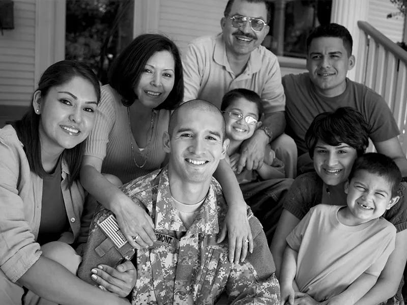
The flag travels on its own as an avatar, a favicon and a tone-on-tone Morse pattern, and black-and-white photos of real service members and families leave the color to the brand.
- NAVY
- WARM RED
- SLATE
- CREAM
(06) PRINT
one flag, on paper
The paper system keeps the full logo on white and puts the flag to work on the backs, in warm red and navy over the Morse pattern. The same parts cover letterhead, business cards, envelopes, buttons and a coaster.
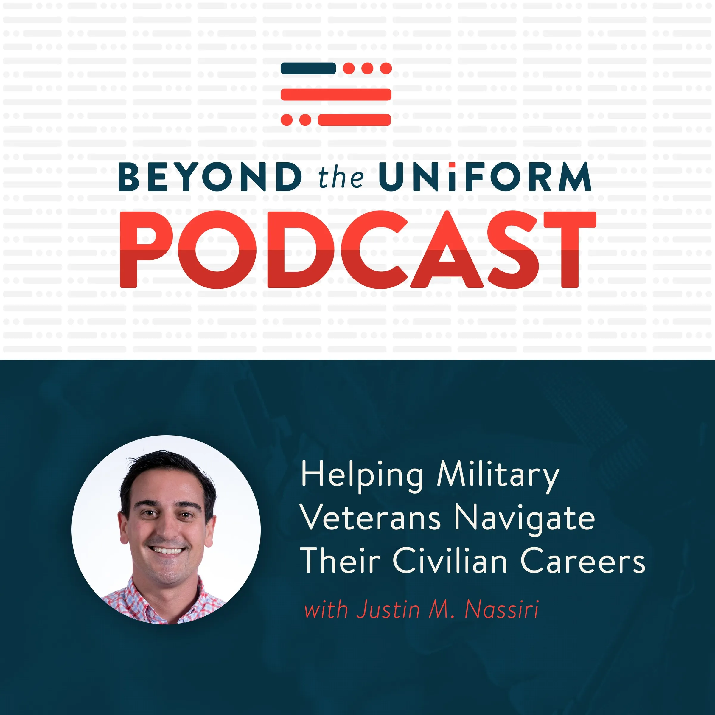
The podcast cover was one of the first pieces out the door. It pairs the full logo with Justin’s portrait and a simple promise: helping military veterans navigate their civilian careers.
(07) DIGITAL
the same signal, on screen
The site banner carries the same promise across the top of beyondtheuniform.io. The homepage, consultation and podcast page concepts show how the system could grow from there.
ORIGINAL MUGS · APPAREL, DRINKWARE AND KIT ARE CONCEPTS
(08) IN THE WORLD
educate and advance
It’s always fun to see how far a small flag can travel. These concepts take it to events with a pull-up banner and a workshop kit, onto apparel and drinkware, and into a set of social templates for every new episode.
DELIVERABLES
- Logo and lockups
- Morse flag and favicon
- Color palette and typography
- Business cards and stationery
- Podcast cover
- Site banner
- Presentation template
- Event, social and merch concepts
DISCIPLINES
- Discovery & Strategy
- Brand Identity
- Digital
CREDITS
- Creative direction: Jeremy Mansfield