brain trauma foundation
A refreshed identity for the nonprofit whose guidelines help doctors treat traumatic brain injury, from concussion to coma.
4 MIN READ · 08 SECTIONS · 37 IMAGES

(01) OVERVIEW01 / 08
a trusted name, a warmer voice
Brain Trauma Foundation had the research and the reputation. It needed an identity that physicians would trust and parents would understand.
Brain Trauma Foundation is a research-based nonprofit that physicians have trusted for a long time. Its evidence-based guidelines inform how patients with traumatic brain injury are treated in emergency rooms and intensive care units. The foundation wanted to reach parents, coaches and patients too, ideally before a concussion ever happens, without losing the credibility it had earned. Working alongside the BTF team, I refreshed the logo and built the system around it: palette, typography, stationery, a conference banner, presentation templates, social and an outreach van.
(02) CHALLENGE02 / 08
credible, but not cold
The foundation was stepping toward the public, but physicians and hospitals still had to trust every word. The brief asked for a brand that felt mature and credible, and approachable and friendly at the same time.
(03) BRAND STRATEGY03 / 08
credible, helpful, innovative
The creative brief gave us three words, and every sketch had to live up to all of them at once.
-
(01) TENET
Credible
Thorough in everything, so physicians can trust the research and the results.
-
(02) TENET
Helpful
A resource for medical professionals, patients and the people who love them.
-
(03) TENET
Innovative
The most advanced research on traumatic brain injury, always pushing results forward.
-
CORE AUDIENCE
Physicians, trauma specialists and researchers who rely on the guidelines every day.
-
GROWTH AUDIENCE
Parents, coaches and patients learning about concussion, often for the first time.
-
BIG IDEA
Mature and credible, but approachable and friendly. Education, research and guidelines.
(04) LOGO04 / 08
one letter, many pathways
The lowercase b had a brain-like quality from the very first round, and after every detour, it’s the mark we came back to.
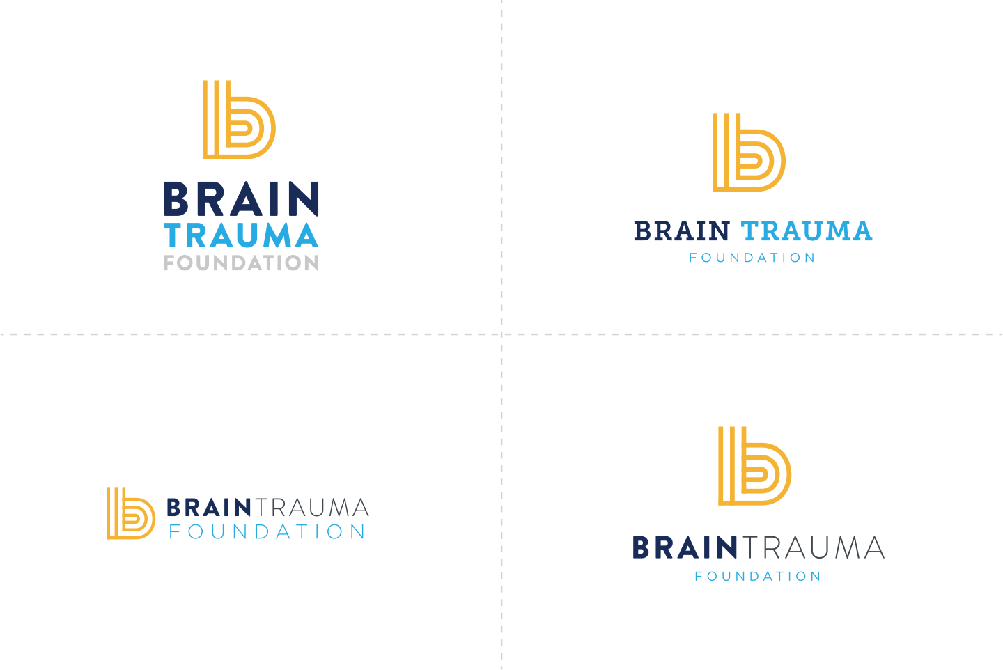
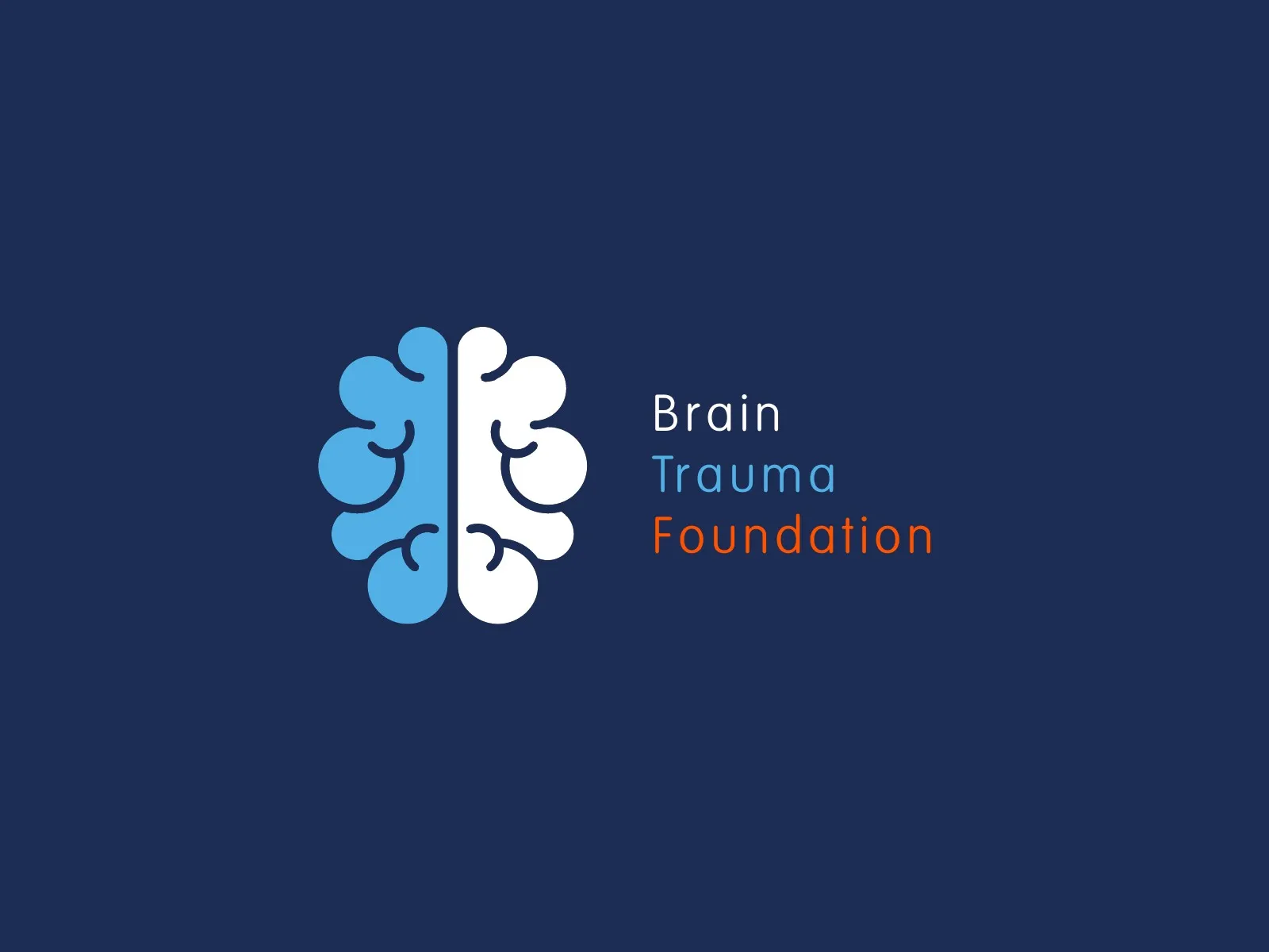
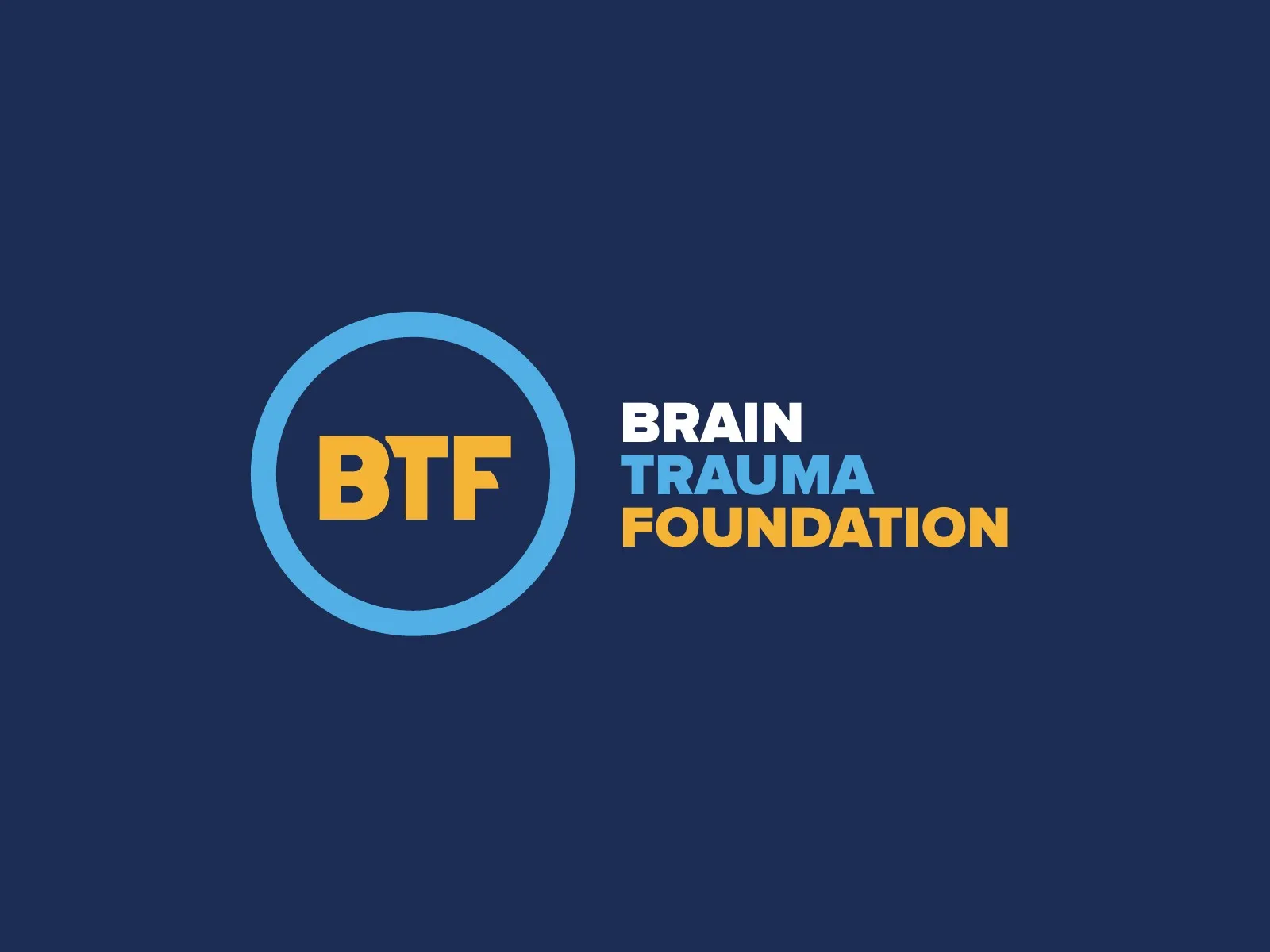
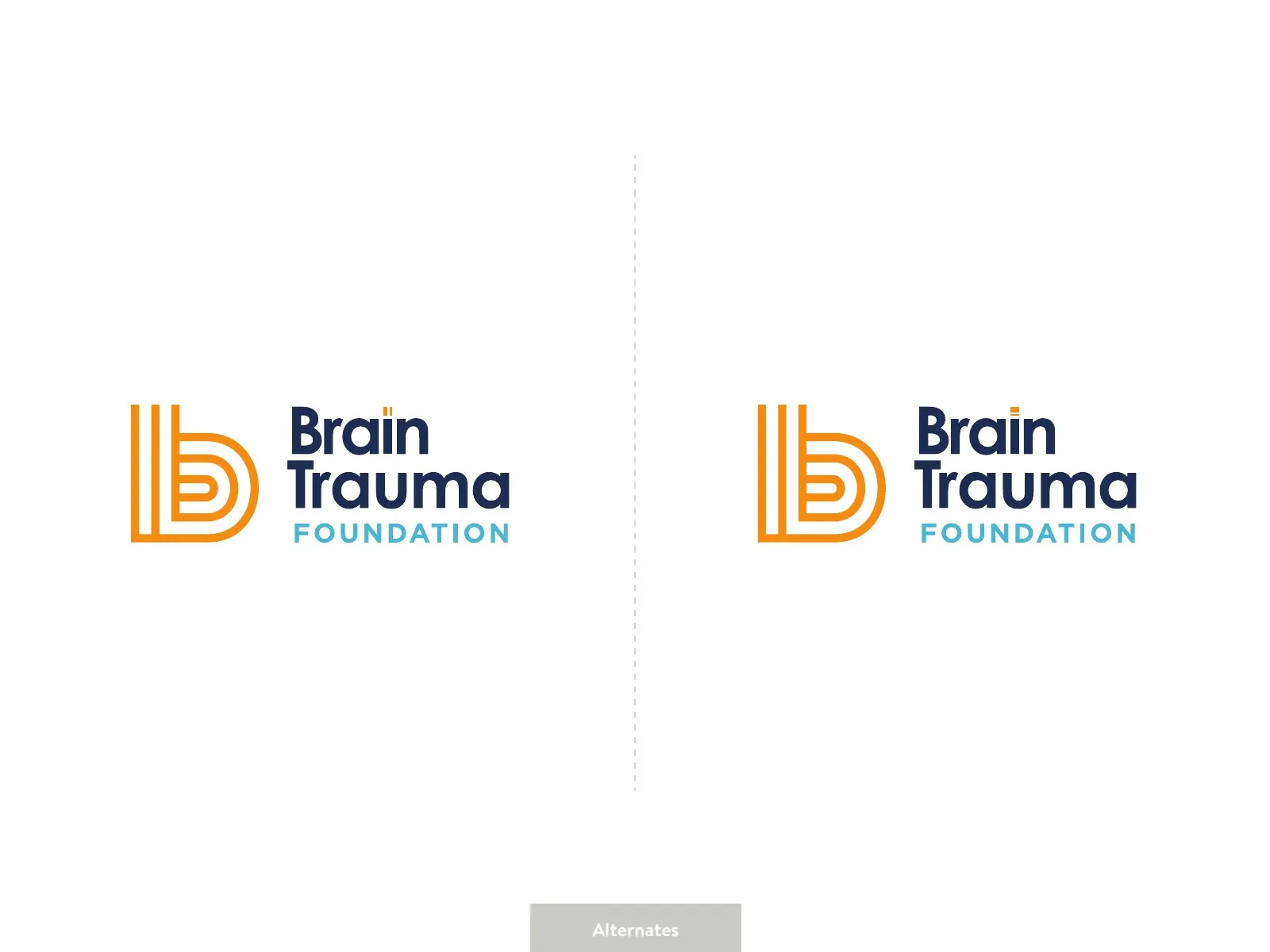
In round one, the team said the striped b already felt like a brain, with folds and a maze-like path. The founder wanted a mark that said more than a letter, so we explored transformation sketches, BTF initials in a ring and a BRAiN wordmark with overlapping circles. In the end, the b said it best. It landed in orange, over the centered, two-row wordmark in navy and sky blue that the founder asked for.
(05) VISUAL IDENTITY05 / 08
orange, sky and navy
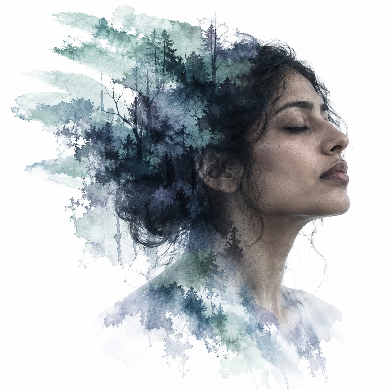
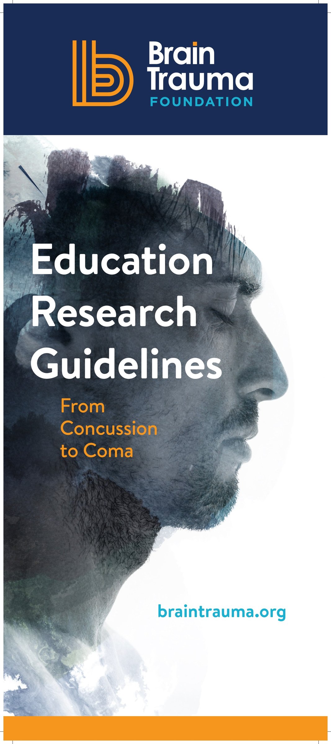
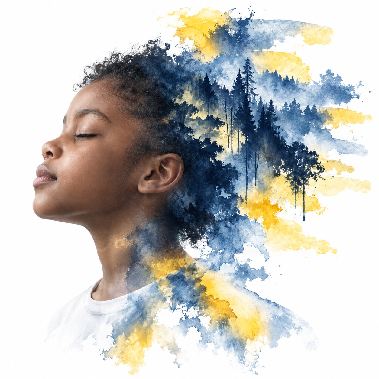
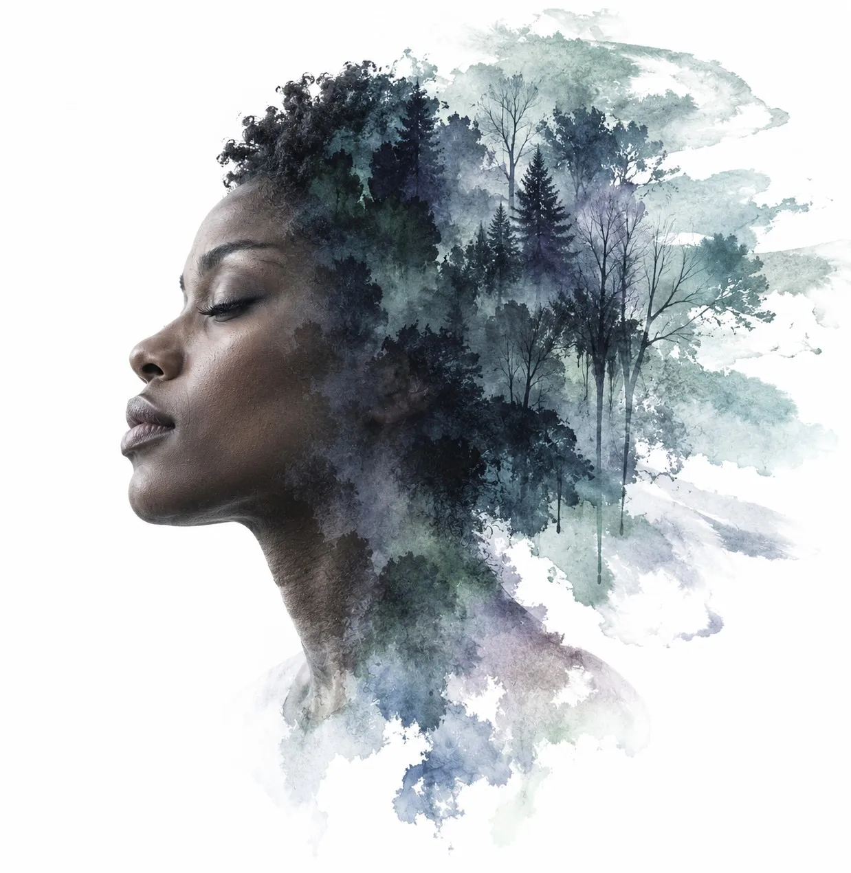
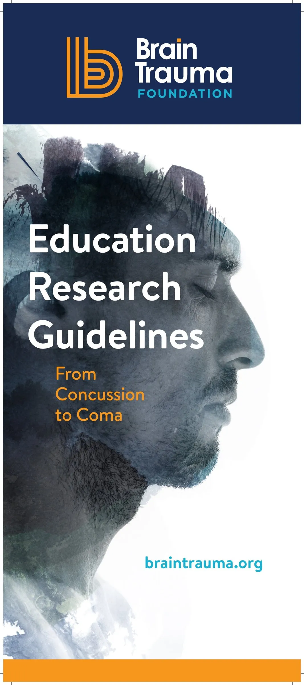
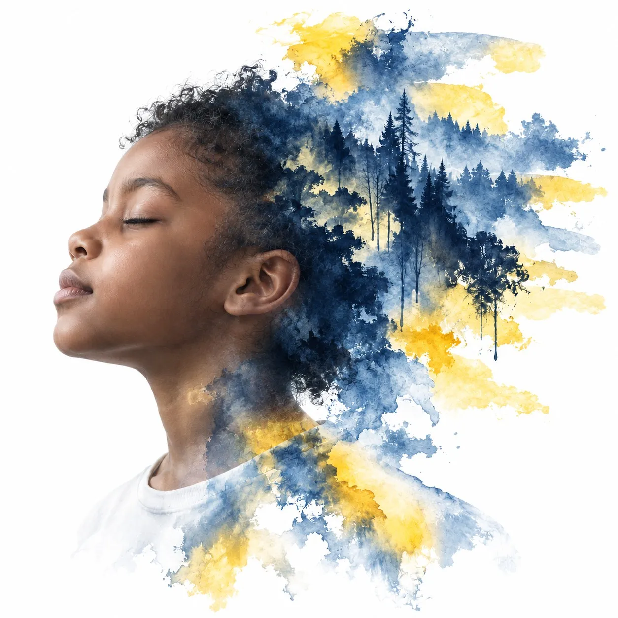
Everything grows out of the logo: its orange, sky blue and navy, Brandon Text for the words, and a signature image of a profile dissolving into ink.
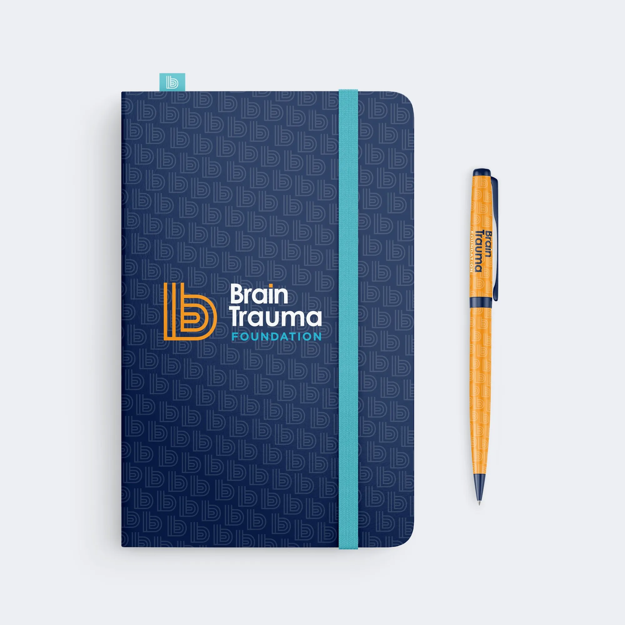
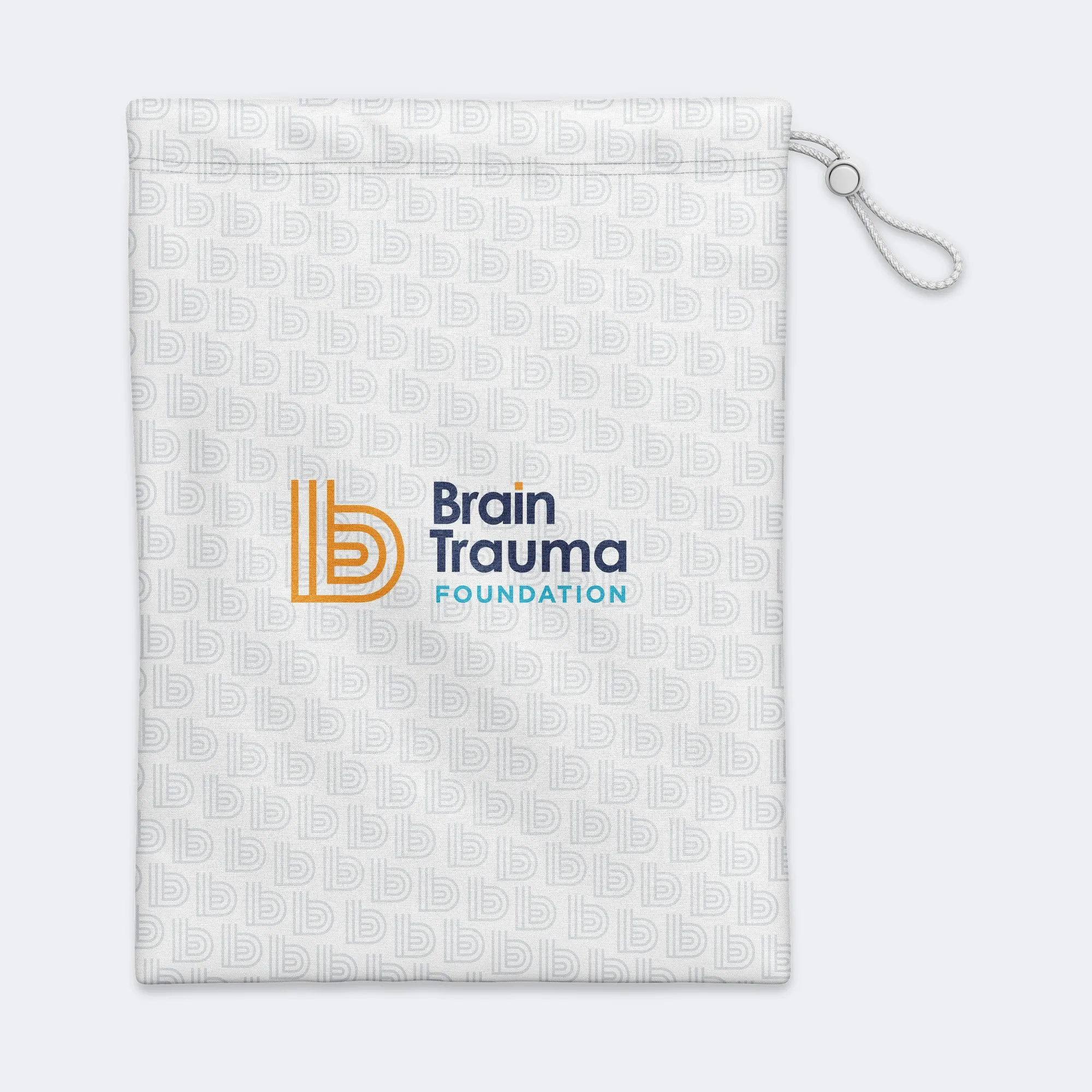
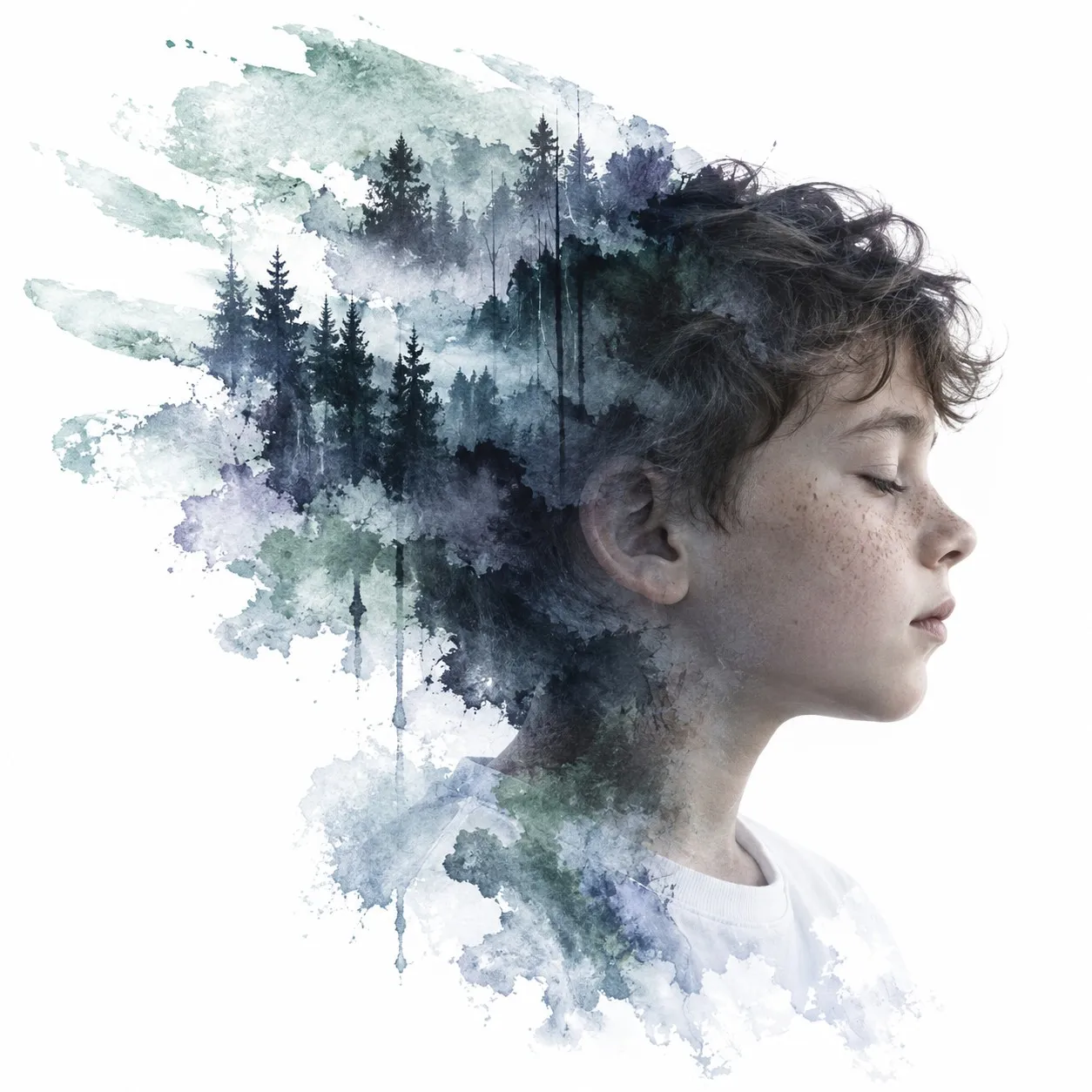
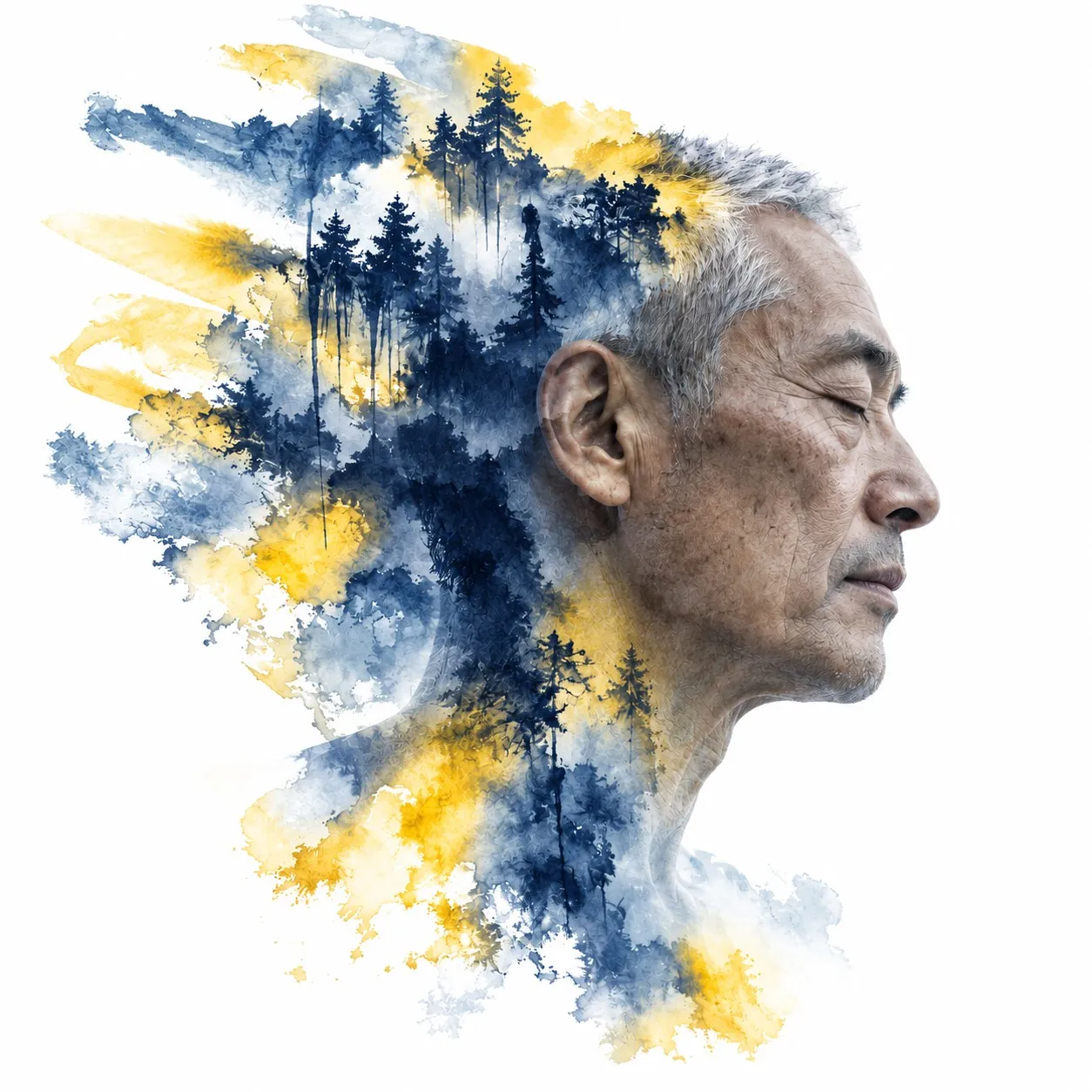
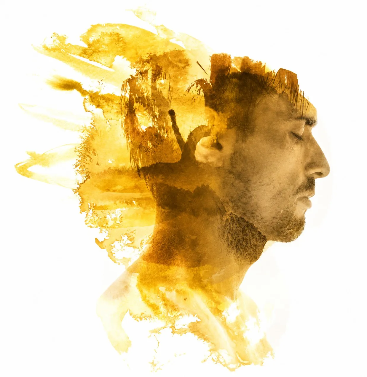
- NAVY#192C56
- ORANGE#FF9E16
- SKY BLUE#46A8C6
- WHITE#FFFFFF
(06) PRINT06 / 08
one system, on paper
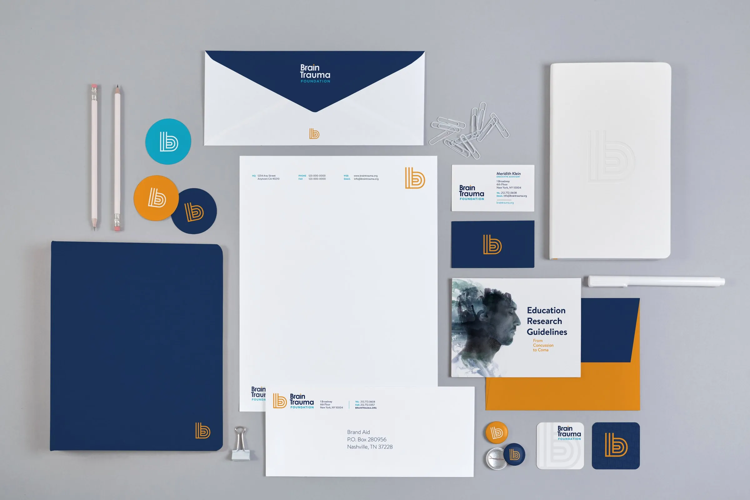
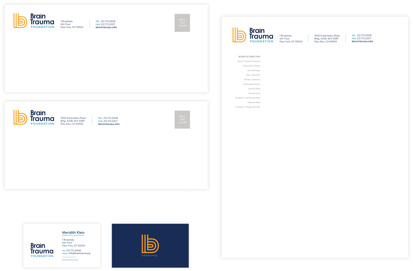
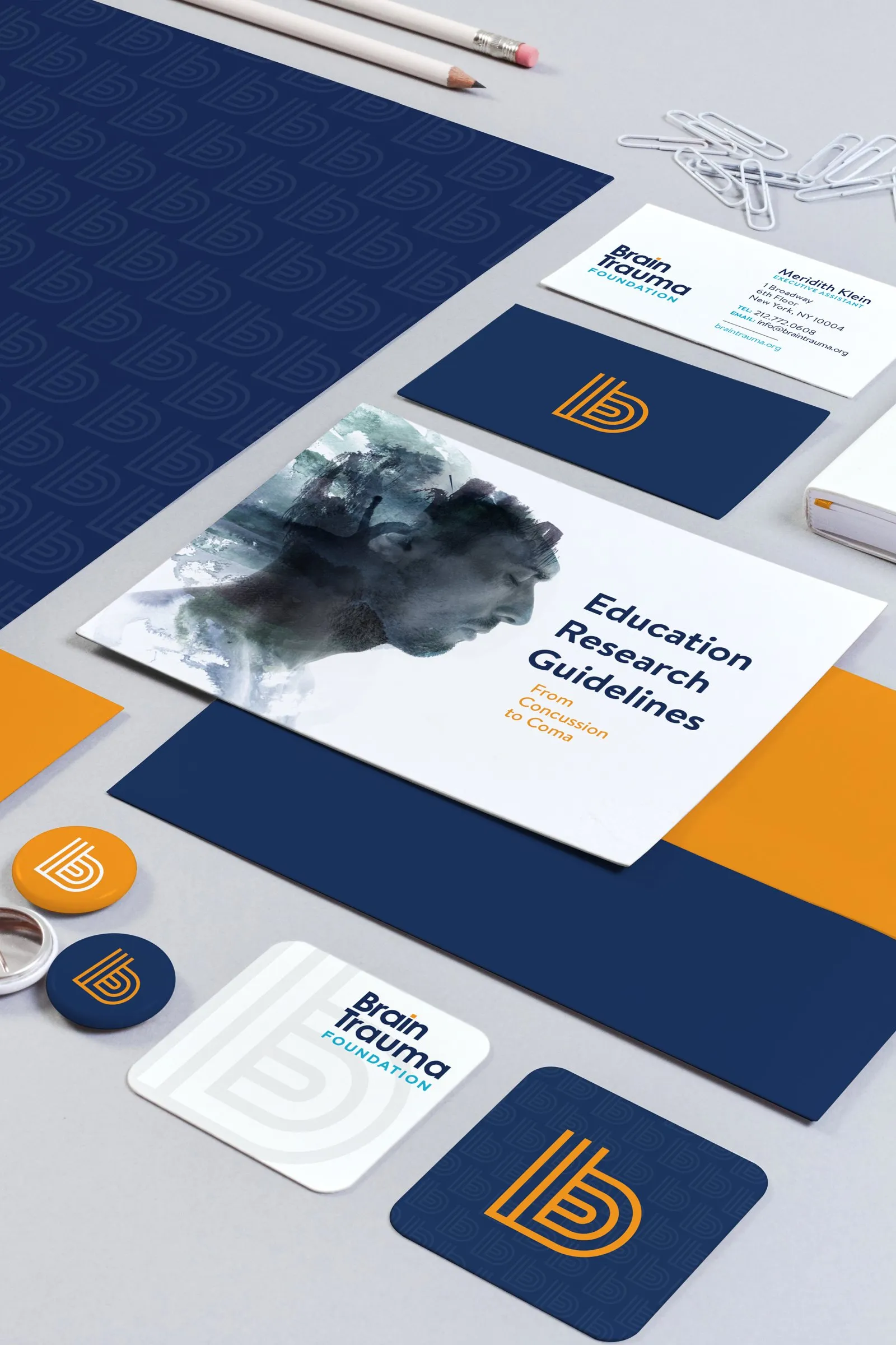
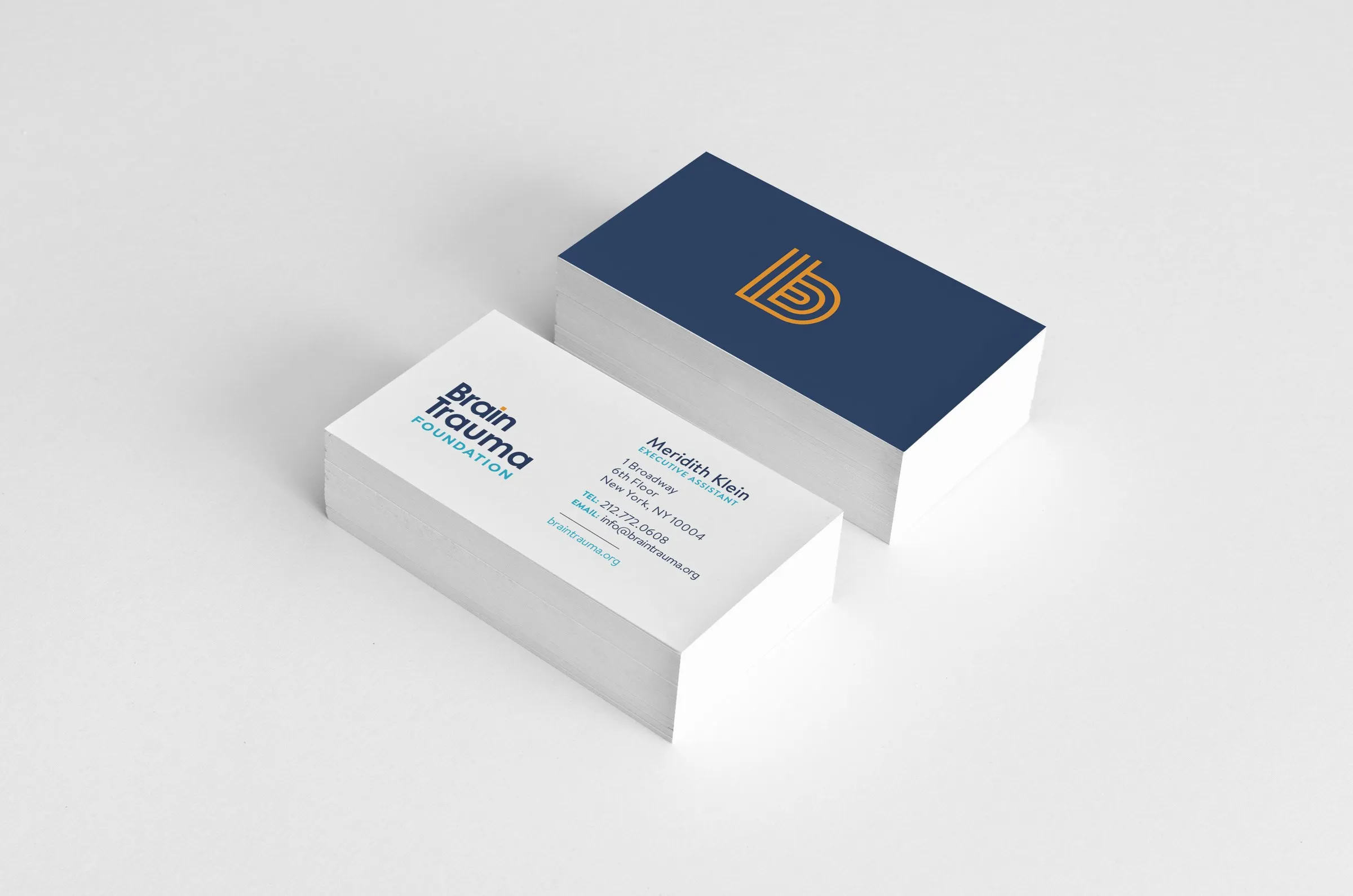
On paper, the full logo sits on white and the b gets to play on the back: orange on navy, over a tone-on-tone pattern.
- 01 LETTERHEAD
- 02 ENVELOPE
- 03 BUSINESS CARD
- 04 FOLDER
- 05 STICKERS
(07) DIGITAL07 / 08
the same system, on screen
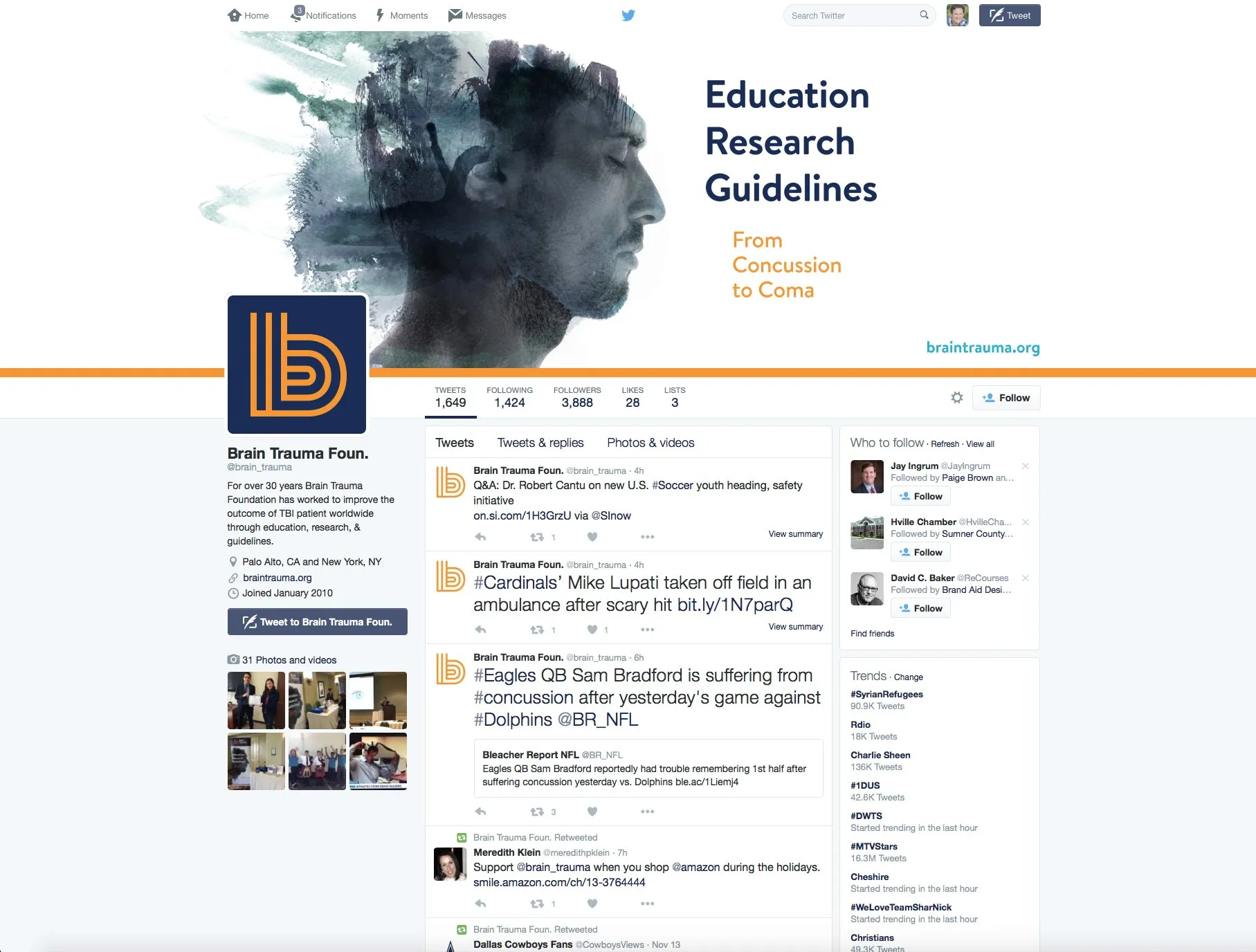
Presentation templates and social profiles carried the same system onto screens, so every talk and every post looked like it came from the same place.

(08) IN THE WORLD08 / 08
education, research, guidelines
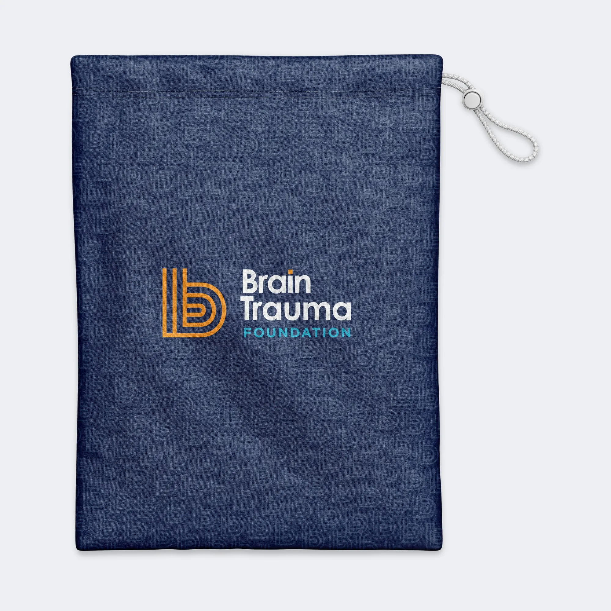
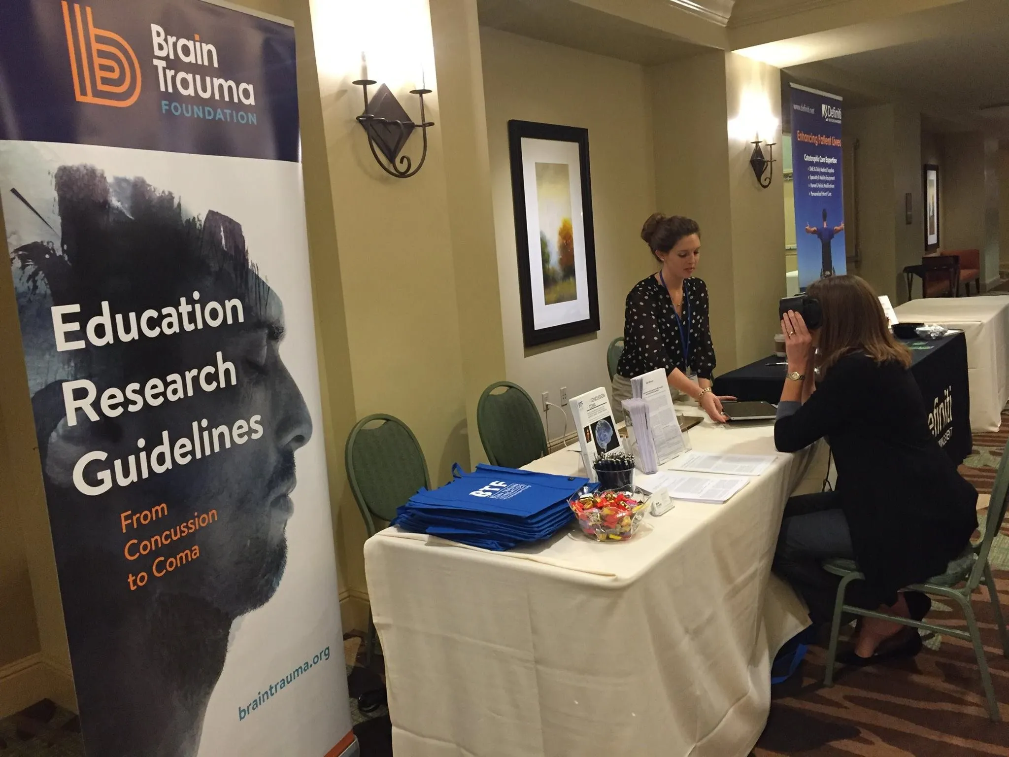
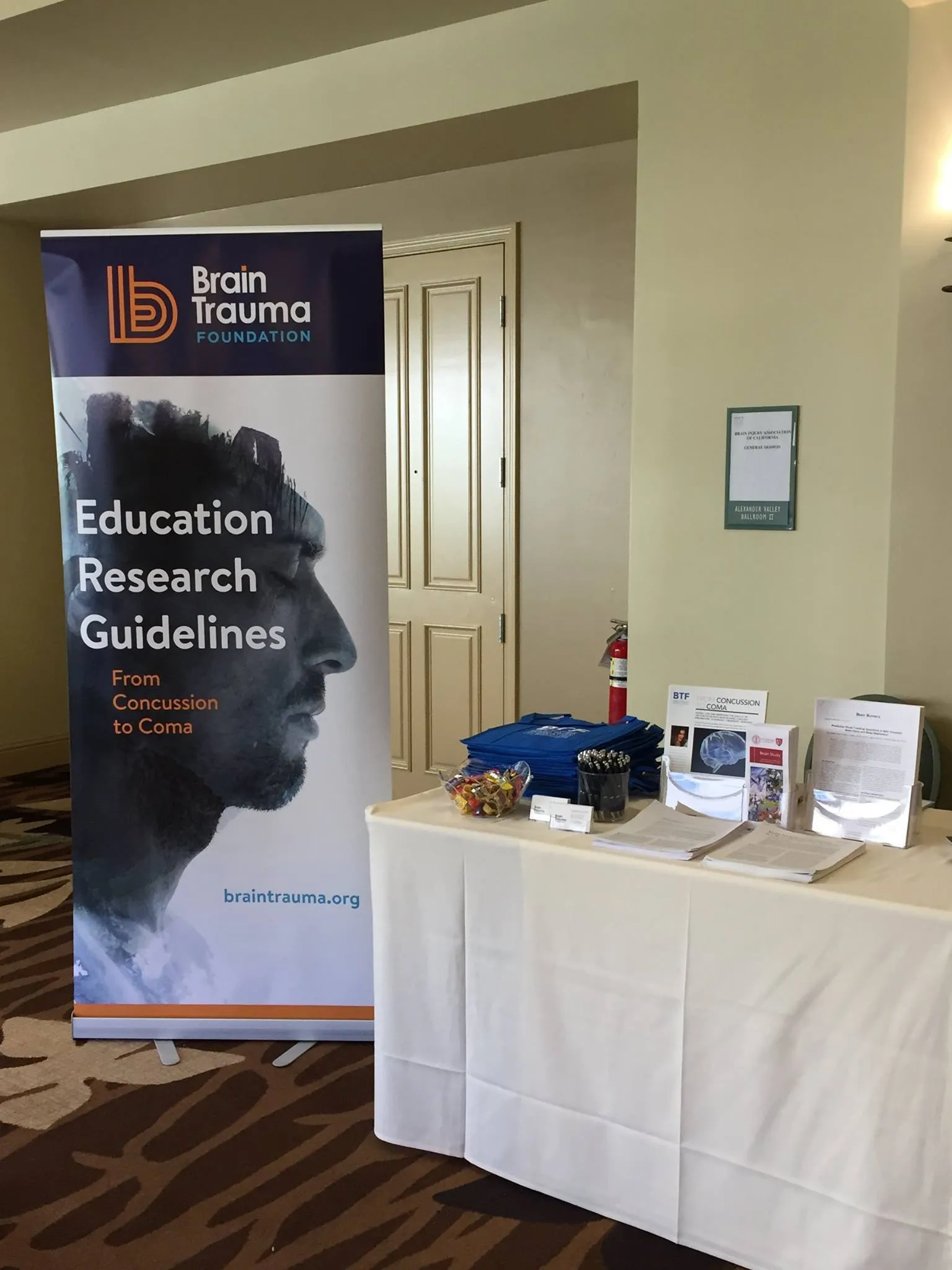
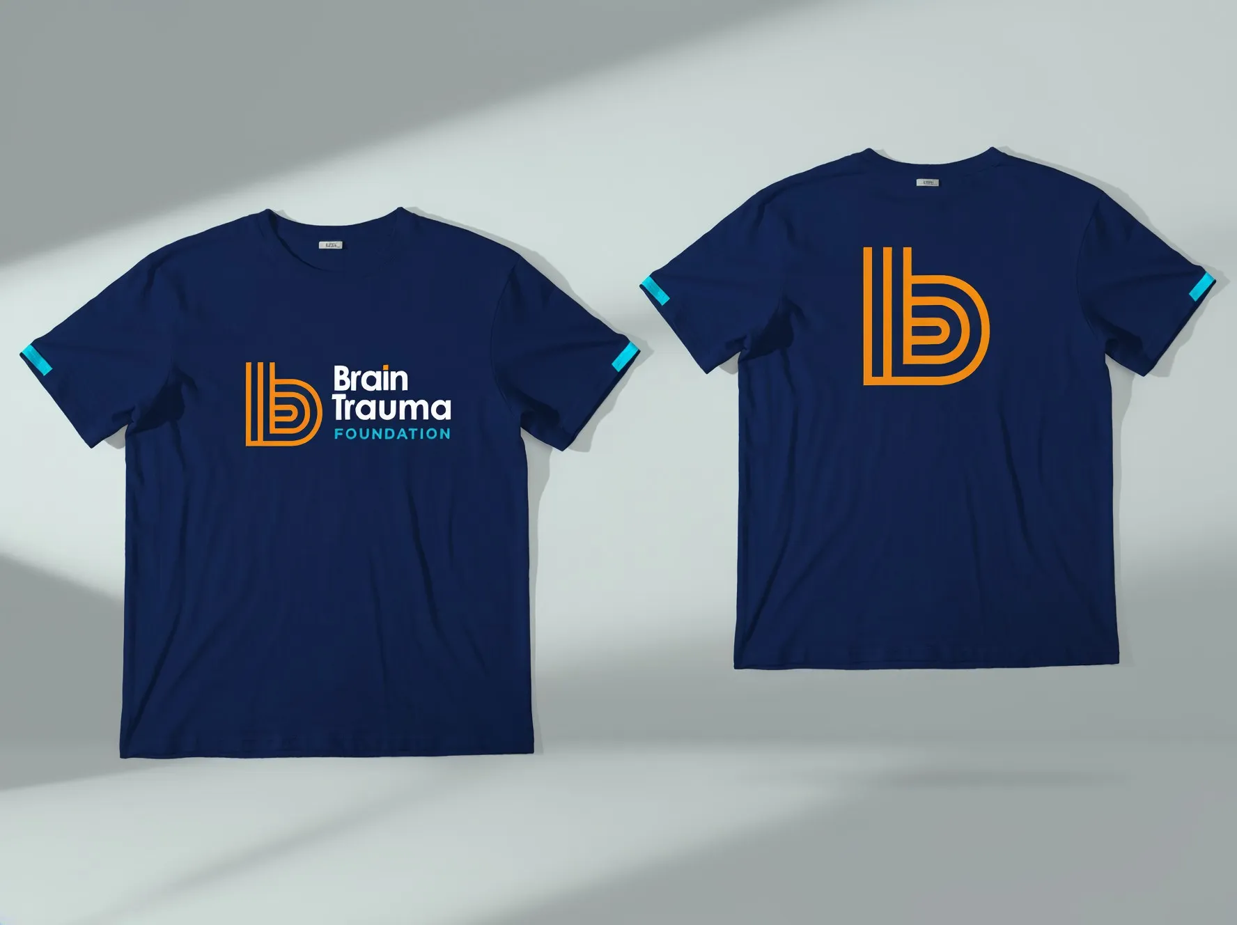
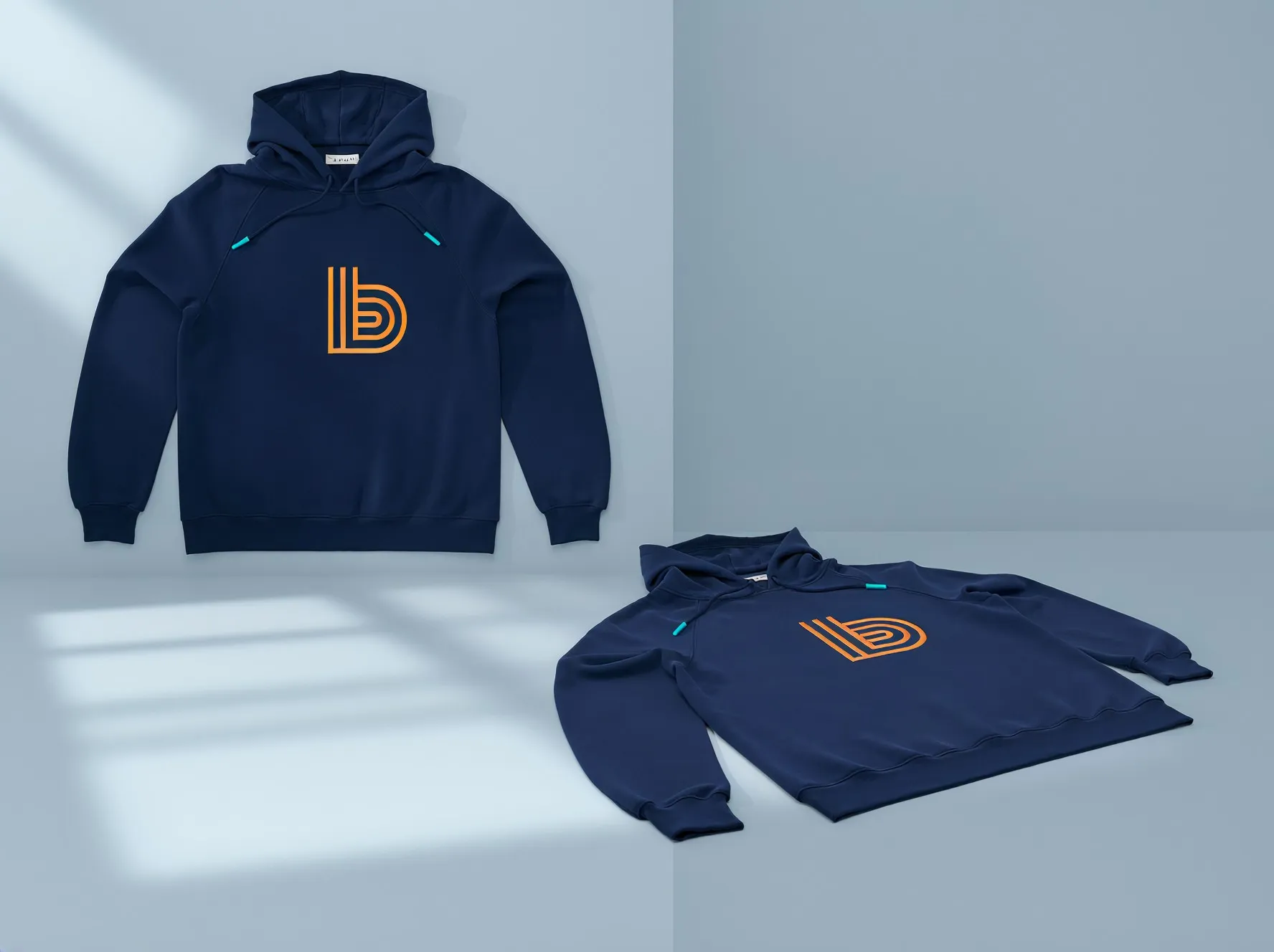
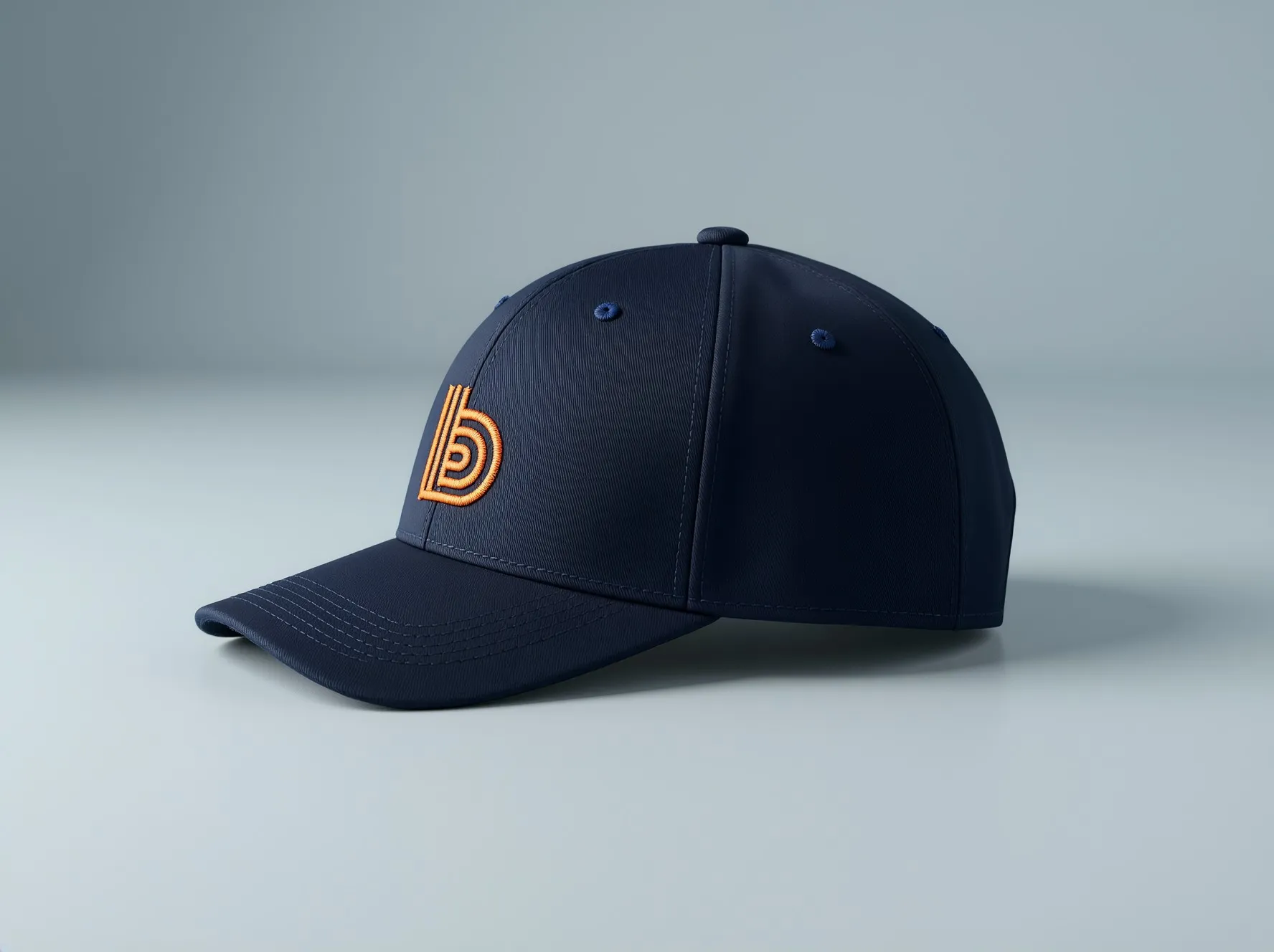
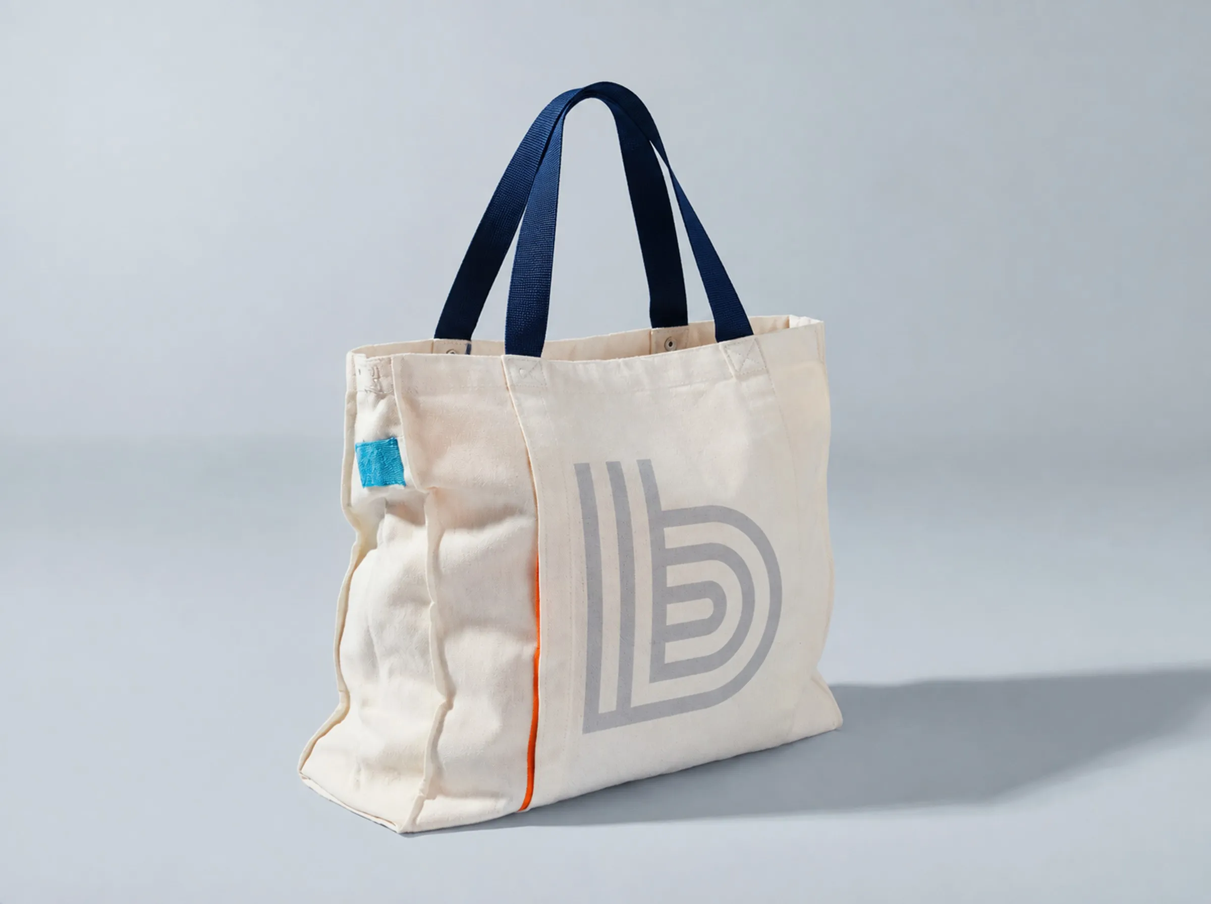
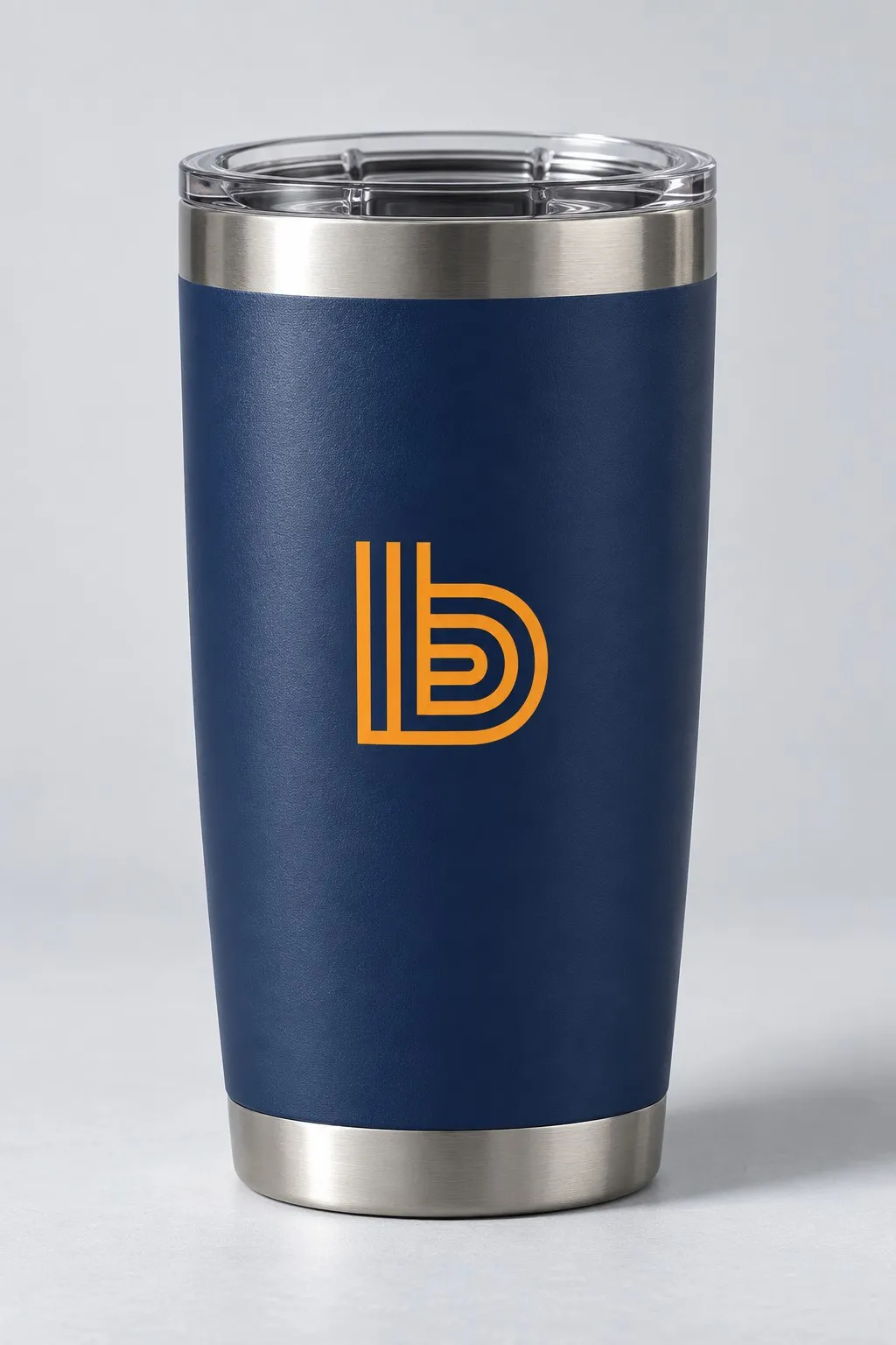
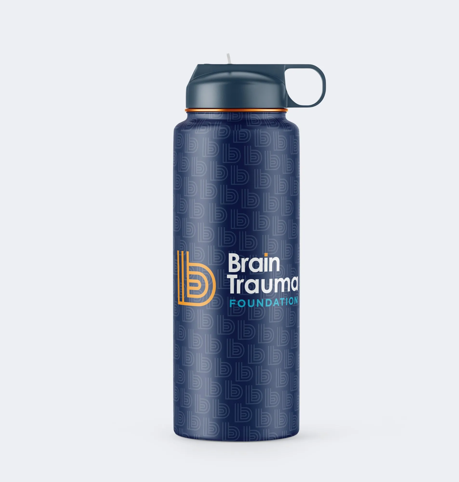
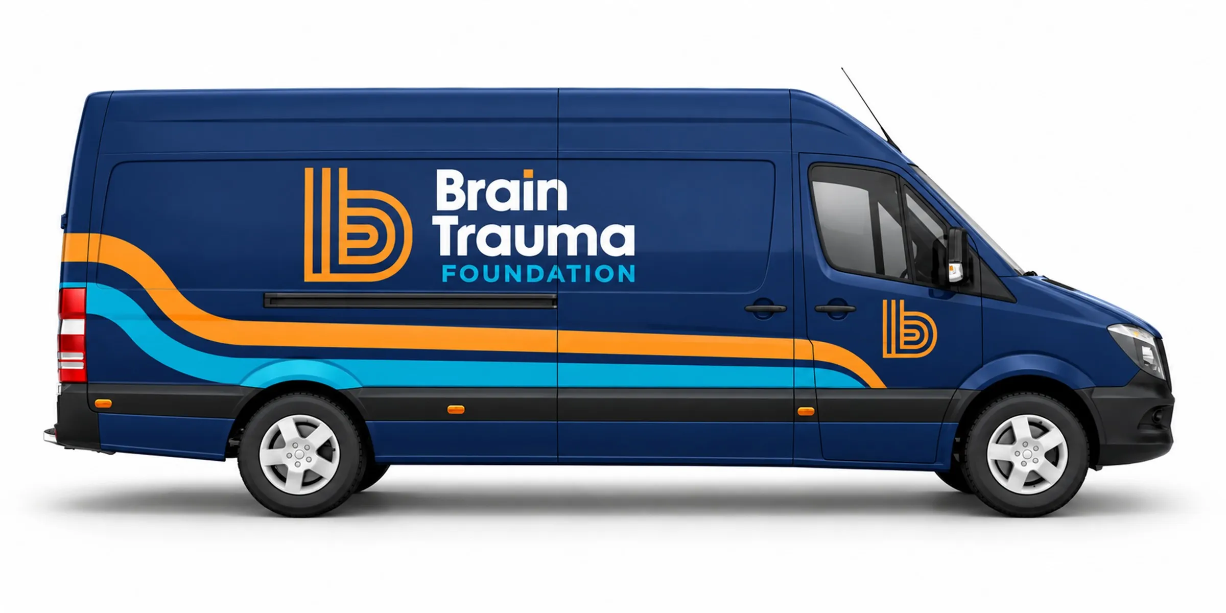
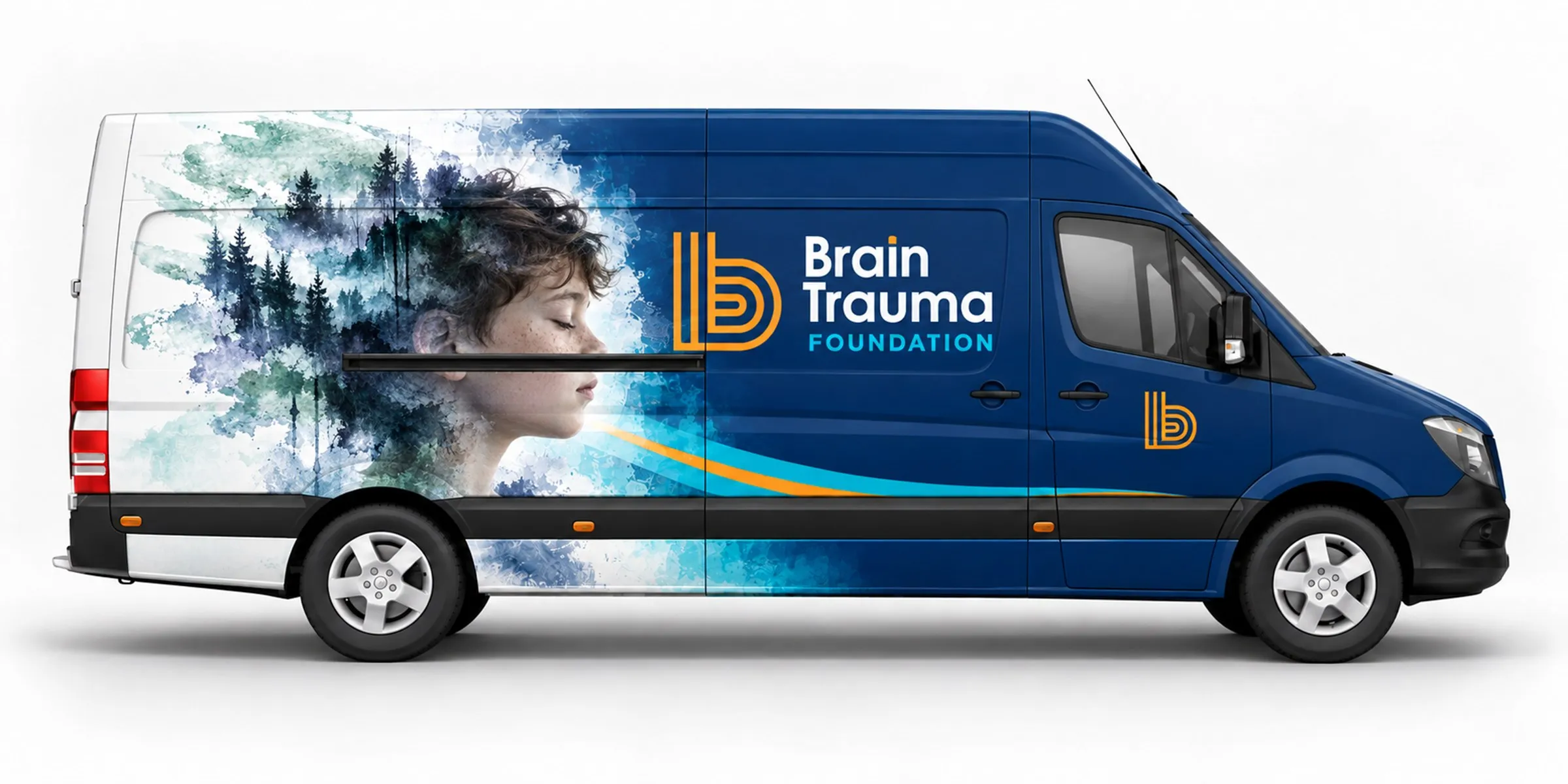
It’s always rewarding to see the system at work: the conference banner and booth, apparel, bags and drinkware, and an outreach van, shared with Stanford Medicine, that visits schools to test kids.
IN USE · BRAIN TRAUMA FOUNDATION
(01) OVERVIEW
a trusted name, a warmer voice
Brain Trauma Foundation is a research-based nonprofit that physicians have trusted for a long time. It funds and conducts research on traumatic brain injury and publishes the evidence-based guidelines that inform how patients are treated in emergency rooms and intensive care units.
The foundation wanted to reach parents, coaches and patients too, ideally before a concussion ever happens, without losing the credibility it had earned with doctors. Working alongside the BTF team, I refreshed the logo and built the system around it: palette, typography, stationery, a conference banner, presentation templates, social and an outreach van.
(02) CHALLENGE
credible, but not cold
Physicians and hospitals rely on the foundation’s guidelines, so its name carries real weight. Whatever we made, that trust couldn’t be put at risk.
At the same time, the BTF team wanted the brand to feel less corporate and more welcoming to families. The brief put it simply: mature and credible, but approachable and friendly. The new identity had to open that door without looking like a consumer brand.
(03) BRAND STRATEGY
credible, helpful, innovative
The creative brief gave us three words, credible, helpful and innovative, and every sketch had to live up to all of them at once, from the mark to the stationery.
- CREDIBLE
- Thorough in everything, so physicians can trust the research and the results.
- HELPFUL
- A resource for medical professionals, patients and the people who love them.
- INNOVATIVE
- The most advanced research on traumatic brain injury, always pushing results forward.
The core audience is physicians, trauma specialists and researchers. The growth audience is parents, coaches and patients, often learning about concussion for the first time. What ties them together is trust: one foundation, speaking clearly to both.
(04) LOGO
one letter, many pathways
Round one put three directions in front of the team: a lowercase b, BTF initials and a brain icon. The striped b stood out right away. The team said it already felt like a brain, with folds and a maze-like path, and its orange, sky blue and navy carried through to the end.
The founder wanted a mark that said more than a letter, something about how BTF helps people come back to themselves after an injury. So round two explored transformation, from broken to whole and dark to light. Round three tested BTF initials inside a ring, and a later round tried a BRAiN wordmark with overlapping circles. In the end, the b said more with less. It sits over the centered, two-row wordmark the founder asked for, and a b of its own anchors the sibling mark for B-TEC, the evidence-based research consortium the foundation works on with Stanford.
(05) VISUAL IDENTITY
orange, sky and navy
The palette comes straight from the logo: navy for the name, sky blue for FOUNDATION and orange for the b, with plenty of white around them. The wordmark is set in Century Gothic and Gotham, and Brandon Text carries everything people read, with Black caps for headlines and Light or Regular for body copy.
The b travels on its own as an app icon, a sticker and a tone-on-tone pattern on the back of every navy card and envelope.
- NAVY
- ORANGE
- SKY BLUE
- WHITE
(06) PRINT
one system, on paper
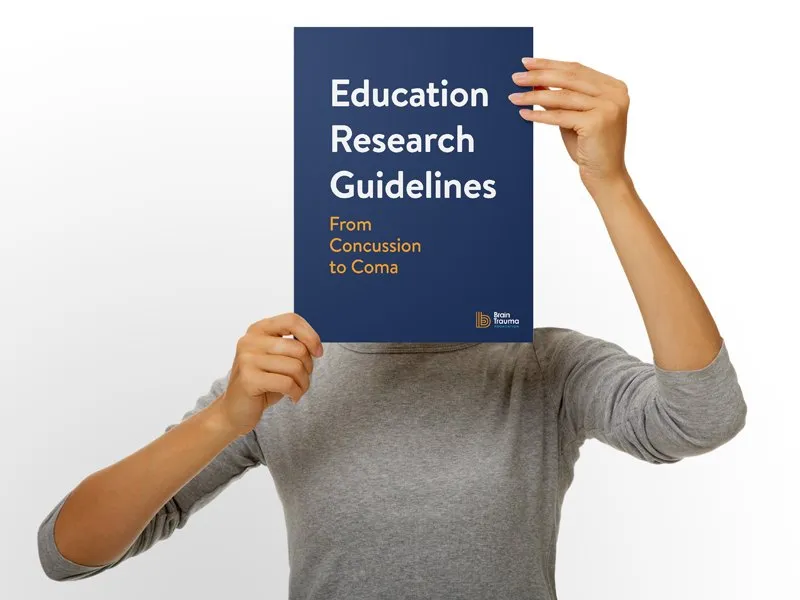
The paper system keeps the full logo on white sheets and puts the b to work on the backs: orange on navy, over a tone-on-tone b pattern. The same parts cover letterhead, business cards, envelopes, a presentation folder and a set of stickers.
A thin orange rule and a navy footer bar carry the system from paper into Keynote and PowerPoint, so every presentation looks like it came from the same place.
(07) DIGITAL
the same system, on screen
Presentation templates open on navy with the logo, or on the signature image, and move into white content slides with the orange rule and the navy footer bar. On Twitter, the same image leads the cover and the b holds the avatar.
IN USE · BRAIN TRAUMA FOUNDATION
(08) IN THE WORLD
education, research, guidelines
It’s always rewarding to see the system at work. At conferences, the banner leads with the signature image and the three pillars, and the booth, apparel, bags and drinkware all carry the b. The outreach van, shared with Stanford Medicine, visits schools to test kids, so it gives both names equal billing and lets a big photo do the talking.
DELIVERABLES
- Logo and lockups
- b icon
- Color palette and typography
- Stationery system
- Stickers
- Conference banner
- Presentation templates
- Social media and merchandise
DISCIPLINES
- Discovery & Strategy
- Brand Identity
- Digital
CREDITS
- Creative direction: Jeremy Mansfield
- Photography: iStock and Brain Trauma Foundation